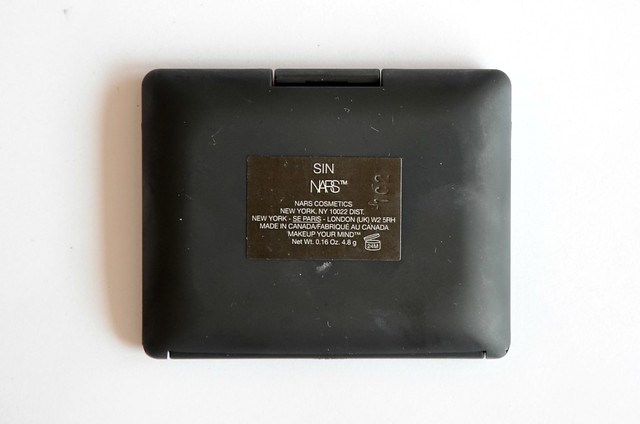


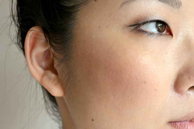
NARS Sin on the cheeks, NARS Douceur to contour
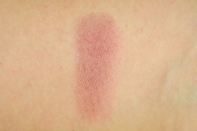
The first thing that struck me about Sin is that to describe it as "pigmented" simply doesn't cut it. Anything more than a feathery touch to the pan is too much. It's one of those blushes that's naturally heavy. I always go over the blush I've applied with a kabuki or buffing brush (usually the one I've used for my foundation) to soften the colour and blend out the edges. I find that the more the blush is blended out, the more it transforms into a warm berry shade that gives an earthy rosiness to the face. However, if applied straight to the cheeks and a little too heavily, it looks very obvious and harsh, even bordering on muddy. It can take on a hideous ashy/dirty appearance if too much is put on.
While you can detect a soft gold shimmer to Sin, I don't find it to be very noticeable once worn. The shade is distinctly autumnal to me, though it's probably more versatile than I give it credit for. Sin was really more my experiment in more purple-leaning blush, but the only way I can wear it is if it's sheered out considerably, at which point it loses its mauve edge and becomes more of a reddish colour. Despite those issues, I love the quality of NARS blushes, the way they apply to the skin and the wear time, so I still consider Sin a worthy addition to my blush drawer.