Saturday, March 9, 2013

Rubenesque Rundown

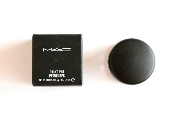
I remember first being introduced to MAC Paint Pot in Rubenesque in one of Nic from Pixiwoo's videos. It made her eyelids glisten with such an eye-catching, subtle but multifaceted orangey-gold sheen that I was compelled to made a note of the name of the product so I could check it out and hopefully purchase it later. I'd always been drawn to the MAC Paint Pots because of the ease and versatility of cream eyeshadows, but with the Maybelline Color Tattoos a much more affordable alternative, I couldn't bring myself to spend $35 on one. Painterly had always been the shade I was most tempted by, but I rationalised that such a colour would barely show up on my lids and only act an an eyelid primer more than anything. Rubenesque was yet another US purchase I made (that trip really was about fulfilling 95% of my makeup wishlist), setting me back $18.50 rather than almost double that had I bought it in Australia.


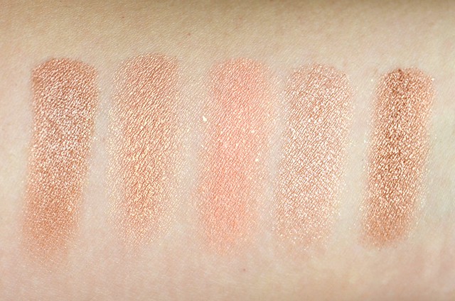
l-r: Wet n Wild Comfort Zone Eyelid shade, MAC Rubenesque, NARS Enchanted, Prestige Champagne, Urban Decay Chopper

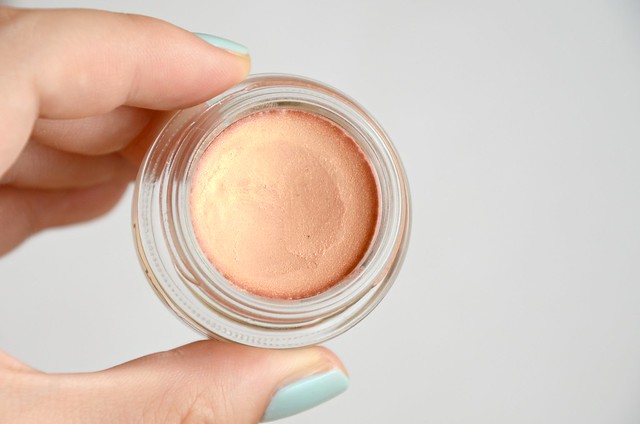
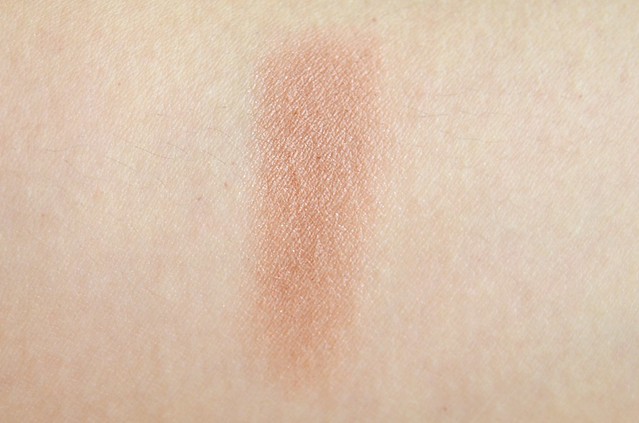
MAC Rubenesque is described as a "mid-tone frosted golden peach with gold and pink pearl". There's only a hint of pink, and it's not as frosty as some other eyeshadows that I have in that the predominant shimmer isn't white or silver. To my eyes, it's more of a sheer peach with a gold overlay. This is one of those colours that looks beautiful when swatched, but falls flat when I apply it. It just doesn't work with my eye shape and skin tone. It took about three layers for the pigmentation to be built up to a light wash of slightly orangey gold. The formula of the Paint Pot itself was smooth, blendable and creamy, but it appeared a little drying on the lid and not as emollient as other cream shadows I have, notably the Benefit Creaseless Cream Eyeshadow/Liner.

Compared to similar shades I have, there's nothing that's an exact dupe. Interestingly, the left "Eyelid" colour of the Wet n Wild Color Icon Eyeshadow Collection in Comfort Zone is nearly identical to Urban Decay Chopper from the Naked2 palette (Chopper is slightly more intense in pigmentation and metallic in finish). Both colours are more copper compared to the lighter goldish peach of Rubenesque. Prestige Champagne is sheerer and more of a browny peach with less of a pinky-orange undertone and missing the gold sheen that runs through Rubenesque. NARS Enchanted, actually a cream blush, is surprisingly the most dissimilar. It's a lot more vibrantly pinky peach with the addition of crazy glitter shards.

I wanted to love Rubenesque, but since I bought it, I've barely touched it. I think this would look better on those with fairer skin and a visible crease/socket for an everyday, brightening look. The only way I'd imagine getting some use out of it is as a base for gold, copper or bronze eyeshadows, or maybe even as a highlighter.

Monday, March 4, 2013

Dabbling in Dallas

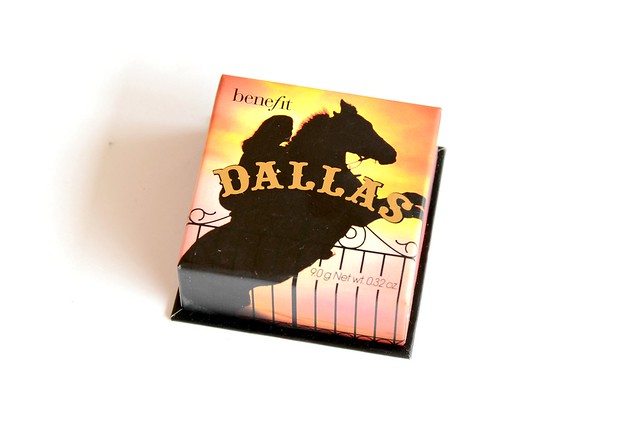
Benefit Dallas never particularly called out to me, until I saw it in action in Alix's Everyday Makeup Routine video. If it looked half as good on me as it did on her, I needed it in my life. I remember tossing up between Dallas and NARS Sin while at Sephora in New York on my holiday last September, as both were of the plum persuasion and I could only allow myself one. Though I'd go on to buy Sin less than a month later, Dallas was my original pick as it seemed a lot more wearable and easier to work with.


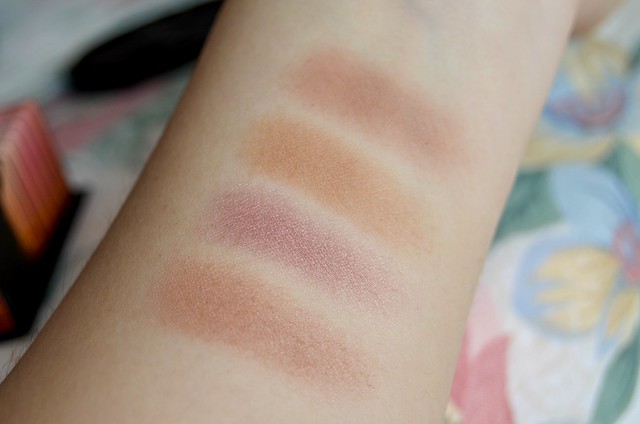
l-r: Benefit Dallas, NARS Sin, Benefit Hoola, NARS Douceur

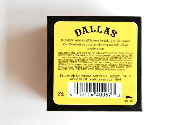
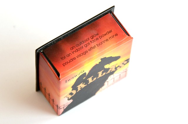
Dallas is a soft tan mixed with dusty, reddish pink. It has a very slight silver shimmer which is barely detectable when applied to the face. Once swatched, it looks nearly identical to NARS Douceur, which is a smidgen more brown and neutral-toned, and completely matte. NARS Sin, which I originally thought would be similar, is completely different — more berry/purple with subtle gold sheen. Benefit Hoola is more of a dirty brown, not as red.

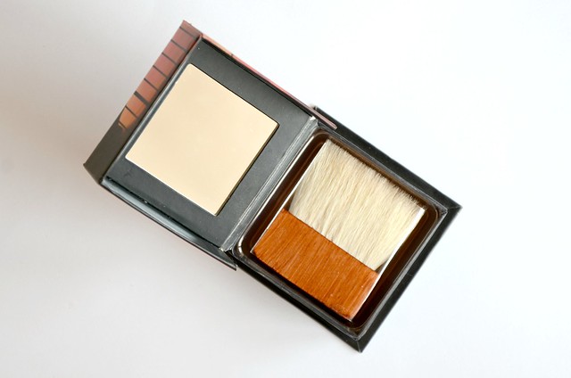
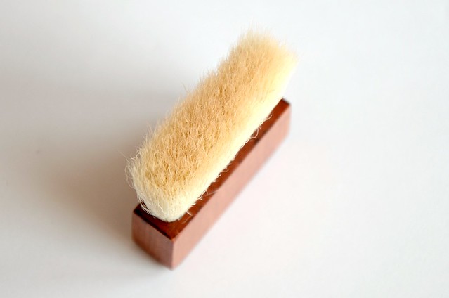
The texture of Dallas is the best among the Benefit boxed powders that I have. Smooth, soft, very pigmented, easy to blend and not at all powdery. Like all Benefit blushes, it comes with a small rectangular brush that's actually not too bad. I usually throw out all included brushes in any eyeshadow palette or blush, but this Benefit one wouldn't be too bad for travel purposes if you really didn't want to carry separate brushes. It does tend to disturb the surface of the powder quite a bit (as if taking to it with a rake), so it's not as gentle as a soft, rounded brush like the Real Techniques Blush Brush or Multi-Task Brush.

I don't wear Dallas all that much as I usually opt for pink and peach on my cheeks, but I feel it still has a place in my blush collection. It's not as serious and polished as Douceur, it's not as tricky to wear and absurdly pigmented as Sin, and it's not a straight up bronzer either. I like Dallas for a kind of bronzed warmth and glow that doesn't lean too brown. It's more earthy and rosy, without being too neutral or overly red.

Saturday, March 2, 2013

Sally Hansen Gift with Purchase

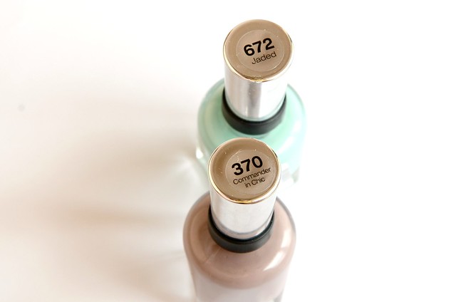
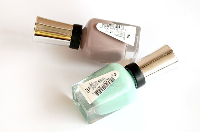
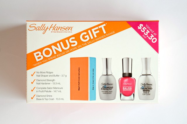
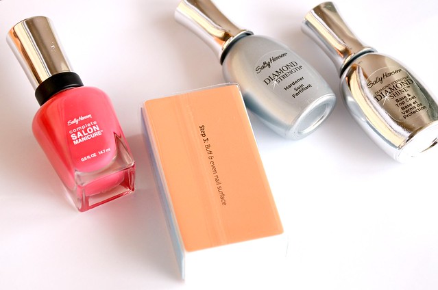
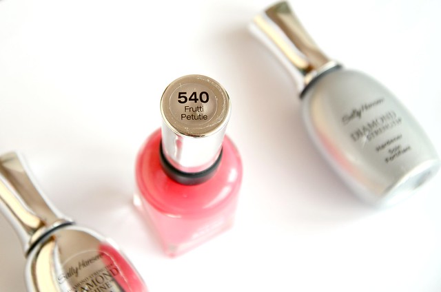
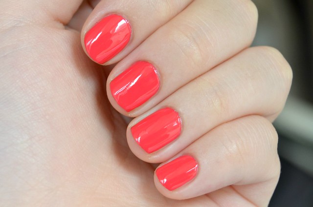
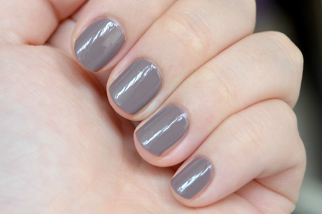
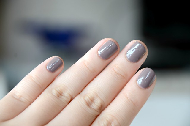
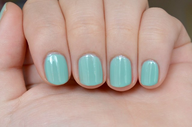
All it ever takes with me is throwing a freebie in the mix. Right now, if you spend $20 or more on Sally Hansen at Priceline, they'll throw in a gift with purchase valued at $53.30. The pack contains a No More Ridges Nail Shaper and Buffer, Diamond Strength Nail Hardener, Diamond Shine Base & Top Coat and a Complete Salon Manicure nail polish in Frutti Petutie (540). After much deliberation about what to buy, I chose two Complete Salon Manicure polishes (on sale for $10 each) in Jaded (672) and Commander in Chic (370).


It was with a previous Sally Hansen gift with purchase at Priceline that I discovered the amazingness that is Insta-Dri Top Coat and the Radiant Hands, Nails & Cuticles Creme. This time 'round, I'm not sure if I'm going to be blown away by any of the products. I haven't touched the nail shaper/buffer, as it just seems like too much work. Frutti Petutie isn't a shade that I'd set out to buy, though it could make a good pedicure colour. I have been using the Diamond Strength Nail Hardener as my base coat, and the Diamond Shine Base & Top Coat as a top coat. They're pretty similar in packaging and effect. I never used to apply a base or top coat, but they do make a huge difference to how smoothly nail polish applies and how shiny the final result is.


Frutti Petutie is a bright, medium pinkish red. Not quite orange enough to be characterised as a coral. I wish this leaned closer to a neon pink, but there's a little more red in it than I'd prefer.


Commander in Chic is one polish that I've been eyeing for a long, long time. I've seen it pop up on Michelle's blog a few times, and I would've bought it earlier had I not thought I already owned similar shades. I'm glad that I finally decided to make it mine, as I love purplish/grey/taupe colours like these. Reminds me a lot of Essie Merino Cool, and looking at swatches online, the two are very close.


I wasn't sure if I'd be disappointed in Jaded, as I have so many mint and seafoam green polishes that are similar, or have been failures. But this one surprised me in a good way. I wouldn't have anticipated how the colour looks on my nails. It has a certain sheerness to it (this one minimally needs two coats and I did three coats in the above pictures, whereas you could get away with just one for Frutti Petutie and Commander in Chic) that gives it a softness and "jelly" appearance. I feared the colour would end up a flat, unflattering green, but there's an aqua/blue tinge and a muted quality that makes Jaded much prettier than expected.


These Complete Salon Manicure polishes thoroughly impressed me with how easy they were to apply. They go on super smoothly, don't bubble, have a wide, flat paddle brush that disperses just the right amount of polish and paints the nail with as few strokes as possible. At $14.95 each, they're relatively pricey if not on sale (and with the added incentive of a gift with purchase), but at least the formula is one of the best I've tried.

Friday, March 1, 2013

February Favourites

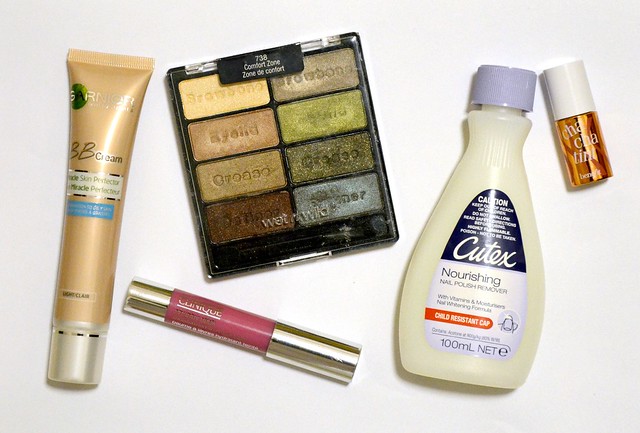
It seems like my makeup during the weekdays hasn't deviated from my normal routine for the longest time. It's only on the weekends that I'm inspired to try out something new or use a product that I haven't picked up in a while. This month, I've been favouring a more minimal (or bare-faced) approach on my "off" days. If I can't be bothered with makeup at all, I've enjoyed the sheer coverage and oil control of my first non-Asian BB cream, a natural pink lip and a multipurpose coral tint that I've finally figured out how to use.


Cutex Nourishing Nail Polish Remover
I couldn't get back to this nail polish remover fast enough after using (and hating) the ineffective and offensive-smelling Sally Hansen Acetone-Free Fast & Gentle Polish Remover. My favourite thing about this Cutex one, apart from the fact it just works a whole lot better at removing nail polish, is that it doesn't smell like nail polish remover. Most nail polish removers I've tried have an overwhelming, sharp chemical stench that makes taking off your polish a generally unpleasant experience. Not this one. Any chemical scent is mild and it smells more like cocoa butter. It's truly unique in that respect, and I'll happily repurchase when I run out.


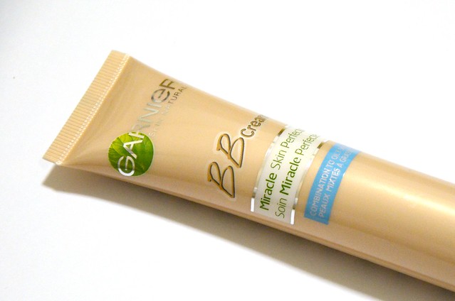
Garnier BB Cream Miracle Skin Perfector Combination to Oily Skin in Light
I've been meaning to try this after reading Dawn's glowing review and seeing Lisa Eldridge use it in her Kylie Minogue video. This has become my go-to for when I don't feel like wearing foundation, but still want to even out my skin tone with light, natural coverage. It goes on smoothly with fingers on a freshly moisturised face. I'm impressed with the oil control — on really hot summer days, this only gets slightly dewier with time, but in a soft, luminous way that actually makes it better. My only caution is that it overflows when you first open it, so it's best to keep it upright and avoid squeezing the tube.


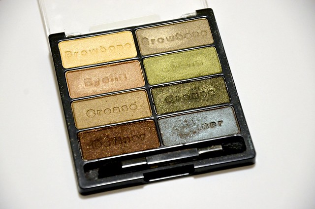
Wet n Wild Color Icon Eyeshadow Collection in Comfort Zone
I've been neglecting my Urban Decay Naked palettes and instead, paying much more attention to Comfort Zone. For the longest time, I was desperate to acquire this palette (along with the Color Icon Eyeshadow Trio in Silent Treatment), but once it was finally mine, my enthusiasm waned. It's taken me a while to come around, but my appreciation for it grows the more I use it. My favourites are the left crease colour all over the lid and the two bottom shades applied along the upper lash line and slightly blended out. The duochrome of the right "Definer" shade is a thing of beauty. Small warning: the bottom left shade has A LOT of fall out. It's also much closer to a straightforward black than the rich, shimmery bronze that it looks like in the pan, which is the only minor disappointment of this palette for me.


Clinique Chubby Stick in Woppin' Watermelon
Despite having a ridiculous number of lipsticks, I barely wear them the vast majority of the time. During the day, if I'm not wearing nothing on my lips, I usually prefer a safe and sheer option. A little something to add some colour and moisture, but nothing that screams lipstick or is too noticeable. That's when Woppin' Watermelon is the perfect choice. It's a neutral, rosy pink that still has a bit of juiciness. It's softly glossy, fairly hydrating and buildable in colour. And I just love the look of it. The packaging is A+ in my book.


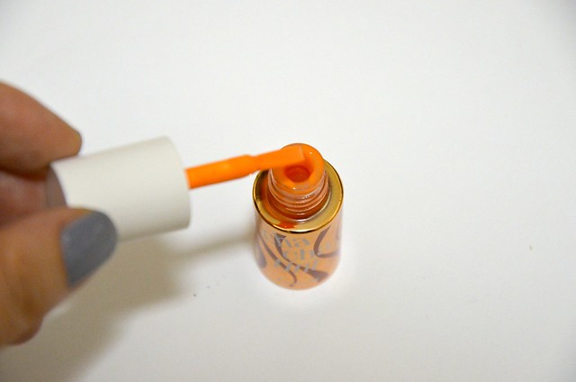
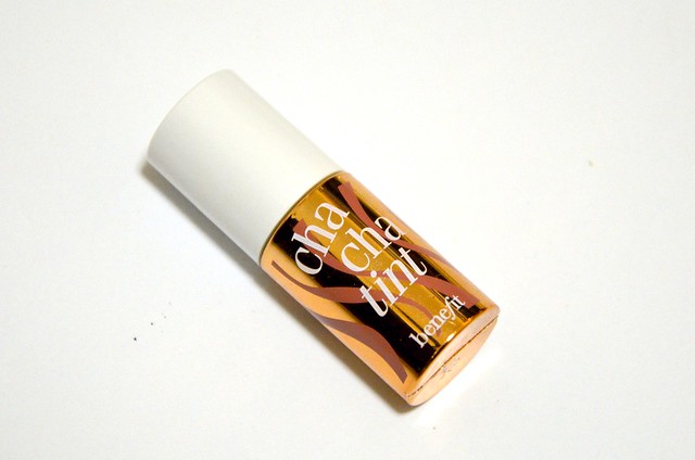
Benefit Cha Cha Tint
I've always liked Cha Cha Tint, but never used it much. That changed when I found an easier way to apply it. Dabbing a bit of the tint on your hand, then dipping your finger into the product to blend onto the cheek, gives you much more control than applying the product directly to your finger, and then to your cheek. (Whatever you do, don't apply this directly to your cheek, unless you want a red dot on your face all day.) The only downside to applying it to your hand first is that it does leave a stain. I can live with that. Though I have a million coral/peachy blushes, what I love about Cha Cha Tint is that it's neither shimmery nor matte. It never looks powdery or shiny on the cheeks. It just melds into the skin completely and invisibly. Sparingly and carefully applied, it gives the face a fresh, youthful, pinky-peachy-coral pep.
Related Posts Plugin for WordPress, Blogger...