Showing posts with label face of australia. Show all posts

Sunday, May 29, 2016

Actually 'Wearable' Lip Colours

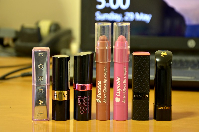
I have a gazillion lipsticks yet rarely wear any of them. It's probably a combination of not liking the feeling of something on my lips, not liking having something on my lips when I need to eat/drink, and not feeling the occasion warrants wearing lipstick. The other night, I went through most of my lipstick collection, trying on each lipstick with a bare face, and I set aside those I deemed acceptable to put into a daily rotation. I suppose you could describe them as the more "wearable", everyday colours that were more flattering than unflattering. Not too opaque, relatively comfortable on the lips, fuss-free and easy to throw on. What emerged were fairly similar colours and textures — warm pinks and rosy nudes in sheerer, glossier formulas.

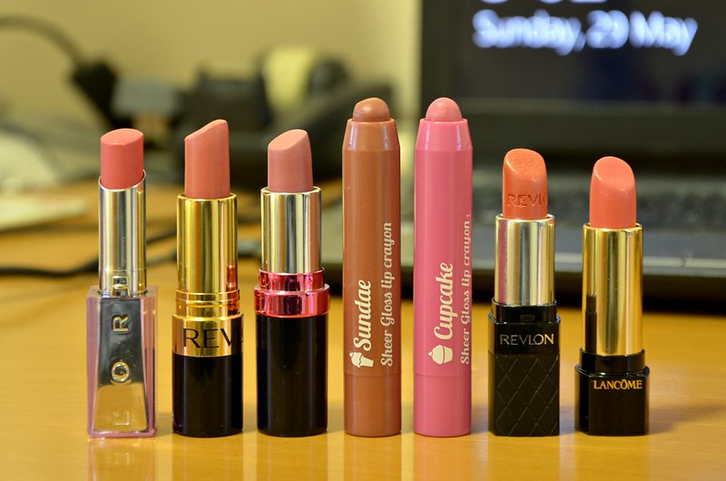
l-r: L'Oréal Shiny Grapefruit, Revlon Pink in the Afternoon, Australis Jive, Face of Australia Sundae, Face of Australia Cupcake, Revlon Rose Nectar, Lancome Blush Classique


What I pulled out of my collection:


The most amusing thing to emerge from all this is I've swatched and mentioned each of these before in separate posts (links are above). I guess lipstick is a favourite topic to feature, photograph and write about, just not actually wear.

Bottom to top: L'Oréal Shiny Grapefruit, Revlon Pink in the Afternoon, Australis Jive, Face of Australia Sundae, Face of Australia Cupcake, Revlon Rose Nectar, Lancome Blush Classique

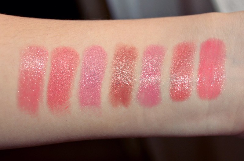
l-r: L'Oréal Shiny Grapefruit, Revlon Pink in the Afternoon, Australis Jive, Face of Australia Sundae, Face of Australia Cupcake, Revlon Rose Nectar, Lancome Blush Classique

L'Oréal Shiny Grapefruit is a warm rosy pink with subtle silver shimmer. Revlon Pink in the Afternoon is a semi-matte medium warm pink, similar to the L'Oréal but a touch darker. Australis Jive is a dusty, retroish, slightly cool-toned medium pink. Face of Australia Sundae is a "my lips but better" sheer rosy nude. Face of Australia Cupcake is similar to Jive, but sheerer and glossier, slightly darker and more cool-toned. Revlon Rose Nectar is a coral pink with prominent gold shimmer. It has a jelly texture — lightweight, translucent and glossy. Lancome Blush Classique is even glossier than Rose Nectar, almost wet look. It's a brighter strawberry pink.

Will I actually wear these now I've picked them out individually? Well, that's the goal. Though the couple of lip products I've kept in my makeup bag that I bring to work have barely seen the light of day. I don't know about you, but these days, work is one of the last places I feel like wearing lipstick to. Unlike the rest of my makeup (foundation, eyes, cheek colour), lipstick to me is purely for the fun of it. It's that extra, finishing step that makes your entire look just that bit fancier and more polished, or becomes the focal point of your whole makeup (as in the case of a bright, dark, or unusual statement lip). These 7 shades I've picked out are more to enhance one's natural lip colour and to add a non-threatening, natural, plumping tint. Beginner's shades for those that prefer their lip colours to be conservative and unassuming. If I need something easygoing and foolproof on the lips that will complement whatever other makeup I have going on, I know what to reach for.

Wednesday, May 6, 2015

Party Popper Nails

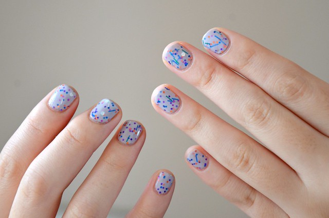
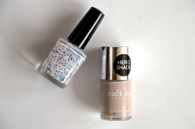
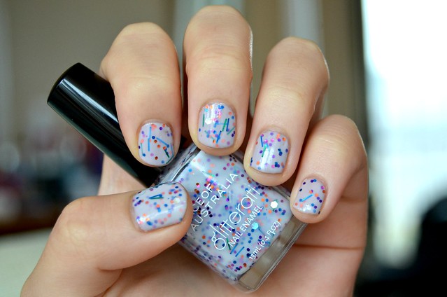
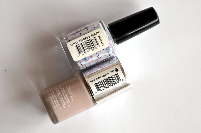
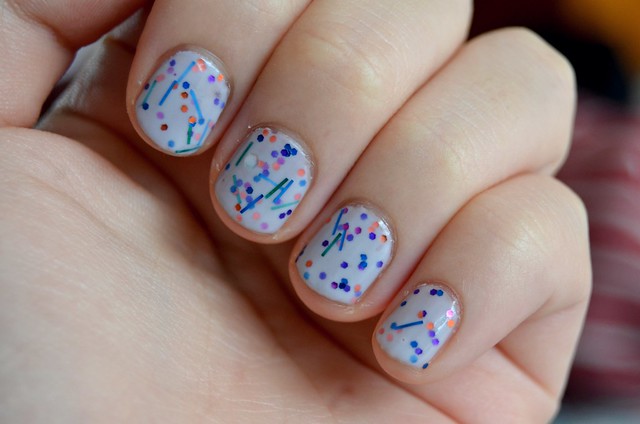
Remember when I was obsessed with tracking down the limited edition Face of Australia Glitterati nail polishes a couple of years ago? Probably not. But the fixation was real. With the help of friends, I managed to find and buy all 8 polishes in the collection. After the pursuit was over though, I immediately lost interest (gotta love human nature). Recently, I was drawn again to Boogie Wonderland as I remembered it'd been a long time since I last wore it. It's a milky, multicoloured confection packed with "small orange, blue, purple and magenta hex glitter with blue and green curls, iridescent bars and huge holographic hexagonal pieces in a whitish blue base". And yes, I had to quote myself just then, since I evidently was much more observant and descriptive with nail polish back in 2013. I don't think I could have come up with that now if you asked me.


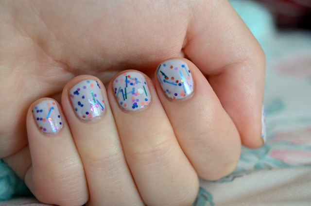
I decided to paint a base of Nails Inc. Porchester Square since Boogie Wonderland is a pale blueish-white on its own. That means it's perfect for transforming any base colour to a lighter, more pastel version of itself. In the pictures, my nails look more blue, but in real life it's more of a pale, ever so slightly purplish mushroom/taupe/grey shade.

What I love about Boogie Wonderland, apart from the fact it looks like someone unleashed a party popper on your nails, is that it's a brilliant layering polish. There's a translucency to it which means it won't completely overpower any colour you paint underneath, but the formula remains very smooth, not too thick or thin, and a breeze to apply evenly. I needed only 2 coats to achieve the glitter density pictured, which I thought was pretty impressive given how much is going on. I was able to get a good mix of everything without having to try too hard to achieve a balanced spread.

As always, I painted a coat of my beloved Sally Hansen Insta-Dri Top Coat to seal everything in and speed up the drying process. In the past few days, I've received multiple compliments and people asking me if my nails are shellac. I tend to get bored of nail polish easily (it's not uncommon for me to get rid of a nail polish only a day after painstakingly applying it the previous night), but this combination has been going strong for a week now with no signs of imminent disinterest.

Thursday, December 5, 2013

Jangle All the Way

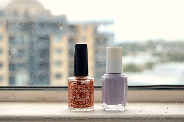
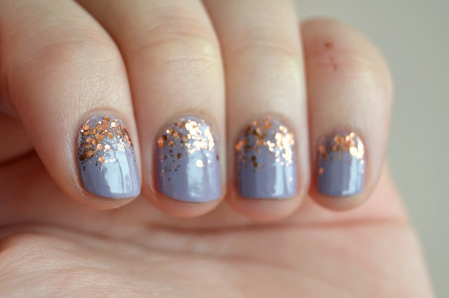
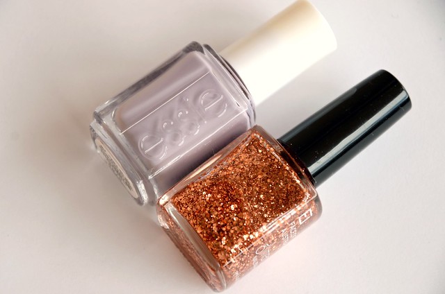
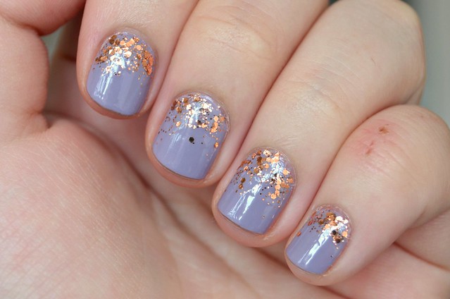
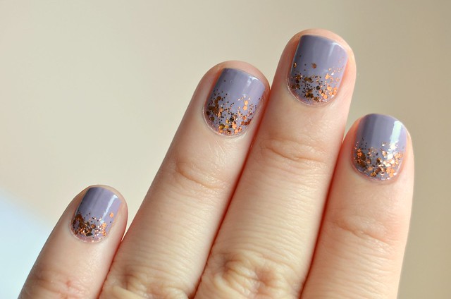
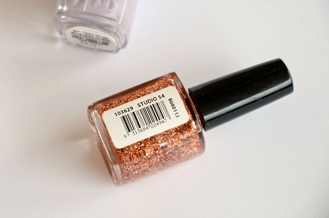
Purplish-greys are one of my favourite nail polish colours to wear (see Sportsgirl Storm, Sportsgirl Smoke), so Essie Bangle Jangle (770) from the Winter 2011 Collection seemed an ideal addition to my collection. I was tossing up between Bangle Jangle and Cocktail Bling, which appeared in swatches to be slightly darker and less purple, but thought Cocktail Bling might be too grey-leaning and desaturated for my liking (didn't want another Sally Hansen Wet Cement). When I first tried on Bangle Jangle, it seemed very similar to Rimmel I Love Lasting Finish polish in Lively Lilac (170), so having both was a bit of a letdown. I thought I'd jazz things up by attempting a glitter gradient with a complementary colour, the coppery Face of Australia Studio 54 from their Glitterati Collection (a 100% dupe for Sportsgirl Rose Gold — seriously, it's the same polish).


I really liked the combination of Essie Bangle Jangle and Face of Australia Studio 54. Somehow, the flourish of glitter manages to rescue an otherwise ordinary creme. Studio 54 would've been blinding and excessive on its own, but paired with a hazy, dusty purplish grey, it adds just the right amount of pizzazz. The glitter "gradient" was surprisingly easy to do, with one layer of Studio 54 painted to around the middle of the nail, and a second layer more concentrated around the base of the nail only. I attempted this kind of mani once before and was pleased with the results, so I enjoyed revisiting it again. From experience, a glitter like Face of Australia Studio 54 (with a mix of small hexagonal glitter and ordinary glitter dots in a clear base) works better for a gradient effect than a more dense glitter made up of larger glitter pieces of the same size.

Sunday, November 3, 2013

October Favourites

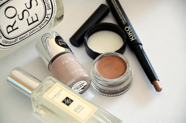
October saw a resurgence in my interest in fragrance, both perfume and scented candles. Well, the scented candles were a new thing altogether, but I was obsessed. I'm pretty sure I smelled every single candle at David Jones one Sunday while entertaining the idea of buying one, but ultimately walked home empty-handed (Glasshouse Oahu and Night Before Christmas were awfully tempting though). I also picked out the best of the skin care and nail polish I hauled in Europe, and a couple of cream eyeshadows on heavy rotation.


diptyque Roses candle
I thoroughly enjoyed burning this candle this month. It's become something of a bedside lamp substitute. The scent isn't that overpowering but it does fill the room for a few hours after it's blown out. I don't think the roses fragrance is anything amazing, it's a little bit generic in a pleasant but inoffensive way. It's not all that sweet, boozy or reminiscent of potpourri, it's gentler, cleaner and a bit more modern. I look forward to burning and finishing it only because I can't wait to be a sheep and use the empty jar as a brush holder.

Liz Earle Cleanse & Polish Hot Cloth Cleanser
I'd wanted to try this cleanser for the longest time and finally managed to get hold of one from John Lewis when I was in London. This has cocoa butter, rosemary, chamomile and hops extract, panthenol, and eucalyptus oil. My skin was in a gross state around in the middle of my European holiday and using this, along with Clarins moisturisers and NUXE Huile Prodigieuse was a godsend. I'd take a good 15 minutes to do the whole routine with the included muslin cloth, but back home I ditch the cloth and use one pump all over my face before washing it all off in the shower. I much prefer this to Emma Hardie Amazing Face Moringa Cleansing Balm. For one, you can use it around the eyes to remove mascara and eyeliner and it won't feel like oil is clouding your vision. The texture is closer to a moisturising, thick cream cleanser that just dissolves into the skin, rather than an oily balm that can't be completely washed off. I love the refreshing cool from the eucalyptus, the minty, soothing herbal scent, and how it leaves the skin feeling clean, soft and supple.

Caudalie Grape Water
I was surprised at how much I liked this, since I'm loyal to my Avene Thermal Spring Water (though my 300ml bottle inexplicably decided to stop spraying with about a third left). This is the first aerosol face mist I've encountered that isn't just water (Avene, La Roche-Posay Serozinc). This Caudalie one consists of grape water and grape juice, so it smells very sweet (a little bit like overripe fruit) and leaves a slight residue on the skin. It's more moisturising than plain water in a can, especially when it dries on the skin. I find it an effective, inexpensive hydrating toner that you can spray over the face before or after your moisturiser. I would definitely be stocking up if it were available here, but unfortunately it's not and I can't buy it online either because of shipping restrictions with the aerosol can. Guess I'll just have to savour it while it lasts.


Nails Inc. Porchester Square
I have Anna from ViviannaDoesMakeup to thank for this one. I immediately jotted down Porchester Square on my London shopping list after seeing it featured in her August Favourites. I absolutely love the colour, especially as my focus has increasingly shifted to office-friendly cremes. I'll always be partial to my glitters, brights, pastels and blues/greens/purples, but sometimes you just need an excellent safe bet with a more conservative environment in mind. Even if I didn't have to worry about whether my nail polish is adhering to a corporate dress code, I'd still enjoy wearing Porchester Square. It's a pitch perfect, elegant and feminine light mushroom with slight purple tones. I love that it's one of those chameleonic shades that leans more sandy beige or cloudy grey or hazy lilac depending on the light. The formulation is also stunning — ultra smooth, buttery, a true one coater with impressive wear time.

Jo Malone Orange Blossom Cologne
Already raved about here, so I'll keep it short. I think this is my favourite of my recent perfume acquisitions. I'm kind of wondering whether I should have heeded to the sales assistant's advice and purchased the bigger bottle. A friend complimented me on this fragrance while we were having dinner out, which only provided more positive reinforcement. What can I say ... it's a crowd-pleaser.

KIKO Long Lasting Stick Eyeshadow in 06
Another product I've already written about before, this truly has set in motion a second wave of enthusiasm for cream eyeshadows (ideally in pencil form). What I love most about the KIKO is that not only is it an effortless all-over lid colour, but I've found that it works just as well on the lower lashline. If anything, I've been preferring to use it that way. It stays on longer than regular pencil eyeliners, it's richly metallic but still daytime-friendly and not too dark, and it's just so quick and easy to swipe on while in a rush.

l-r: Face of Australia Budge Proof Eyeshadow in Bronze Sphinx, KIKO Long Lasting Stick Eyeshadow in 06

l-r: Becca Gilt, Essence Pas des Copper, Maybelline Bad to the Bronze, Face of Australia Bronze Sphinx, Benefit Busy Signal

Face of Australia Budge Proof Eyeshadow in Bronze Sphinx
Undoubtedly one of my favourite recent discoveries, Bronze Sphinx is one of those unanticipated, lucky finds. I was casually browsing Big W and came across the Face of Australia stand, where they had a blanket $3 off the entire range. I'd heard about the new Budge Proof Eyeshadows (evidently inspired by Maybelline Color Tattoos) from local bloggers, but I hadn't seen them in person at Priceline or anywhere else. I was interested in Tip Top Taupe as well (which reminded me so much of a toned down Chanel Illusion D'Ombre in Illusoire), but ultimately settled for just Bronze Sphinx, as I rationalised I'd get infinitely more wear out of it. Tip Top Taupe looked a bit too cool and grey, which I've found isn't the best with my skin tone. Bronze Sphinx, on the other hand, is just what I'm after in a cream eyeshadow.

Compared to similar shades, Becca Eye Tint in Gilt is closer to a warmer version of Benefit Creaseless Cream Eyeshadow/Liner in Busy Signal, with more gold shimmer but a difficult texture to work with (slides around, very patchy, a struggle to get even coverage). Essence Eye Soufflé in Pas des Copper (tragically limited edition) is lighter than Bronze Sphinx, with a touch more of a silvery overlay. Maybelline Color Tattoo in Bad to the Bronze is cooler, more of an intensely metallic, medium frosty brown. Benefit Busy Signal is the darkest, a rich chocolate brown with fine gold shimmer. It's very pigmented and the tiniest amount goes a long way. Face of Australia Bronze Sphinx has more of a copper (red/orange) tone, and isn't as silvery as Pas des Copper or Bad to the Bronze, or with as much gold shimmer as Gilt or Busy Signal. Equally easy to apply with fingers or a brush, it's smooth, emollient, and not gritty or patchy in any way. Building up pigmentation in thin layers is a breeze. A bargain at $8.95, this is well on its way to being a much-loved staple.

Saturday, August 10, 2013

So Many Regrets, So Little Time

It's been nearly a year since my take on a Products I Regret Buying post, so I thought another instalment was well overdue. More blatantly negative than the the mixed sentiments towards the Products I'm on the Fence About, I wouldn't mind giving away or binning any of the selected items this instant. They're disappointing in performance, disgusting to use, easily disposable, downright ugly and smell bad. I'm at a stage where I have to be exceedingly selective when it comes any makeup purchases, because whatever I'm eyeing, I probably already have four things exactly like it at home. That's what makes makeup regrets more acute — in a world of excess, these unloved additions serve as unpleasant reminders of how overindulgence can backfire.


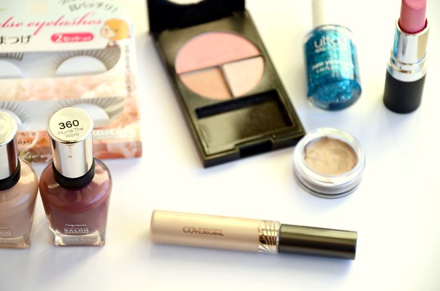
CoverGirl Intense ShadowBlast in Beige Blaze
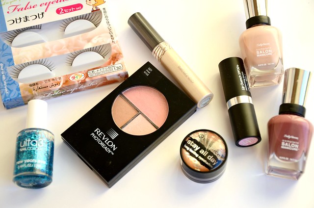
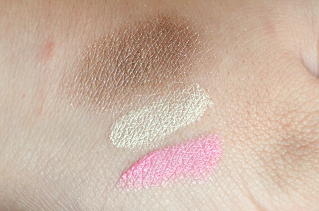
I bought this on the recommendation of Zoë Foster, and I don't get it. I knew things were wrong from the moment I opened it up and it smelled funky. This isn't a resoundingly bad product, I just wish I hadn't bought it. I had such high hopes seeing that Zoë herself totes it around in her makeup bag, and after a review I read that compared it favourably with Urban Decay Primer Potion in Sin and Eden. But it just doesn't do anything for me. As an eye primer, I have better alternatives (NARS Smudge Proof Eyeshadow Base), as a cream eyeshadow it barely shows up on my lids, as a base for gold/yellow powder eyeshadows, I can use Maybelline Color Tattoo in Bold Gold or just an ordinary primer. Waste of money and space.


Face of Australia Lip Quench SPF30+ in Pink Champagne
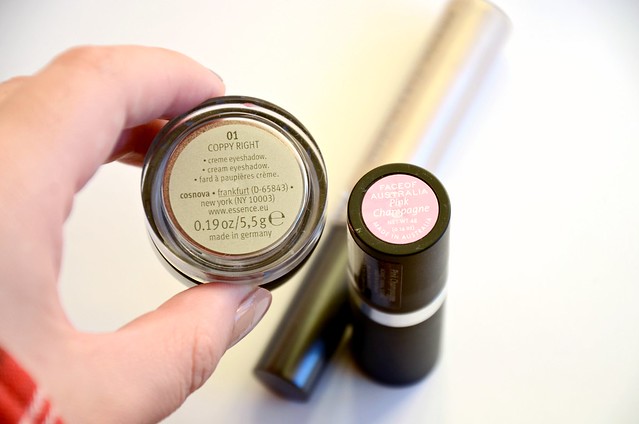
This light, blue-based pink looks horrid on me. Every time I get it wrong with a pink lipstick, I can't help but berate myself. I've had enough experience by now to realise what colours I should stay away from, but sometimes logic simply doesn't enter the equation. What distinguishes this particular lipstick from my other pink lipstick failures is the unappealing smell and texture. Like all of the Face of Australia Lip Quench lipsticks (blame it on the SPF or something), it stinks. I can't put my finger on the scent, but it's like melted plastic covered by a strong, synthetic, floral perfume. It's so soft and creamy that not only has it broken off at the base, but you can't apply it straight from the bullet, otherwise the product just sits on top of your lips and looks patchy and uneven. You have to really rub it in with your finger, at which point it loses all vibrancy as a pink and just melds with the natural tone of my lips, making it look even duller and more purple.

Essence Stay All Day Long Lasting Eyeshadow in Coppy Right
I gave Glammy Goes To... to a friend because I simply didn't get on with the colour, but I hoped that Coppy Right would fare better. It doesn't. This is so dry, patchy, lumpy, hard to blend and frosty to the point of looking scaly on my lids. The shade, while an improvement on Glammy Goes To..., is still too cool-toned for me and more or less overtaken by the silvery/white shimmer. There's no reason to have this sitting around when there exists the infinitely superior Maybelline Color Tattoo in Bad to the Bronze.


Top to bottom: Essence Coppy Right, CoverGirl Beige Blaze, Face of Australia Pink Champagne


Revlon PhotoReady Sculpting Blush Palette in Pink Rose
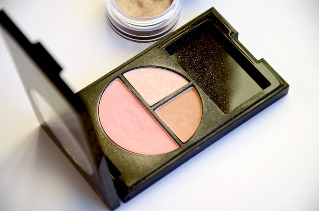
Remember when Sunday Life Magazine pictured Revlon PhotoReady Sculpting Blush Palette among "three of the best blushing beauties", then lost all credibility? I'll let the swatches speak for themselves (each was 3 swipes, by the way). The only passable part of this palette is the highlighter, which is still average at best. Everything is packed with shimmer, with the faintest pigmentation and zero lasting power. It's honestly hard to believe an otherwise solid, occasionally brilliant brand like Revlon released such an emphatic dud.


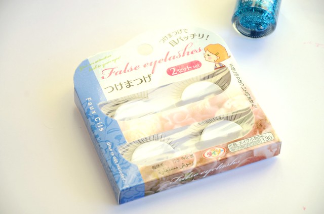
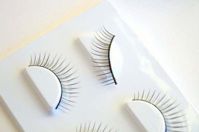
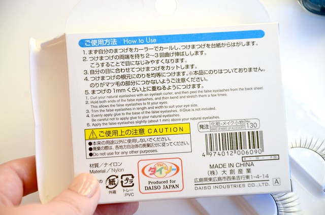
Daiso False Eyelashes No. 130
When Daiso first rolled into town and I saw rows upon rows of fake eyelashes for a mere $2.80 per pack, I admit I went a little overboard and bought about five pairs. My enthusiasm came to a screeching halt when I actually tried these on. These lashes are perfect ... for that costume drag queen look. They're extremely unnatural and cartoonish, hard to manoeuver, and uncomfortably stiff and spiky. Each of the fake lashes are quite spaced out on the band and flare out in a manner that no human lashes would ever. Cheap and nasty.


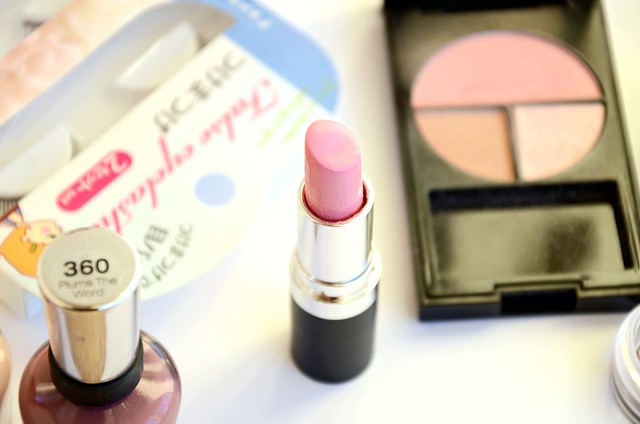
Sally Hansen Complete Salon Manicure in Plums the Word & Café Au Lait
I was such a fan of the Complete Salon Manicure polishes I'd bought (Jaded and Commander in Chic), that when Priceline had a buy one, get one free on this range, I immediately set out and bought two more. Sadly, I can't get on board with either of the new shades I purchased. I was trying to eliminate one of them for the sake of not repeating myself, but they're equally grotesque. Café Au Lait is one of the most unflattering neutrals I've ever come across. It's like an opaque skin colour that adds nothing to my nails. I might as well skip polish altogether. It's not dark enough to be called a beige, or light enough to be a sheer or pale nude. It's not so much that it's dull (I could do with a few more conservative, work-appropriate shades), it's just that it's plain ugly. Plums the Word looked like it could be a promising, moody, autumnal pick, but it's the most bizarre, yucky mix of red, brown and purple. It's just so unattractive, it pains me. Both colour choices were complete fails, which is an utter shame because I love the smooth, high shine formula.
Ulta3 New Years Eve
I put New Years Eve, but it's really every single polish from the 2012 glitter collection because they all share the same MASSIVE problem. This polish is simply offensive to me. I can feel it destroying my nasal passages, nails and lungs as I use it. It smells noxious. Like a combination of fresh paint and the stinkiest nail polish remover out there, but sharper, more pungent, more poisonous. The formula is terrible as well — thick, gloopy, impossible to dry. As pretty as these glitters are, the smell and formula make them unfit for sale.

l-r: Café Au Lait, Plums the Word

Saturday, June 15, 2013

Shop My Stash #2

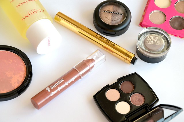
My first Shop My Stash post was a few months ago and in all honesty, I haven't really been making much progress in that endeavour. Partly because of my unending acquisition of new products, partly because I tend to stick with the same few things over and over again. In the morning rush to get ready, I grab reliable products that I know will do their best to transform my barely-awake face into a slightly more presentable form. It's not often a time to start experimenting with new eyeshadow combinations or to start mixing my own bases. But that doesn't mean I shouldn't attempt to switch up my current product rotation with several items that could easily substitute for what I'm already using. I had a dig around my makeup stash and picked out a few things that I hope to pay more attention to and make a concerted effort to use.


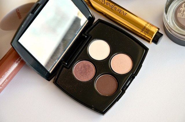
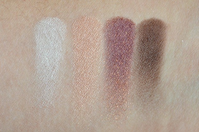
l-r: Daylight (matte), Gaze (shimmer), Color Du Jour (metallic), Lezard (matte)

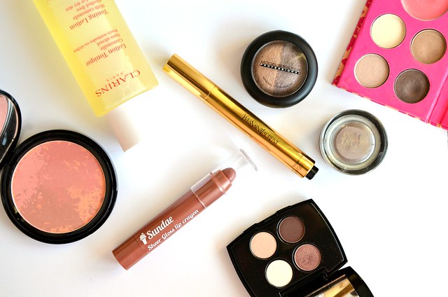
This Lancome Color Design Sensational Effects Eyeshadow quad was been overlooked and neglected for a very long time. I bought it from Chemist Warehouse a while ago as it was super cheap for a high end product and the colours seemed appealing enough. The shadows are good quality, very nicely textured and decently pigmented. Color Du Jour reminds me of Laura Mercier African Violet, but warmer and more red (it's said to be similar to MAC Trax). The tiny size and inbuilt mirror makes it ideal for travelling with, especially as there's a good mix of finishes and light/dark shades.


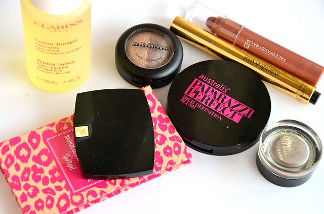
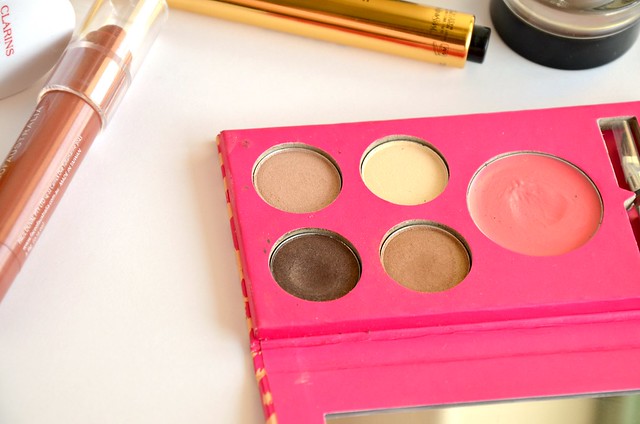
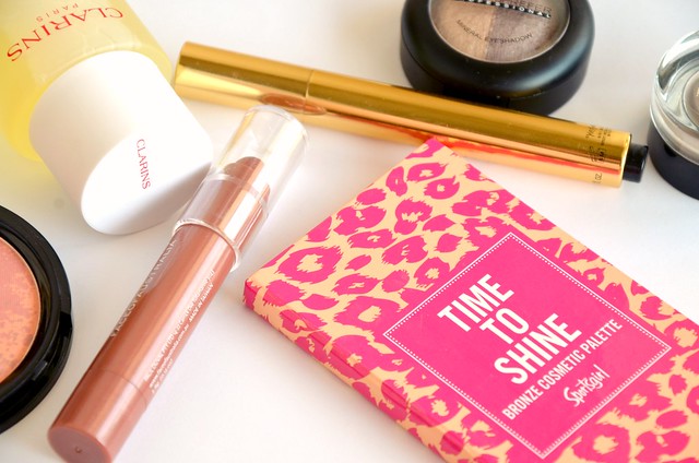
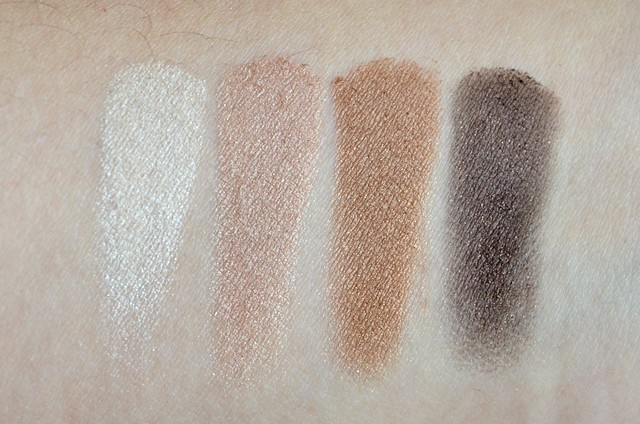
Sportsgirl Time to Shine Bronze Cosmetic Palette is an old favourite. I never touch the lip gloss included in it, but the eyeshadows really surprised me in terms of quality. Sportsgirl is a bit hit and miss with their cosmetics and they're not exactly renowned for putting out incredible eyeshadows, but the ones in the Bronze Palette are without a doubt the best I've tried from the brand (miles superior than the Work of Heart eyeshadow palette). I've previously used the last two shades so much that there's a considerable dent in both pans. I remember being really happy with the performance and look of these eyeshadows, so I'm looking forward to getting some wear out of them soon. It's times like these I wish I knew how to depot eyeshadows so I could throw away the rest of the palette that just unnecessarily takes up space.


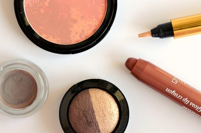
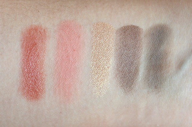
l-r: Face of Australia Sundae, Australis Screen Siren, Models Prefer Brown & Dirty, Maybelline Tough as Taupe

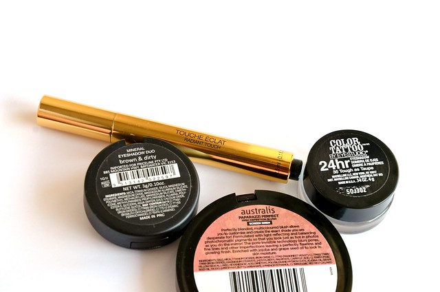
I wish I could find a way to make Maybelline Color Tattoo in Tough as Taupe work, because something tells me that it does have its purpose and value, I just haven't been able to tap into it yet. I mean, it's a matte, neutral cream eyeshadow — that in itself is exciting. As a base, it does increase the vibrancy and longevity of powder eyeshadows it's paired with. It also has the potential to effect subtle changes to the finish or colour. As Lau and Carolyn suggested in my post on L'Oréal Infallible eyeshadow in Tender Caramel, using a matte base like Tough as Taupe could be just the solution to tone down a super shimmery shade.

The Models Prefer Mineral Eyeshadow Duo in Brown & Dirty was something I purchased while trying to convince myself I didn't need Urban Decay Naked2 (needless to say, that plan backfired). The shadows aren't the most vibrant, richly pigmented or long-lasting, but the neutral colours and soft, satin finish are perfectly acceptable for a more low-key, daytime look. The peachy champagne gold and cool, slightly purplish, bark-brown taupe work well together.

In the blush department, I pulled out Australis Paparazzi Perfect High Definition Blush in Screen Siren. I honestly feel this blush is comparable in quality to MAC (though admittedly I don't have any MAC blushes — this is just from my experience swatching them in the store). It is super pigmented, finely milled, soft and blendable. This is a warm matte peach with some red tones, which makes it a bit tricky for me to apply without looking overdone or ruddy. I guess I'll just have to find the right brush and adopt a very light hand.

For lips, there's Face of Australia Sheer Gloss lip crayon in Sundae. This MLBB shade is extremely reminiscent of YSL Rouge Volupté Shine in 9 (Nude in Private). Back when Tiffany was tempting me with the YSL, I may even have placed a bit of Sundae on my hand and then headed to the shops to swatch Nude in Private next to it to compare. Seeing how similar they were side-by-side effectively put an end to that lemming, though I now have a new one for 19 (Fuchsia in Rage) thanks to Lisa Eldridge.

Speaking of YSL, my Touche Éclat barely ever gets used. It does make a powerful difference in terms of highlighting darker/discoloured areas of my face (including under the eyes), but not so much as a concealer for blemishes. I just never remember to use it because I'm reluctant and too time-poor to add another step to my base makeup after I've put on foundation. It's quite fiddly in that I have to be careful with the amount and placement, and sometimes I need to mix it with a tiny bit of moisturiser so it applies better to the skin. But maybe if I can be bothered to wake up a few minutes earlier one day, I'll give this pen a whirl.


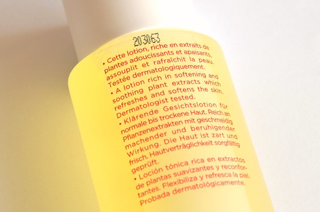
Finally, we have the Clarins Toning Lotion with Camomile for normal or dry skin. This alcohol-free toner was in the unbelievably good value Renewing set that I mentioned I bought on Boxing Day in my January Favourites. I've seen similar value packs pop up at Myer and David Jones recently, though unfortunately none of them included a 30ml tube of the Multi-Active Night Youth Recovery Comfort Cream for Normal to Dry Skin that I'm now hooked on (only one had a 15ml tube which I thought was too small to warrant a purchase). I figured since I never use toner, I might as well try to regularly use this product and finish it up. I like that it's non-drying and doesn't leave my skin feeling tight or stripped of moisture, though I'd need to use it more consistently for a longer period of time to comment on any skin care benefits it has, if any.

Related Posts Plugin for WordPress, Blogger...