Wednesday, March 26, 2014

It's Not Me, It's You

Time for another roundup of products that left me distinctly unimpressed. I feel these kinds of posts are some of the easiest to both read and write, because the sentiments expressed are so genuine and immediate. We all have certain hopes and expectations after handing over hard-earned money for products that are hyped or look promising. An initially rosy outlook can swiftly turn into disappointment and a sense of waste once reality enters the equation.


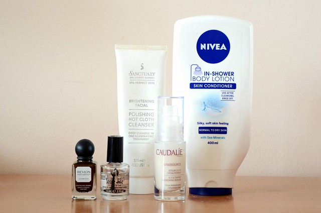
Revlon Parfumerie Scented Nail Enamel in Autumn Spice
When these range of nail polishes launched in Australia (for an eye-watering $15.95 each), I was dead set on getting Autumn Spice because of how incredible it looked on Scrangie's nails. Her swatches sold me 100%. The shade looked so rich, complex and unique, a smoky russet with fiery, coppery shimmer that gleamed in the light. I don't know if Scrangie just has a gift of photographing nail polishes in the most flattering way possible, but Autumn Spice was so underwhelming on me. I disliked the thin, runny formula immensely, the brown metallic colour looked extremely dated and unattractive, the shimmer was flat and almost grainy, the polish refused to dry, and the gimmicky scent was overwhelmingly cloying and artificial. Unpleasantness all around.

Seche Vite Dry Fast Top Coat
I've previously ranted a bit about Seche Vite, but I feel it deserves another mention here. Since I discovered more about "3 Free" polishes, I was surprised to read that the second ingredient in Seche Vite is toluene. Because of that, the bottle has a disclaimer that reads, "WARNING! This product contains a chemical known to the State of California to cause birth defects or other reproductive harm." Hmmm. Not very confidence-inspiring. Even if the risk is low, which it probably is, I just don't like this top coat. It smells offensive, it slightly discolours certain polishes depending on the shade (it gave a dirty yellow tint to my OPI I Don't Give A Rotterdam!), but most problematically, it shrinks around the nail edges. I always have to consciously paint over the edge of my nail, onto the surrounding skin, so that the top coat will cover the whole nail when it dries. I don't have to deal with any of these issues with Sally Hansen Insta-Dri, in my opinion a far superior fast-drying top coat.

Sanctuary Spa Brightening Facial Polishing Hot Cloth Cleanser
I bought this to qualify for the Priceline skin care goodie bag last June, hoping it'd be similar to the Liz Earle Cleanse & Polish Hot Cloth Cleanser which isn't available in Australia. Now that I've tried the Liz Earle, I can confidently say this Sanctuary Spa version is nothing like it. And not in a good way. Every time I've used this, it's mainly left my skin feeling more dry and slightly irritated. It has an almost lemony, herby, tea scent which isn't awful, but isn't my favourite either. It does have a thick, creamy texture which works into the skin nicely, but it's hard to wash off completely and leaves a balmy residue that doesn't feel hydrating.

Caudalie Vinosource S.O.S. Thirst Quenching Serum
This one is definitely the most heartbreaking of this current crop of product disappointments. An Essie Button favourite with a 4.5/5 rating on MakeupAlley to boot, I was more or less expecting that I would fall in love with this serum. I don't know if the problem is my skin type (probably not dehydrated, as it seems to be recommended for) or something else with my skin's chemistry, but it just does ... nothing. At best, nothing, at worst, it breaks me out. It has a very light, almost watery consistency that's easily spread and sinks into the skin quickly. I try to layer this underneath my moisturiser, both day and night, and I see and feel no noticeable difference than if I'd skipped it altogether. I love the refreshing scent and the packaging, and generally hold Caudalie products in high regard, so this was an extreme bummer.

Nivea In-Shower Body Lotion Skin Conditioner Normal to Dry Skin
I'd read about the dry skin version on milkteef and I Covet Thee in June last year, which was enough exposure to make me at least curious to try this newfangled product for myself. I'm guessing there isn't a huge difference between the normal to dry skin, and the dry skin versions, so I was puzzled at the good reviews. When I put this on, it feels like I'm putting Pantene hair conditioner on my skin. It's that same type of consistency. The first time I used it, I made the mistake of not washing the lotion off thoroughly enough. I dried myself off, and my legs were basically still covered in the lotion. My skin felt uncomfortably sticky and wet. The lotion just sat on top of my skin and didn't sink in properly whatsoever. The second time I used this, I actually applied it first, then used a BODY WASH in an attempt to avoid a repeat of the first experience. There was definitely less remnant lotion on my legs, but I strongly disliked the sensation of the product still physically lingering on my skin. Plainly put, it's not a good body moisturiser, at all. It's no better than sorbolene and it's very heavily perfumed. It's arguable whether there's any meaningful time saving using this in the shower compared with slapping on some body moisturiser post-shower, given you're still taking the time to apply this in the shower anyway, and not only that, you're taking extra time and effort to wash it off, lest you want unbearably greasy legs afterwards.

Saturday, March 22, 2014

My Essie Collection

About four months ago, I went through a major Essie phase and bought 8 of their polishes in a short period of time. Since then, I've been meaning to do a post about my Essie nail polish collection, but never managed to get around to it until now. I'm happy with the shades that I have and no longer feel the need to add to my collection, with the exception of limited edition flakie polish Shine of the Times. (Liz and ChloƩ know what I'm talking about.) It got so bad late last year that I seriously contemplated forking out $31 to have it shipped to me. Fortunately, I was talked out of it, but I'm still kicking myself for not buying it while I was on holiday in New York. I picked it up at least twice on separate occasions while at Rite Aid, only to put it down again. Why.


l-r: Leading Lady, Mint Candy Apple, First Timer, Bangle Jangle

Essie Leading Lady
I have an entire post dedicated to this stunner, so there isn't too much to add here. What I love most about Leading Lady is its glass fleck quality. It has this jelly-like translucence and shine, but is still entirely opaque. The red shimmer looks suspended in the polish, rather than just sitting on top of the nail or disappearing underneath.

Essie Mint Candy Apple
An Essie classic, Mint Candy Apple was always sold out at Woolworths or Priceline when Essie first launched in those stores. I had to resort to an online shop to purchase mine. In the end, I have to say this shade was a bit of a letdown for me. I was hoping for mint green perfection, but for whatever reason, this applies extremely blue on my nails. I already have way too many similar pale blues (Sally Hansen Complete Salon Manicure in Barracuda, Sportsgirl Nail It! in Iceberg) so I didn't need another one.

Essie First Timer
Ingrid of missglamorazzi kept talking about this polish and I'm glad she did, because it's turned out to be a surprising favourite. Greens are a bit unusual and mainly associated with Saint Patrick's Day or Christmas, but I find myself frequently drawn to them. First Timer is more medium-toned with a slight pastel edge, which makes it quite unique in my collection, as most greens I have are either very light and minty or much darker.

Essie Bangle Jangle
I bought this one blind, not having seen the bottle in person and basing my decision purely off swatches online, and it didn't turn out to be exactly what I was hoping. I've featured this previously with a copper/rose gold glitter which I thought paired well together, but the polish on its own is a little underwhelming. I'm not sure what it is precisely, but perhaps I was hoping for something paler and a touch more grey? More of an airy, delicate dove grey, than the medium dusty purple that it is.

l-r: Fiji, As Gold As It Gets, Chinchilly, Bikini So Teeny

Essie Fiji
Tanya Burr convinced me I needed Fiji in my life, but for the longest time I resisted buying it because I felt I could find similar alternatives for much cheaper. It was somewhat amusing in the end when I caved and bought this, because I compared it against all the "cheaper alternatives" I'd purchased that I thought would be nearly identical, and they were completely off. From swatches I'd seen of Fiji, I always assumed it was such a pale pink that it photographed nearly white. Turns out it really isn't that light. Revlon ColorStay Nail Enamel in Pale Cashmere and Sinful Colors Easy Going are much, much lighter.

Essie As Gold As It Gets
This definitely isn't as gold as it gets — see OPI GoldenEye for that. But it's a very pretty gold flakie topper regardless. The flakes are distinctly yellowish as opposed to a metallic gold and the density is good. I have on two coats in the picture. Because of the opacity of the flakes and the predominately yellow colour, it might not suit every single base colour that it's painted over. This one requires some experimentation to achieve the most flattering base and top coat combination, but it's nifty to have in your nail art arsenal.

Essie Chinchilly
Along with Mint Candy Apple, this is another one of those iconic Essie shades that you always hear about. For me, it's just too similar to Sally Hansen Commander in Chic to justify having both. An excellent "drugstore"/budget dupe for Chinchilly is Essence Colour & Go Quick Drying Nail Polish in Walk of Fame. Still, a very sophisticated, medium-to-dark mushroom shade that remains timeless.

Essie Bikini So Teeny
I first heard about this polish from Allison of amarixe in her Drugstore Makeup Haul all the way back in June 2012, so when I saw Bikini So Teeny at Priceline in November last year, I was mainly surprised that Australia had begun selling it more than a year after it launched in the States. This "sparkling, cornflower blue" (light, bright periwinkle with slight silver shimmer) is one of my favourite blue polishes because it's not a shade that I see very often. A must if you're partial to blue polishes.

l-r: Van D'Go, Funny Face, Absolutely Shore, A Cut Above

Essie Van D'Go
My very first Essie polish which I ordered from BeautyBay back when you could still order nail polish from there and have it shipped to Australia. This is a creamy pastel pinky-peach that looks quite Barbie-ish on my nails, but I love it anyway. The definition of a "spring colour".

Essie Funny Face
A medium fuchsia/hot pink that I was fortunate to win in Sue's giveaway. The formulation on this one is impeccable, it applied so smoothly and evenly, and was opaque in one coat. For whatever reason, I don't find myself naturally drawn to fuchsia shades in nail polish, though I can't seem to stay away from them in the lip department. I should really give more love to Funny Face because it's fun and girly (and I can totally go matchy-matchy with my lipstick).

Essie Absolutely Shore
My favourite Essie polish ... and one of my favourite polishes, period. Now this, not Mint Candy Apple, is mint green perfection, though it's more of a pale, airy, slightly dusty, seafoamy green. For a light colour, it applies completely opaque with not a bald patch to be seen in just two coats. Absolutely Shore paired with Revlon Whimsical is my ultimate go-to combination.

Essie A Cut Above
Major pink bling bling. This is incredibly dense for a glitter polish which means you can easily wear it on its own for ultra jazzed up nails. It only has one colour of glitter in varying sizes, so it's not the most complex of glitter concoctions, and there are similar polishes that are more affordable (Maybelline Color Show Sequins in Rose Bling comes to mind), but when this is on the nails, it demands your attention.

Wednesday, March 19, 2014

Amateur Approach

I've actually had the LORAC Pro Palette for many months, but apart from a brief mention in the Perfect Palette Tag, I've never been inspired to write about it in any detail. I bought mine from Tarazz, parcel forwarded from Sephora, for around $60. The relative difficulty of tracking down this palette naturally only increased its appeal. The fact you get a generous 16 shades, half matte, half shimmer, made it seem like a worthy investment for eyeshadow novices and experts alike. To be honest, I would say my primary motivation in buying the palette was for the Pewter shade, which I found myself transfixed by. Every swatch I came across of Pewter convinced me I needed the Pro Palette in my life. It's not an inaccurate assessment to say that I basically purchased the whole palette for that one shade.


l-r: White, Cream, Taupe, Lt. Pink, Mauve, Sable, Espresso, Black

l-r: Nude, Champagne, Gold, Lt. Bronze, Pewter, Garnet, Deep Purple, Slate


First off, I have to say I can't fault the pigmentation of these shadows. They generally all have excellent colour payoff. The mattes are some of the best I've encountered, particularly my favourites Taupe, Mauve and Sable, while the shimmery shades are incredibly vibrant, especially the ridiculous Gold and Garnet. The mattes aren't powdery or chalky, though there is a bit of fallout with the darker colours. The metallic shades are the kind that you barely need a brush to apply. You can easily use your fingers to blend out the colours given how smooth, soft and packed with pigment they are.

Despite the high quality of these shadows, my main issue with the palette is the colour selection. It's almost too broad, but at the same time, the vast majority of shades are about as unique as their names. I don't do anything particularly complex or involved with my eyeshadow looks, mostly preferring to stick with a maximum of two colours — one for the lid, one darker which I focus more on the outer corner or blend upwards from the upper lash line. I feel the Pro Palette is oriented more towards those who want to get the most out of their shadows and are comfortable with intricate highlighting, shading and blending.

I've barely touched a lot of these colours because I simply have no use for them or don't know how to use them, e.g. White, Lt. Pink, Deep Purple and Slate. At the same time, there's a lack of those highly sought-after medium, neutral, all-over lid shades (the only two I would classify as such in this palette are Taupe and Mauve). I find the shades are all either too light, too dark, or too colourful and metallic. Even Pewter, the one colour I was most excited about, ended up being nearly as dark as Burberry Midnight Brown, in other words, too heavy to apply as a wash over the lid for the daytime.

All in all, it's a high-performing palette if you know what you're doing with eyeshadow, and you're not afraid of colour with some of the metallic options. When it comes to shade selection, I definitely prefer something like the Urban Decay Naked Palettes or NARS And God Created the Woman. Having said that, there's one shade in the Pro Palette which I love the way I thought I'd love Pewter, and that's Mauve. It's a little cooler, more purplish/grey than Nooner from the Urban Decay Naked3 Palette, but without a doubt one of my most used and favoured matte shadows.

Saturday, March 15, 2014

'90s Nude for Now

Despite the sane part of me acknowledging the last thing I need is another lipstick, when the new shades of Rimmel Moisture Renew Lipstick launched recently, I couldn't resist picking up Notting Hill Nude (720). This was a lipstick I felt compelled to rush out and buy after reading about it months ago on UK blogs. At the time, the revamped line wasn't yet available in Australia, so I waited patiently for the latest range to hit our shelves. While I rarely wear or feel drawn towards nudes, I had high hopes for Notting Hill Nude (the 40% off sale Priceline was having didn't hurt, making it an affordable $8.37). It's been touted as a Tom Ford Spanish Pink dupe (though to my eyes, they're really not that similar in colour), and it looked dark enough to wear on an everyday basis without washing the complexion out.


Rimmel Moisture Renew Lipstick in Notting Hill Nude reminds me of the quintessential '90s reddish brown nude lip, but modernised. It's not really my thing, but I can appreciate the intent. It's a medium, distinctly brown-based nude, but with enough red in there so it's more flesh-toned than caramel or chocolate. It's still a bit too brown for my liking, but you can definitely sheer it out or mix it with something pinker and softer, so it's fresher, less brown and not as dark. It seems like a very serious lipstick shade (no frivolous pinks or party brights here), office-appropriate, grown up, conservative and polished. It's a good pick for a true nude when you still want to give some shape and colour to your lips while keeping it entirely neutral.

One unexpected and quite unpleasant aspect of this lipstick is the smell. I do remember the other Moisture Renew lipstick I have, Nude Delight, having a similar scent, but it's nowhere near as strong (or maybe enough time has passed that it's faded). When you lift off the cap of Notting Hill Nude, the strong "grandma lipstick"/synthetic floral fragrance just assaults your nose. You can smell it when you're applying it, and you can smell it once it's on your lips. Formula-wise, the lipstick is smooth, glossy and nicely pigmented. It's not overly thick or creamy, but it's not thin and slippy either. It strikes a good middle ground between the two. It does settle slightly into lip lines because of the more moisturising formula, but it's not too noticeable.


l-r: Revlon Soft Nude, NARS Biscayne Park, Rimmel Notting Hill Nude, Face of Australia Sundae, Revlon Ginger Rose, Revlon Mauve It Over

Once I took Notting Hill Nude home and saw exactly what kind of colour it was, I instinctively knew I'd have a couple very close dupes. Closer than Tom Ford Spanish Pink, at least. I included two lighter nudes in the above swatch mainly for comparison purposes. Revlon ColorBurst Lipstick in Soft Nude is the lightest, most pinkish/peachy nude. NARS Satin Lip Pencil in Biscayne Park is a bit darker than Soft Nude, slightly redder and more brown-toned. Face of Australia Sheer Gloss Lip Crayon in Sundae is very similar to the Rimmel in colour, but significantly glossier and sheerer. Revlon Super Lustrous Lipstick in Ginger Rose is more opaque and less glossy than the Rimmel, also darker and more rosy. Revlon Matte Lipstick in Mauve It Over is probably the closest match to Notting Hill Nude in both shade and finish, but more matte, a tinge darker, slightly more red than brown.

I see Notting Hill Nude working with a variety of skin tones, given it's not one of those pale, milky nudes that only the fairest among us have a chance at successfully pulling off. It gives me a bit of a nostalgic '90s vibe (kind of like a lighter, glossier version of the lip colour worn in this "Kate Moss/boho/grunge look" by Pixiwoo, but the concealer added later on the middle of the lips ruined it for me), though it's not as dark or brown/raisin as what was in fashion then. I prefer it to Revlon Ginger Rose and Mauve It Over, two similar-coloured lipsticks that I feel are too heavy for my tastes. The smooth, shiny, lightweight texture makes it easy to layer with another colour or a balm underneath, or dab on for a more subdued, easygoing look. Just hope the off-putting smell eventually loses steam.

Thursday, March 13, 2014

The Hottest Thing in Blush

For a brief moment, I thought I'd be a rare specimen among beauty bloggers: someone that didn't succumb to the monstrous hype surrounding Hourglass Ambient Lighting Blush. Who was I kidding — even if they turned out to be hideously expensive and overrated, I just wanted to join in on the fun. When these rolled in Mecca Cosmetica, I was quick to slap some of the testers on my cheeks and examine closely. Was the effect that special and unique that I'd fork out $50 a pop for them? Probably not. I wasn't convinced with Radiant Magenta on me, as incredibly attractive it looked in the pan, the subdued browny peach of Dim Infusion seemed a touch too dusty and light, Ethereal Glow was out of the question and Mood Exposure didn't appeal to me. It wasn't until I spotted Luminous Flush and Diffused Heat at another Mecca store that I was tempted to buy. Luminous Flush was a bit too reddish/rosy, but I was drawn to Diffused Heat, particularly the swirls of Diffused Light (the one Ambient Lighting Powder that I kind of wish I'd purchased instead of Dim Light) mixed into the "vibrant poppy" colour.


l-r: NARS Orgasm, Hourglass Diffused Heat, NARS Deep Throat, theBalm FratBoy

I'm of the view that the single most important factor in ensuring satisfaction with these Ambient Lighting Blushes is picking the right shade that best suits your blush preferences and skin tone, since the application takes care of itself and the quality seems uniform across the board. They definitely have good colour payoff, but I don't find Diffused Heat ultra pigmented (which is a good thing), especially if you use a fluffy brush like the Real Techniques Blush Brush or Multi Task Brush. The inbuilt highlighter works to soften and add dimension to the coral/pink pigment so it's not just a block colour.

Predictably, I have several very similar shades in my blush collection. I guess I just can't stay away from my brightening coral/peachy pinks. I was actually more surprised that NARS Orgasm and Deep Throat aren't as similar to Diffused Heat as I'd anticipated, in that both are lighter and noticeably more shimmery, Orgasm more than Deep Throat. I thought Diffused Heat would have a comparable amount of shimmer, but it doesn't have the same characteristic golden, glowy sheen of Orgasm and Deep Throat. It's closer in colour to theBalm FratBoy, though FratBoy is slightly redder, darker and earthier in tone, with a more powdery texture and matte finish.

As most reviews have pointed out, the texture of the Ambient Lighting Blush is very close to the Ambient Lighting Powders: soft, bordering on a touch powdery, and incredibly smooth. It's a breeze to pick up pigment with your brush and blending on the skin is effortless. I've found the lasting power to be better than average, though not as good as NARS. If anything, as much as I've enjoyed Diffused Heat since I purchased it, and I'm truly impressed with how foolproof it is to apply, this whole frenzy with the Ambient Lighting Blushes has reinforced my love for NARS blushes. They might lack the eye-catching marbleisation of the Hourglass, but I feel they are the superior product, and prettier in action.

Sunday, March 9, 2014

Blue Trend

Nails Inc. Baker Street might be better known as "that polish BeyoncƩ wore after she had Blue Ivy". I've had my eye on this famous cobalt blue for quite a while, but what always stopped me was this niggling suspicion that I already had a very similar shade back at home, Ulta3 Blue Marlin. When I unexpectedly spotted Baker Street on sale at a chemist near my work, I decided it was a sign that we were meant to be. Plus, even if the colour ended up being an exact dupe of Blue Marlin (unlikely), I'm such a fan of the Nails Inc. formula that it would've still been worth it.


Once at home, I tested Baker Street next to the darker, more navy Blue Marlin, and thankfully they were sufficiently different to justify having both. After enthusiastically painting both hands with Baker Street and closely examining my nails over several days, I've concluded that for me, the colour is only "pretty good", not "mindblowingly, heart-stoppingly amazing". I can see why some might think it's truly an exceptional shade, but to me it's just a bit too medium blue with a hint of creaminess and nothing else. It reminds me of a darker shade of primary blue or the non-metallic version of deep, bright blue car paint. Don't get me wrong, I imagine this exact shade of blue would be hard to find a perfect dupe of, and it is unique and eye-catching, but I just don't personally adore it. Something tells me without BeyoncƩ's personal endorsement as documented through pap snaps, Baker Street wouldn't be anywhere near as popular or coveted. The impeccable Nails Inc. formulation doesn't disappoint though, with an absolutely buttery consistency that is largely opaque with one coat, and with two, leaves your nails looking so smooth, glossy, evenly painted and neatly manicured.

Tuesday, March 4, 2014

Third Time Rosy

Like most beauty junkies, I was in danger of “Naked fatigue” from the continual releases from Urban Decay of their Naked eyeshadow palettes. When I first saw pictures and swatches of Naked3 online, I was a bit on the fence about whether the palette was for me. “Rose-hued neutrals” sounded off alarm bells in my mind about the difficulty of pulling off pink eyeshadows, and I’d largely dismissed the first half of the palette as shades I would hardly ever touch given they looked so light, and so pink. But you know how the story goes. With every new YouTube video I watched and blog post I encountered that featured Naked3, my initial lukewarm sentiments inevitably turned around. The fact the palette seemed perpetually out of stock on Look Fantastic and HQHair did little to dissuade me. Finally, one night in a moment of weakness, I made a order on BeautyBay, where I also previously purchased my original Naked and Naked2 palettes.


Before I get into the review, a little rant about BeautyBay. I noticed they deliberately hiked up the price of the Urban Decay Naked palettes to Australian customers by some $20. They also seemed to be selectively selling them to certain countries, as I would read messages on their Facebook from UK customers asking when Naked3 would come back in stock, but I’d check the website and Naked3 would be available to purchase for me, albeit at a whopping $82 or so. I checked my order history and in 2012, I bought the original Naked palette for $59.60 (which back then, included $9.90 shipping) and Naked2 for $58, but I paid around $82 for my Naked3. Granted, the Australian dollar has also fallen a bit since then, making foreign currencies more expensive, but it’s clear there’s been some deliberate, targeted price hike which I find dishonest and unjustified, especially since comparable sites like Look Fantastic and HQHair are selling Naked3 for the retail price of £37 or $69.


Moving on to my thoughts about the actual palette. I’ll begin by saying I love Naked3 much more than I thought I would, and even though I paid a premium for it, I’m thrilled to have it in my hands. Despite reservations about the shades in the first half of the palette, I actually use them more than I do the first half of Naked or Naked2. Yes, they’re generally very warm, pink, coppery, peachy shades, but I tend to focus them primarily on the first third of my eye or as an inner corner highlight. The more outright glittery shades like Dust, Buzz and Trick do have quite a bit of fallout (as well as Blackheart), but I usually overcome that problem by wetting my brush with one or two spritzes of Avene Thermal Spring Water first. Doing this also makes the eyeshadows much more vibrant and smooth to apply.

l-r: Strange, Dust, Burnout, Limit, Buzz, Trick

l-r: Nooner, Liar, Factory, Mugshot, Darkside, Blackheart

l-r (top row, then bottom row): Strange, Dust, Burnout, Limit,
Nooner, Liar, Factory, Mugshot

l-r (top row, then bottom row): Limit, Buzz, Trick,
Mugshot, Darkside, Blackheart

l-r (top row, then bottom row): Strange, Dust, Burnout, Limit, Buzz, Trick,
Nooner, Liar, Factory, Mugshot, Darkside, Blackheart

A surprising favourite in this palette has been the ultra sparkly, bronzy, coppery Trick. Liar is also beautiful as an all-over lid colour, and the mauve/taupe matte shades like Limit and Nooner are super versatile and something a bit different to your usual beiges and browns. I feel Urban Decay has done incredibly well with the overall shade selection in Naked3, especially in coming up with twelve, all new eyeshadows that form a very complete, coherent palette that still is sufficiently different to its two predecessors. The quality is as you would expect from Urban Decay, and while a couple of the shades were perhaps slightly lacking in pigmentation and drier in texture than in the original Naked and Naked2 palettes, there’s nothing to really complain about. I’ve been reaching for Naked3 almost non-stop since it arrived. Just when I thought I’d had enough, Urban Decay have done it again.
Related Posts Plugin for WordPress, Blogger...