Thursday, November 29, 2012

Bare Blush

After Orgasm, the prospect of more NARS blushes beckoned. I guess you could say I caught the blush bug, and the idea of building a mini NARS collection was suddenly very enticing, despite the high price. A part of me regretted not purchasing more NARS when I was in the US, as out of all the blushes I bought there (Benefit, Illamasqua, Tarte, Revlon), I ended up preferring NARS the most. I didn't want to buy more NARS blushes online (though I contemplated ASOS, Kiss and Makeup or StrawberryNet), so I summoned a friend to buy on my behalf on a recent trip to Hong Kong. The first shade on my list was the much hyped Douceur.


Caution: Do not eat.

l-r: NARS Douceur, Illamasqua Zygomatic, Tarte Exposed


There's not much I can say about Douceur except looovvveeee. New favourite blush, or bronzer hybrid, or whatever it is. Illamasqua Zygomatic is darker, a touch more rosy. Tarte Exposed is about the same lightness, but on me has more of a reddish tone. Douceur doesn't look like a colour I'd ever reach for in the pan, but somehow on the skin it transforms into a really natural, soft, sculpting and warming shade. It's not brown enough and doesn't have any orange in it like a conventional bronzer, but it's not exactly a shade that you'd concentrate on the apples of your cheeks only to lift the complexion. I've been using this in an attempt to add some depth and structure to my plump face, patting the blush down my non-existent cheekbones with a Real Techniques Multi-Task Brush or Ecotools blush brush. It's not super pigmented, but I actually prefer that it's relatively sheer as it makes it easier and more foolproof to apply.

Douceur fills the hole in my blush collection for a more brown-toned, slightly pink nude that adds definition, warmth and a subtle glow to the face, though admittedly Zygomatic is similar enough that you probably don't need both. I'd still pair Douceur with a pink or peach blush on the apples of my cheeks if I wanted more colour, but for days when I want to keep the face mostly neutral, it's perfect on its own.

Tuesday, November 27, 2012

Constant Colour

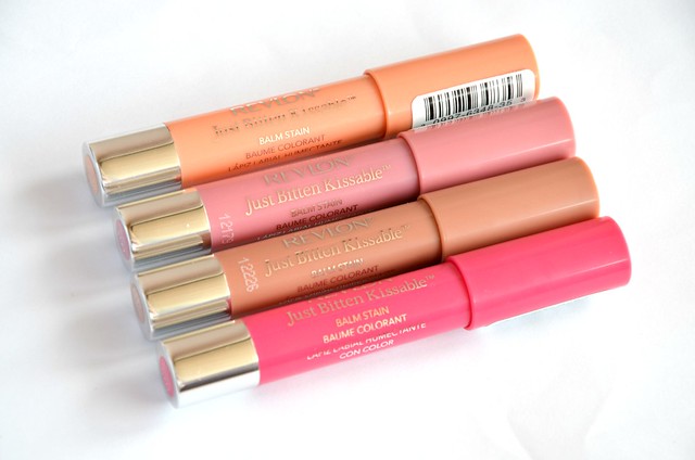
You're probably sick of seeing them and they're old news by now, but I thought I might as well do a post on my collection of Revlon Just Bitten Kissable Balm Stains, now that they've recently been released in Australia. Priceline is currently holding a buy one, get one free sale on all Revlon nail and lip products, meaning you can nab two of these for $17.95. They're a little cheaper than the Revlon Lip Butters which are $21.95 each. I've already written about the first one I managed to get my hands on, Charm, so I'll focus on the three others I've since bought, Honey (from my New York trip), Precious and Sweetheart (from the Priceline sale).


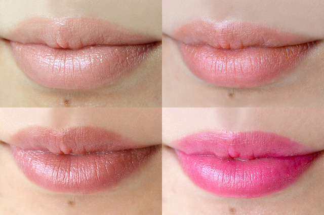
l-r (first row, then second row): Precious, stain after Precious is taken off, Honey, Sweetheart

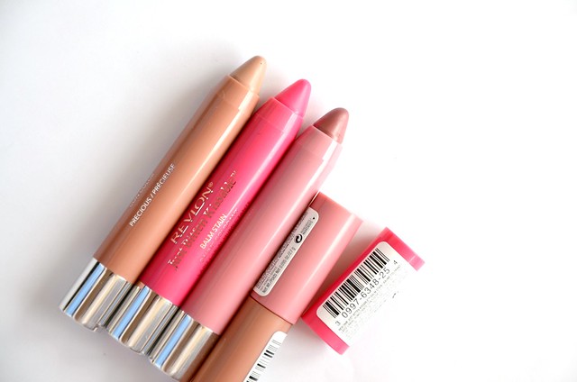
l-r: Honey, Sweetheart, Charm, Precious

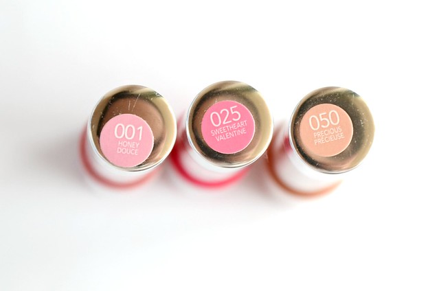
Honey (001) This was the shade that I wanted to get the most after Charm, as it seemed the most suited for everyday wear. It's a bit darker than expected, especially since my lips are already quite pigmented. It's a rosy, slightly brown colour, kind of like a dark, muted raspberry, though it applies on my lips more like a light raisin.

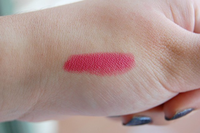
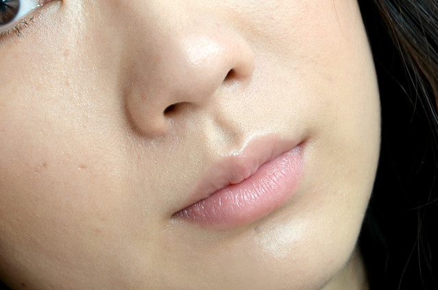
Precious (050) I surprisingly really like this one. This is probably what I'd hoped Honey would be closer to. Precious is a pinky nude that is slightly peachy. It tones down my lips without looking too brown or washing me out. Like Charm, it stains brighter and darker than the colour itself, almost to a coral shade. I really don't like this aspect of the Just Bitten Kissable Balm Stains, as it seems to negate the whole point of having lighter shades if they're all going to stain much darker and not true to colour.

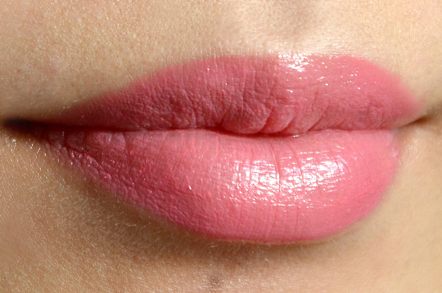
Sweetheart (025) Michelle first alerted me to this shade, and ever since, I'd been leaning towards getting it. Sweetheart is a medium, teeth-whitening bright pink with a stain that just goes on and on. Seriously, this one doesn't come off. Ever. I applied this on a whim at night, showered, double cleansed my face, and it was still there. No matter, I thought, surely it'd be gone in the morning. Woke up six hours later, and it was still there, bright as ever on my lips. Once you apply this, be prepared to have it stay on your lips for at least 8 hours. That's surviving futile attempts to wipe it off, multiple reapplication of lip balm, and even trying to remove it with a bit of Bioderma. The unbeatable lasting power means if you want a hot pink lip to last a whole night, and then some, Sweetheart is for you.

I find these lip crayons to be slightly on the drying side, in that you need well moisturised and exfoliated lips for these to go on smoothly. They're a little inconsistent and unpredictable, in that the staying power differs depending on the shade (with Sweetheart being miles ahead of the rest), and the lighter colours stain a totally different colour to how they initially apply. I cannot fault the packaging however, and for the most part, they're a fun and (still) novel way to add truly long lasting, transfer-proof colour to your lips.

Sunday, November 25, 2012

Lingering Spring

When I first heard about the Laura Mercier Lingerie Eye & Cheek Palette from Pixiwoo all the way in February, I didn't really think anything much. It wasn't until months later, when I saw it pop up on Emma Bovary Beauty, that I started to take notice. By the time my casual interest had turned into full blown obsession, it had sold out everywhere (Myer, DJs, even Adore Beauty). I was just about to give up on it ever being mine, when Mishelle thoughtfully notified me that it was available on StrawberryNet (thank you, Mishelle!). It was meant to be after all. And to hell with my spending ban.


Despite how thrilled I was to finally have this in my possession, I'm starting to wonder whether I should order from StrawberryNet again. This is the second consecutive purchase where one of the pans had detached completely (the first being the Stila Bronzing Powder). To make things worse, I think someone botched an attempt to affix the loose pan to the palette, because there was a blob of semi-dried glue at the base which did absolutely nothing. If anything, it made it harder to try and squeeze the pan snugly into the empty slot, because the glue created an uneven surface at the bottom. It meant the pan protruded out and would fall out again at the slightest movement.


Packaging issues aside, this palette pretty much represents everything I'm drawn to in makeup (at least for eyeshadow and blush). I wouldn't want lip products to be in there anyway, as mixing powders with creams in one palette often gets messy and unhygienic. There's more mattes than I'd normally like, but the matte shades here (especially the brown and the blue) are so well done, that I don't even mind. If there was a shimmery olive shade and a bronze (probably replacing the peach and the light pink), you'd have all my go-to eyeshadows in one place.

l-r: Buff Pearl, Tawny Apricot, Rich Cocoa, Pale Pink, African Violet, Black Plum

Buff Pearl (Luster) Shimmery, whitish beige with a touch of iridescent pink. Very similar to Urban Decay Bootycall (from the Naked2 palette), though Bootycall is a bit more peach.

Tawny Apricot (Sateen) Muted, light burnt orange, like a dusty peach colour. One of the less pigmented shades. Can't see myself wearing this much.

Rich Cocoa (Matte) Dark chocolate colour. Not much red in it, but not greyish. Kind of like a bark colour. One of the most pigmented mattes I've come across, blends beautifully with other shades as well.

Pale Pink (Matte) As the name suggests, slightly dusty, very light matte pink. This one was a bit powdery and chalky in texture compared to the other two mattes, but still quite pigmented. I don't think Pale Pink shows up on my skin very well, so maybe this could be more of a blending shade.

African Violet (Luster) The stunner of the palette and the main reason I wanted to get it, though I know you can buy this colour separately. Pinkish violet with gold shimmer. The shimmer is pronounced enough that it's almost like a duochrome, but rather than overtaking the colour, it just seems to imbue it with fine gold sparkle. It's a sophisticated and wearable shade that still remains soft despite the shimmer. I love that there's no fallout with it either. My new favourite eyeshadow combination is African Violet over the lid, with Rich Cocoa applied closer to the upper lashline and blended upwards slightly to give definition and a hint of smokiness. The two surprisingly work really well together.

Black Plum (Matte) Dark, blackish eggplant but without any red. Like navy, but purple. Great for lining the eyes as an alternative to black, and something softer than a gel or liquid liner.


l-r: Rose Desire, Fresh Peach

Rose Desire Bright rosy shade with a touch of coral.

Fresh Peach Looks bright in pan but applies quite softly to my cheeks. Doesn't look red at all, but isn't overwhelmingly orange. My favourite of the two blushes.

This is a limited edition palette, so if you're keen on it, it's still available on StrawberryNet for a bit over the retail price of $60 (though if you're a regular StrawberryNet shopper, you'll have extra loyalty discounts). It's a bit steeper than what I'd normally shell out for in a palette (it's actually my most expensive single makeup purchase to date, trumping the Urban Decay Naked palettes), but it's so versatile, soft and classic that I know I'll get plenty of wear from it. I don't have two really good quality, dark mattes like Rich Cocoa and Black Plum either, so I'm pleased with the inclusion of them, and African Violet is an eyeshadow must-have.

Thursday, November 22, 2012

Soft Sculpture

Illamasqua Zygomatic was totally an unplanned purchase. I had already bought Naked Rose on holiday in the US less than a month earlier, and thought that effectively eliminated Zygomatic from my mental wishlist (it was a choice between the two of them, and I'd made mine). But what happens when Illamasqua decide to lower their Australian prices, making a blush almost the same price as in the US? You know what happens. An innocent trip to the Illamasqua counter in Myer, to merely check out what's on offer, with no intention to buy, of course. Until I decide to try some Zygomatic on my cheeks, and the rest is history.


In the pan, Zygomatic looks like a medium rosy brown, kind of like a dusty pink but more brown-leaning. I've been getting more into neutral blushes rather than the usual pinks and peaches I gravitate towards, and Zygomatic is exactly what I'm after. Though it swatches quite brown, it actually appears more pink on my cheeks. The effect is quite subtle and natural looking. It's not a bright or warmed up pink, it's more of a toned down, neutral pink that melds with the colour of your own skin. If built up, it can start to look more brown than pink, so I prefer to apply it lightly. I usually apply this with my fingers, mainly on the apples of my cheeks and then blending outwards and upwards, but I've tried it with the Ecotools baby kabuki brush and it worked well, though it dispersed more product over a wider area. This is a cream blush, so it's a little messier than a powder, but it texture is non-sticky and it's easy to blend.

I think this is the perfect blush to add really natural, subtle colour to your face. I often find blushes are too dark, too red, too shimmery, too bright, too difficult to apply — but Zygomatic is none of those things. This sophisticated pinky nude is soft, understated and easy going.

Tuesday, November 20, 2012

Chatterbox & Coldplay

The final lipstick in my mini MAC collection (after Viva Glam Nicki, Shy Girl and Creme Cup) is Chatterbox. This is a bright pink lipstick in the same vein as Viva Glam Nicki, while Shy Girl and Creme Cup are softer, everyday colours. Chatterbox has an Amplified finish, which is the clear favourite of the ones I've tried (Cremesheen and Satin being the others). It absolutely glides on and feels moisturising while still being insanely pigmented. It wears off really nicely as well, fading in a natural way that isn't drying or staining.


On the lips, Chatterbox can look quite different depending on the light. In direct sunlight, it's a warm, almost strawberry pink, much lighter than how it looks indoors or in artificial light, where it's more of a medium to dark pink that looks a bit reddish and raspberry toned. I really don't have any dupes of this colour in my lipstick collection, a fact that seriously surprised me. I thought Revlon Pink About It might be close, but it looked much more coral and muted. Chatterbox is the perfect lipstick to pop on when you're looking to wear a bright colour that's not too bold and attention-seeking.

Saturday, November 17, 2012

All the Right Signs

Taupe and bronze, and all their variations, seem to be all that I ever wear for my eyeshadow. Occasionally, I'll feel slightly adventurous and reach for a purple, green or blue, but most of the time, it's all about those two neutrals. One of my favourite eyeshadows is the bronze shade in the Sleek Storm palette, and I wanted to find a cream eyeshadow equivalent. There wasn't anything available from drugstore/cheaper brands (Essence Coppy Right maybe, but I never managed to find it), so I turned my attention to more expensive options. I narrowed the field down to Make Up For Ever Aqua Cream in #14, MAC Paint Pot in Constructivist, Smashbox Limitless 15 Hour Wear Cream Shadow in Icon and Benefit Creaseless Cream Shadow/Liner in Busy Signal. In the end, I was won over by the Benefit as I thought it was the prettiest shade of them all.


I've been curious to try the Benefit cream eyeshadows for a while, and was dead set on getting Birthday Suit, as it seemed to be the most popular and raved about shade. But when I swatched Birthday Suit on my hand, I was immediately struck by how cool and almost grey it was, like a light, silvery taupe. Though I'm usually drawn to this kind of colour, from my experience (with light taupes, and shades like Essence Glammy Goes To and L'Oréal Sahara Treasure), it never quite works on me. I remember reading about Busy Signal on Drama & Makeup, so I knew that it was probably the second best option for me if Birthday Suit was out of the picture. A lot of darker bronze cream shadows can turn out a little flat, overly dark or muddy, but Busy Signal retained a pleasing vibrancy and warmth. I also love that it's not frosty in any way. It has fine gold shimmer that adds extra sparkle and dimension.

It's a bit too dark to wear on my lids, but I've been loving Busy Signal to define my lower lashline. The gold-flecked, warm bronze is a bit more interesting and less harsh than a conventional black. I lightly dip my Ecotools concealer brush (from the Bamboo 5 Piece brush set) into the product, and run the brush two-thirds across the lower lashline from the outer corner. It manages to give me just the right amount of definition, without looking too heavy (both in terms of the colour, and softness of the line). I'm impressed by how it stays put all day. I also love just how emollient and easy to apply the Creaseless Cream Shadow/Liners are. They're significantly softer and smoother in texture than other cream eyeshadows I've tried, particularly Maybelline Color Tattoos, which are much harder and drier. The Benefit really just glides on, and you only need to brush the surface to get a good colour payoff. My only small complaint is that if shading the whole lid, it applies a little on the sheer side, and you do need to build up the colour to get full intensity. Other than that, I cannot fault this product, and it now forms part of my morning routine.

Thursday, November 15, 2012

Summer in A Box

On the first day of my September New York holiday, I found myself at the Sephora in Times Square and spotted this Benefit Go TropiCORAL Lip & Cheek Kit on the shelves. It had two items that I was wanting to buy individually (Cha Cha Tint and Coralista), so purchasing the set was a no-brainer. Even though the products included are smaller sizes (Cha Cha Tint is 4ml, compared to the 12.5ml of the full size, Coralista is 3g while the full size is 8g), I figured I'd most likely never use up the larger sizes, so having a chance to sample both at a fraction of the cost was ideal. I managed to buy this in the US for around $30 — it retails in Australia for $59.


As with all Benefit products, a lot of care and attention to detail has gone into the packaging. The Coralista blush comes with its own mini brush which is adorable, though perhaps lacking some functionality. I never use the brushes that come with Benefit boxed powders anyway, but they're not too bad for travel. The kit also comes with "Tips and Tricks" cards attached to the top flap that provide instructions on how to use the included products. There's a mirror behind the cards (which I never realised until I was photographing the box for this post).

Cha Cha Tint straight from the bottle, then blended

A word of warning about Cha Cha Tint: BLEND QUICK. If left on the cheek for even 1.5 seconds, it'll leave a stain. I learned the hard way when I dotted it on my cheeks and didn't blend immediately. There was an orangey red blotch on both cheeks that I couldn't conceal with foundation or more blush. The best way I've found to apply it is to dab some from the brush directly onto your finger, then quickly blend it onto the cheeks straight after. Lots of coral/orange blushes can look overly red, but this one doesn't. It's the perfect summer tint for the cheeks.

I've mentioned High Beam a couple of times (see How Much Is My Face Worth? and October Favourites), so I won't go into too much detail, except to say that it lives up to the hype.


I didn't really have any expectations about the Coralista Ultra Plush lip gloss, but I found myself pleasantly surprised. I could've done without the inclusion of this gloss altogether, but it's sheer and inoffensive enough to wear casually without looking like you're obviously wearing lip gloss. It's not sticky and feels moisturising on the lips. It isn't very pigmented. It's more like a sheer wash of colour, leaving a warm orange tint to the lips with just a touch of shine. The only thing that bothers me is the sickly sweet scent it has.

l-r: Coralista, the stain that Cha Cha Tint leaves, Cha Cha Tint blended

The mark in the middle of my hand? That's what Cha Cha Tint looks like if you leave it on for just a few seconds. And it's impossible to get off without some serious makeup remover. Coralista is a glowy, slightly sheer, soft coral. It's much lighter in colour than Cha Cha Tint, and more shimmery. I didn't expect that it would swatch the way it does — it's lighter than how it looks in the pan and almost seems like a brightening powder that gives a touch of pinky orange if build up in intensity. I find it a bit too luminous as a blush. It has a tendency to enlarge the appearance of pores if applied to the cheeks. If only the shimmer were turned down a few notches, I'd reach for Coralista more to lift and warm up the complexion without looking overdone, as the colour and softness are exactly what I'm after.

Tuesday, November 13, 2012

Powder Play

It took me a while to figure out how I felt about Laura Mercier Mineral Powder SPF 15. It's my first foray into both mineral powder foundation and Laura Mercier products, and my expectations were pretty high given what I'd read about it (Courtney's post was particularly convincing, and it holds a 4.0/5 rating on MakeupAlley). I had tried it a couple of times at Sephora by helping myself to the jar and slapping on a decent amount to part of my face with my fingers, and each time it seemed to blend into my skin without caking and provide surprisingly decent coverage for a loose powder. After some deliberation (should I, shouldn't I?), I rationalised it wouldn't be an unwelcome addition to my base makeup options.


I chose Real Sand, as the shade up (Natural Beige) seemed too dark and orange-leaning. For my skin tone, Real Sand is a touch too light, but given the choice between too light or too dark, I'd go with the former. The finish of this mineral powder is brightening and almost glowy — I'm not sure whether it's entirely due to the SPF, but it definitely lightens the complexion. It's especially noticeable in direct sunlight when first applied.

I use the Real Techniques Buffing Brush to apply it, and it works well enough that I haven't wanted to try any other brushes. I find the loose powder quite fiddly, in that I periodically have to turn the jar upside down, shake it a little for a bit of the powder to fall through the holes, and then open it up slowly once it's back upright, making sure to position it flat so powder doesn't spill out. It also hasn't cut down the time I take to apply my foundation. It probably takes just as long, if not longer, than my liquid foundation, as I have to make special effort to dip my brush in the powder evenly, and buff the powder into my face so I have seamless, even coverage all over. It's easy to get too much on the brush (as you really only need the smallest amount on the tip), which means more blending if some parts of the face have more powder applied than others.

What's really impressed me has been the oil control, the coverage and the staying power. It doesn't get greasy and my face doesn't need blotting in the middle of the day, unlike my liquid foundations. There is slight shininess after a while around my T-zone, but it doesn't really bother me. The coverage that the powder gives is unexpectedly good. It really can cover up a whole array of imperfections and unevenness (short of large blemishes) while still making the skin look natural. It also lasts longer than my liquid foundations, which tend to slip off my face and fade by the end of the day. I like the fact that it feels completely weightless on the skin. There's none of the tackiness or dampness that can come with liquid foundation. I can buff this over my whole face, including over my eyelids, and it feels like nothing.

I still need to moisturise before using this, as I find that it can cake around the edges of my nose if my skin is particularly dry. I've primarily been applying it on the weekends if I'm going out, as I prefer the greater ease and speed of liquid foundation on weekdays. My only major complaint is the fact I don't think Real Sand is a perfect match for me, and the powder has a slight but noticeable whitening effect on my skin that I'm not convinced looks entirely natural. If there was the exact shade for me, and the loose powder was a bit less fiddly, I'd be completely enamoured.
Related Posts Plugin for WordPress, Blogger...