Saturday, November 30, 2013

Burberry Does Brown

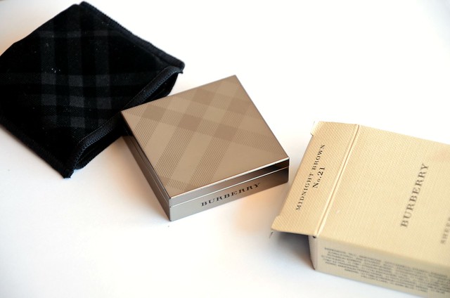
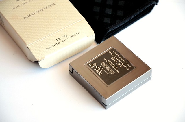
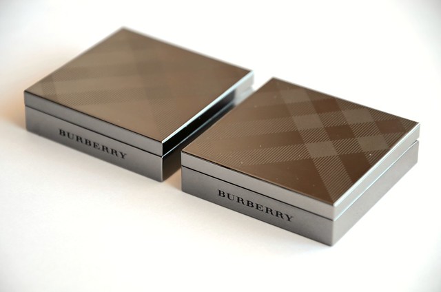
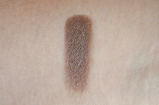
I was dead set on Pale Barley for my first Burberry eyeshadow, but a little more hesitant about Midnight Brown. It recently returned to my attention after this post by Shari of The Misty Mom who raved about how it was unparalleled among the brown eyeshadows she'd tried. I did my research beforehand (who wouldn't, at $45 a piece) and the consensus seemed to be that Midnight Brown had a complexity that made it special and worth the splurge. I wasn't entirely convinced when I swatched it at David Jones, but I still favoured it over Rosewood, so it came home with me.


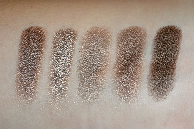
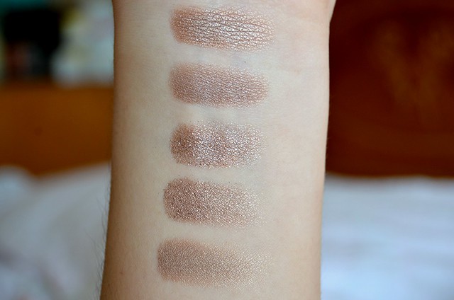
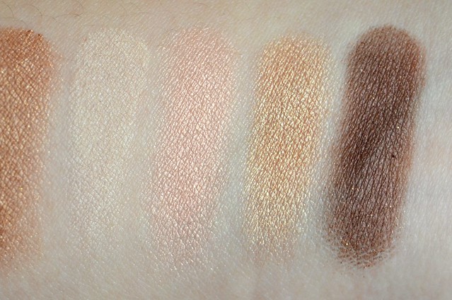
l-r: Burberry Midnight Brown, L'Oréal Bronzed Taupe, NYX Iced Mocha, LORAC Pewter, L'Oréal Endless Chocolat

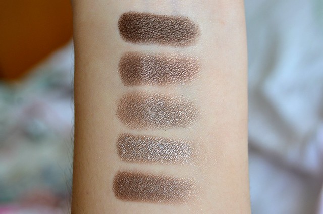
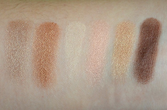
Bottom to top: Burberry Midnight Brown, L'Oréal Bronzed Taupe, NYX Iced Mocha, LORAC Pewter, L'Oréal Endless Chocolat

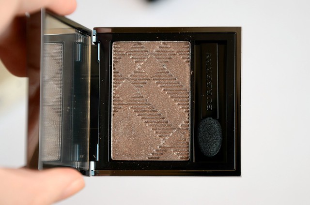
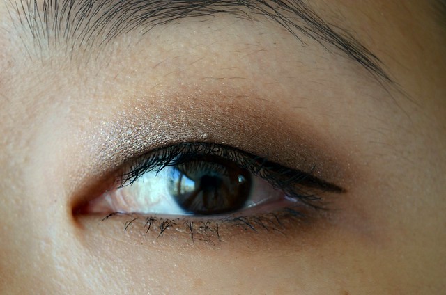
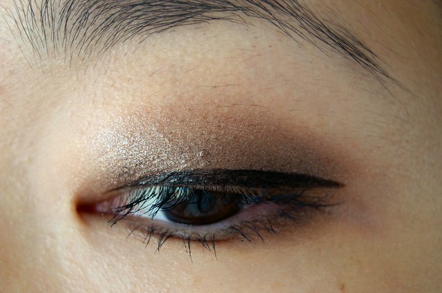
Burberry Midnight Brown (No.21) is a cool, dark, taupey brown that flashes mainly silver. Under certain light, it looks more bronze with an understated golden sheen. Overall, it can lean muddy, especially when built up in intensity — I find that's when it starts to look more ashy and grey. Underneath a warmer, reddish base (like Maybelline Color Tattoo in Pomegranate Punk), it can look much more traditionally bronze.

L'Oréal Infallible eyeshadow in Bronzed Taupe is lighter, frostier and more grey-leaning. It's similar texture-wise, highly pigmented and smooth. If anything, Midnight Brown is more powdery and prone to a bit of fallout.

NYX Iced Mocha is lighter still, not as silvery as Bronzed Taupe, a bit more beige. This one had major texture issues, being dry, crumbly and patchy.

LORAC Pewter (from the PRO Palette) is the closest, a tad warmer with a slight purple tinge, not as dark brown. You definitely don't need both.

L'Oréal Infallible eyeshadow in Endless Chocolat is clearly much deeper than the rest, more of a metallic bark brown, not very warm. It tends to look closer to black on the lids.


Midnight Brown is too dark as an all-over lid colour but it's a good option for a quick smokey eye. Its versatility lies with how it's able to be sheered out to a more warm, reddish bronze, but also intensified to a more cool, silvery taupe if built up in pigmentation. I can also see its potential to be subtly transformed with a cream eyeshadow as a base, depending on the colour. It's smooth, highly pigmented and a breeze to blend — I almost prefer applying it with my fingers over an eyeshadow brush, as I think it leads to a better result. The shimmer in this is very fine and isn't overly reflective or metallic.

Ultimately, much like how I felt about Pale Barley, despite being well-made and having chameleonic qualities, I still don't find the shade alone to be entirely remarkable. If anything, I think Midnight Brown is even less unique than Pale Barley. While there's more variation in my arm swatch comparing similar shades than with Pale Barley, I just don't see myself getting all that much wear out of Midnight Brown to justify having so many close alternatives that basically look the same once on the lid. I wouldn't normally opt for a darker colour to wear during the daytime (only using them in a relatively discreet fashion closer to the lash line for added depth and definition) and I rarely go for deeper, dramatic eye looks if going out.

Still, Midnight Brown is a classic Burberry shade. It feels very true to the brand's look and ethos. It's a little sludgy, smouldering and overcast, while still retaining a sense of sophistication and effortlessness. I probably would've liked it more if it didn't lean so cool on my lids, but it can be easily tweaked depending on the heaviness and technique of application, and in combination with different coloured cream bases (slightly altering its appearance to be more bronze, gold, purple, plummy).

Thursday, November 28, 2013

Fig & Watermelon

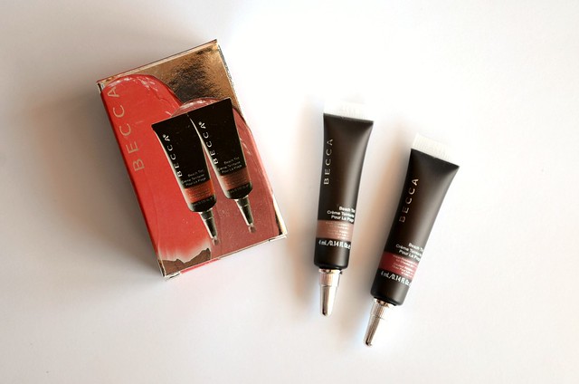
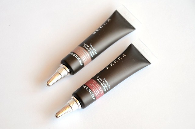
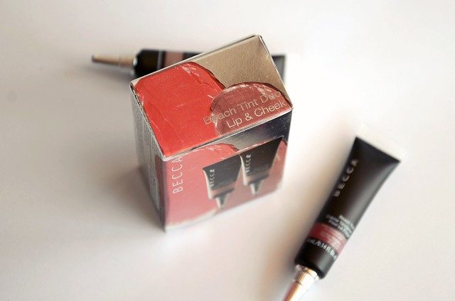
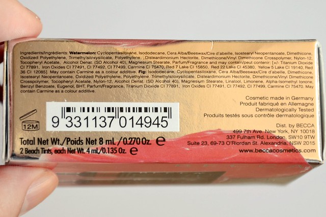
When Tarazz held a $10 flat rate shipping from Sephora a few months ago, I couldn't resist placing an order with a friend. Among the items I purchased was this BECCA Beach Tint Duo, consisting of 2 x 4ml tubes of their Beach Tints in Fig and Watermelon (the full size is 7ml). Apparently the duo is a Sephora exclusive, making it seem like a worthwhile addition to my cart given how arduous it normally is to ship from the US Sephora website to Australia. (I may have also been swayed by Liz's review on them.) The set was just over $20 which I found to be decent value for money, considering the regular size retails for $42 a piece and the amount of product in each is close to an Illamasqua cream blush (4.5g) or Stila Convertible Color (4.25g).


l-r: Becca Fig, Revlon Soft Nude, NARS Biscayne Park, Illamasqua Zygomatic, NARS Douceur


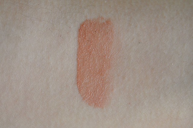
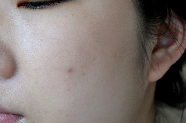
I'd read reviews of how light Fig was, but I took a gamble and hoped it would show up on my skin. No such luck. My attempt at something approximating a cheek swatch shows how barely detectable the colour is. It's not completely invisible, but it's more or less negligible in terms of any effect that you'd normally want blush to give, and blends out into nothingness. It leaves a slight pinkish brown tint, but mainly just looks like extremely subtle shading or the faintest tan. I originally suspected it would be nearly identical to Illamasqua Zygomatic, but Zygomatic actually can be seen on the cheek and is darker, pinker and dewier.


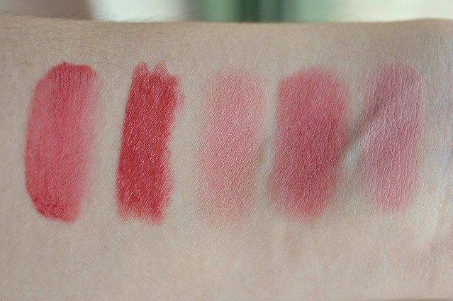
l-r: Becca Watermelon, Revlon Soft Rose, Napoleon Perdis 'Color' from the Ultimate Contour Palette, Bourjois Rose Éclat, Illamasqua Naked Rose


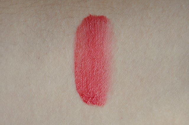
Watermelon is on the opposite end of the spectrum to Fig. This one is hella pigmented. You really need only the tiniest amount, otherwise it's easy to put on too much and risk looking ruddy. It leans quite red against my skin tone, which is a colour I usually try to avoid when it comes to blushes. This is what I imagine a red-leaning blush like Tarte Natural Beauty would look like on me, except Watermelon might be more berry pink than classic red. While it might not be my favourite colour, at least it provides more variety to my blush collection and a change of scenery from the "peachy pinks" that tend to dominate it.


I tried two coats of both shades on the lips and wasn't particularly impressed with the results. I found them to be surprisingly very drying. Once the product sets, it turns from thin, emollient and slippery in texture, to a matte cream, almost what I imagine the NYX Soft Matte Lip Creams would be like. Once it turns matte, it starts to become quite flaky, accentuating dry patches and unevenness. It was difficult to get even coverage as the product is so thin and lightweight but easily spreadable. I just felt it was sliding around everywhere and application was extremely patchy when I used my fingers. The problem isn't as bad when applying the Beach Tint on the cheeks, but I still don't find them as forgiving and easy to work with as other cream formulas. I think the trick is to use minuscule amounts spread as evenly as possible in thin layers, gradually building up to achieve your desired pigmentation.

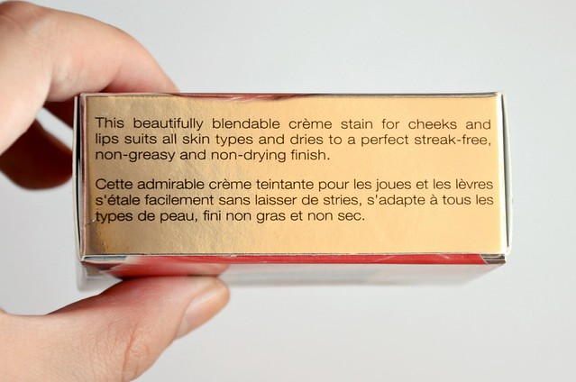
Fig was too light on my cheeks and on my lips was terribly unexciting. Watermelon reminded me so much of Revlon ColorBurst lipstick in Soft Rose and sure enough, they swatched almost identically. Watermelon is just a touch more muted and subdued compared with the more pigmented and opaque Soft Rose. The texture and application issues don't encourage me to favour these Beach Tints as a lip colour over the multitude of proper lipsticks or lip crayons I have that are similar in shade. While they're marketed as a "crème stain", they weren't at all staining on the lips and could be completely removed with a tissue, as if all the product was merely sitting on top of the lips, ready to be wiped off.

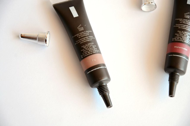
Another strange thing I noticed was my tube of Fig had these sparse, tiny black granules in it, visible when I squeezed a small amount out, that made it weirdly grainy. I have absolutely no idea what they were or whether it was a product defect, but it did little to ignite my enthusiasm.

Much like the BECCA Eye Tints, my overall experience with these Beach Tints was underwhelming. On the plus side, I do like the candy/fruity scent and the packaging is both novel, convenient, hygienic and aesthetically pleasing. But Fig is a nonevent and Watermelon is passable, but not really my thing. While I do watch the odd video or read a blog post featuring these Beach Tints in a way that makes me think "what am I doing wrong?", I just haven't found myself warming up to them or utilising them to their full potential.

Tuesday, November 26, 2013

Stars on Show

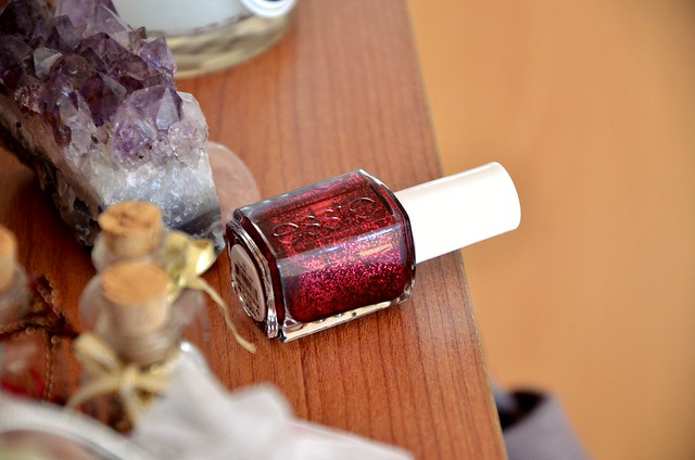
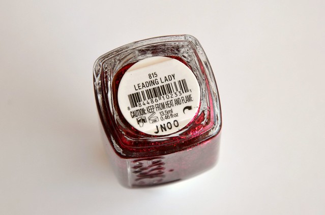
When I saw the Essie Winter 2012 collection last year, the one polish that caught my eye was Leading Lady. I was keen to get my hands on it, but never found it in the shops here and didn't want to resort to buying it online, where the price of shipping wouldn't make it worthwhile. The brand released a very similar polish this year called Toggle to the Top which rekindled my interest in Leading Lady. Essie recently launched in Priceline pharmacies, which unfortunately triggered in me a major Essie phase. Not only did I buy 4 polishes from Priceline, I also decided to place an online order for more Essie polishes with a friend. One of the polishes I bought in my haul was, of course, Leading Lady.


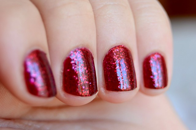
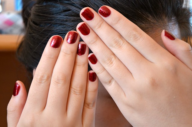
Leading Lady is a deep ruby red flecked with dense red glitter. It's completely opaque in two coats and imparts a shiny, jelly-like finish which adds dimension to the polish. The composition reminds me of what I imagine a colour like Ulta3 Brandy Wine or OPI The One That Got Away would look like with an ordinary red glitter painted over it. The tone of red is dark and full-bodied enough that it almost borders on vampy. This is by no means a subtle or quiet polish. It's loud, a little dramatic and appropriately festive for the upcoming holiday season. What I like most about it is how the glitter looks suspended in the polish, as if sandwiched between semi-translucent layers, rather than merely sitting on top. It gives the polish much more complexity and depth, and leads to a shimmering, starry effect that's positively dazzling in direct sunlight.

Sunday, November 24, 2013

Bound for Barley

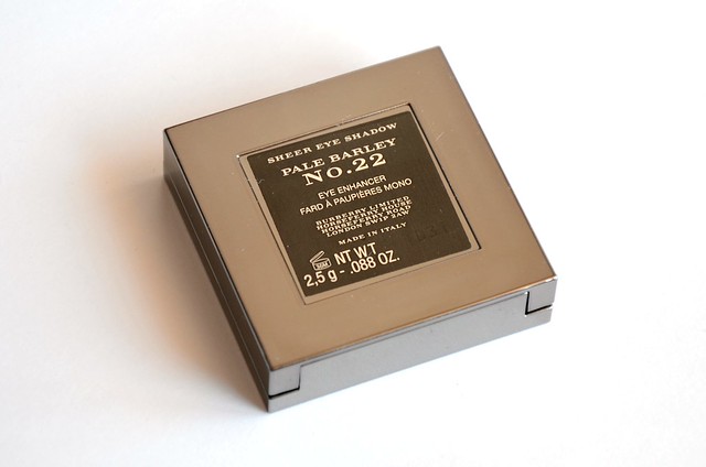
I've been wanting to try Burberry cosmetics for the longest time, but could never justify the hefty prices. I finally had sufficient impetus to splurge after coming across an enticing gift with purchase from David Jones: purchases of $79 or more would result in a 7-piece gift set purportedly worth over $149. The gift included a Sheer Eyeshadow in Pearl Grey, Lip Mist in Camelia Pink, Eye Brush - Socket Line No.09, baby kabuki brush, something called the "Beauty Glow Multi-Usage Highlighter" and a 4.5ml Burberry Body miniature, all housed in a (cheap-looking) black makeup bag. While the eyeshadow and lipstick aren't shades I would've personally selected, considering they're proper full size products able to be purchased separately, I found them to be generous inclusions. I was most excited about the full size eye brush, worth $US38 or $55 alone. To qualify for the gift, I contemplated a blush or eyeshadow palette, but in the end, picked two of their most-hyped eyeshadows: Pale Barley and Midnight Brown (Rosewood was in the running, but I wasn't sure if it'd be too cool and grey for my skin tone). I'll talk more about Midnight Brown later, but focus on Pale Barley for now.


Pale Barley was an eyeshadow destined for my collection. It wasn't a matter of if, only when. I was prepared to hold out for quite some time given the 28471 similar shades already in my possession, but I figured there was no point in waiting any longer. It'd been a couple of years, it cost as much as my typical Friday dinner and dessert out, if not less, and it wasn't like I was easing off on the non-luxe makeup purchases anyway. Yes ... the workings of a cosmetics junkie's mind. Frightful, I know.

I remember reading a blog post a while ago that compared Maybelline Silken Taupe to Pale Barley. In fact, that was one of my primary motivations for buying Silken Taupe last year. Now that I have both, I really don't see how the two are similar. Silken Taupe is more of a pale, silver-purple. I found these particular reviews of Pale Barley helpful and definitely persuasive prior to purchasing: Kate at gh0stparties, Christine at Temptalia, Trang of Delicate Hummingbird (miss her blog), and Reika of Front Row Beauty.

l-r: Burberry Pale Barley, NARS Kalahari, Urban Decay YDK, Rimmel Smokey Quartz, bareMinerals A-Ha

Bottom to top: Burberry Pale Barley, NARS Kalahari, Urban Decay YDK, Rimmel Smokey Quartz, bareMinerals A-Ha

About the multitude of similar shades I mentioned. I picked out four of the closest I could find after briefly rummaging through my makeup drawers. I realise that to most sane and rational human beings, all the eyeshadows look the same. But they're not, I promise. There are differences, as minute as they may seem.

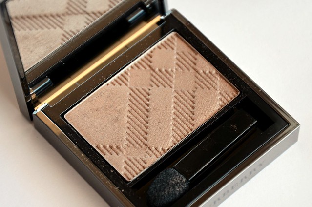
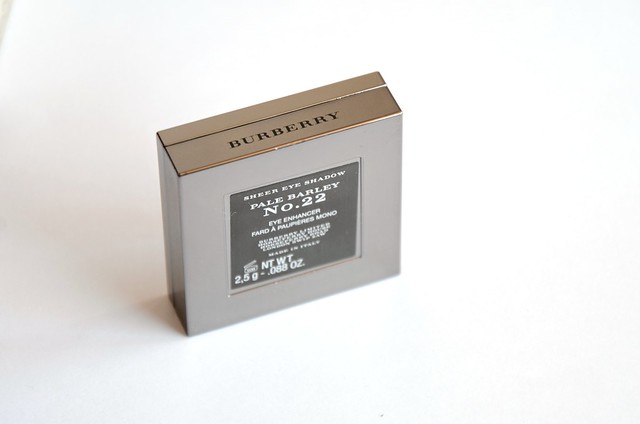
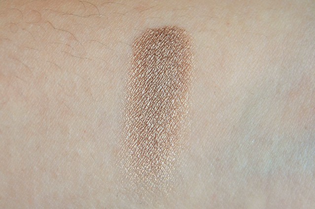
Burberry Pale Barley (No.22) is the most dirty yellow, with a slightly ashy appearance. I'd describe it as a darkened beige that can be built up to a medium brown base with a gold pearl overlay.

NARS Kalahari (from the And God Created the Woman eyeshadow palette, or the left side of the Kalahari duo) is more shimmery, with an almost flaky glitter. It's warmer, more golden and bronze than the cooler, tad more pewter Pale Barley. I think it's the more beautiful shade, but due to a somewhat crumbly yet dry texture, it's a lot more difficult to work with than the buttery smooth, superbly blendable Pale Barley.

Urban Decay YDK (from the Naked2 palette) is even more metallic than NARS Kahalari, but with more of a silvery thread running through it. It's also slightly more coppery than both Pale Barley and Kahalari.

Rimmel Glam'Eyes Mono Eyeshadow in Smokey Quartz is warmer, more brown and a little darker than Pale Barley. It differentiates itself from the rest with a hint of mauve.

bareMinerals A-Ha (from The Epiphany duo) is warmest still, more coppery/bronze, more metallic and reflective than Pale Barley without being shimmery or glittery.


Did I need Pale Barley? Probably not. I'm at the stage of makeup accumulation where there is no "need". For someone that might just be starting out with makeup or who has relatively minimal products, I think it's well worth the splurge to buy something like Pale Barley than a multitude of cheaper eyeshadows that might be similar in shade, but incomparable in terms of quality.

Do I consider Pale Barley a worthy addition to my stash? Sure. But at the same time, I don't find the colour to be so beautiful and unique that I can't picture myself living without it. I think what makes it special is the subtle gold overlay and how it falls in a near-perfect place between warm and cool. On medium and darker skin tones, I can see how it could be too light. I was afraid that it'd blend into my skin tone and hardly be visible, but it's pleasingly dark enough to serve as an easy, fuss-free all-over lid colour. If I wanted to add more depth and definition, I'd have to place a much darker shade closer to the lash line and blend upwards.

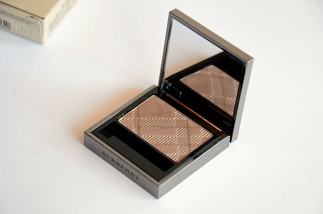
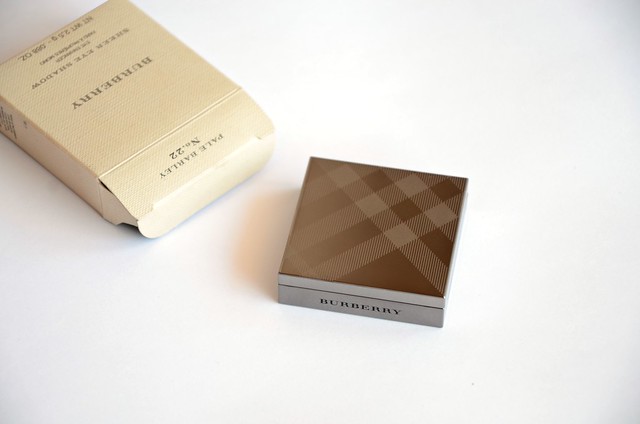
Pale Barley is a very well-made, high quality eyeshadow. The solid-feeling, gunmetal Burberry check packaging is, of course, a major part of its appeal and reflective of an elevated price tag. I can't fault the pigmentation, texture or application. I experienced hardly any fallout. It's an ideal everyday shade that leans more on the subdued side both colour-wise and with its soft, sophisticated sheen.

Friday, November 22, 2013

Jumping on Jouer

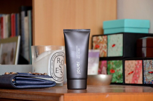
Alongside Chanel Vitalumière Aqua, Jouer Matte Moisture Tint is the one foundation I've been eager to get my hands on for quite some time. The number of base products I have is simply a waste considering I will never get through them all, but that didn't stop me from snagging a tube of Matte Moisture Tint after spotting it in pristine condition on a blog sale. What I thought was my shade, Linen, seemed to be perpetually out of stock when I searched online, so I couldn't say no when that was the exact shade on offer.


The Jouer Matte Moisture Tint is a generous 50ml, significantly more than the standard 30ml for a foundation. Not that it makes a practical difference since I struggle to finish up any foundation (I'm still trying to get through my bottle of Bourjois Healthy Mix Serum in 53 which I've had since last year and use regularly), but it does appease the part of my brain wanting value for money.


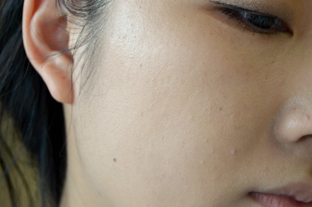
The texture of this foundation was somewhat unexpected. It's not very liquid or runny. Rather, it has an almost whipped, airy consistency, a bit like mousse but denser. Once worn, it feels extremely lightweight and works into the skin effortlessly, sinking in and becoming undetectable once blended out. I found it evened out and brightened my skin tone around all areas of the face, but does tend to cake slightly around the edges of the nose. The coverage is light-to-medium, ideal for an everyday foundation, but perhaps not for special occasions or an evening out where you want extra flawless skin.


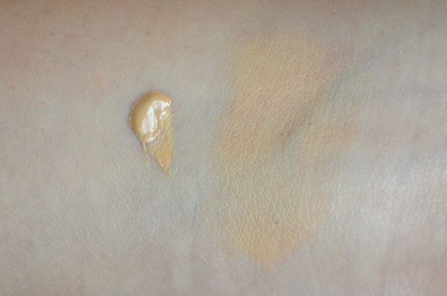
Linen is a little too light for me (not helped by the SPF 15 which gives off that additional white cast under certain lighting), but I normally prefer to go too light than too dark, and I'm not sure how the next shade up (Nude) would fare. To create a closer match, I've been using my beloved Real Techniques Buffing Brush to apply the Jouer over my bare face, then darkening my skin slightly with a thin layer of Chanel Soleil Tan de Chanel buffed all over with a baby Ecotools kabuki brush. I also set everything with a dusting of Hourglass Ambient Lighting Powder in Dim Light. I'm not sure if it's all that layering, but I've been experiencing better than average lasting power compared with my other go-to daytime foundations. Usually my foundation has largely slid off my face by the end of the day, looking far from fresh with greasiness and areas of redness peeking through. I'm not saying that the Jouer looks exactly the same as after I put it on in the morning, but it definitely does its darndest to hang on in there.

The two adjacent words "matte" and "moisture" seem to be an oxymoron, but I suppose the intention was to connote superior oil control combined with a still somewhat glowy finish that doesn't make the skin look dry and painted on. I'd be inclined to say that this foundation delivers in both respects. My T-zone is less shiny 2-3 hours into the day (normally the time I have to do a major blot), but I wouldn't describe the foundation as looking typically matte on the skin. It does start with a slightly more velvet/satin finish, but becomes more glowy and radiant as time goes on, without ever crossing into greaseball territory.

I had high expectations of Matte Moisture Tint, and they've mostly been met. If only the shade was more spot on for me, it'd be near perfect. Having said that, the fact it's a tad too light is a major inconvenience, as every single time I have to either mix it with a darker foundation (which I haven't yet tried), or apply something over it to make it darker. I could potentially get away with wearing it alone, but I'd be paranoid of looking unnatural and noticeably the wrong colour. The importance of shade matching when it comes to foundation cannot be overstated, but remains a frequently frustrating endeavour. Still, it's worth the extra effort to reap the benefits of the foundation's other qualities, including better staying power than most and how it wears off in a smooth and softly radiant way.

Tuesday, November 19, 2013

Textbook Glamour

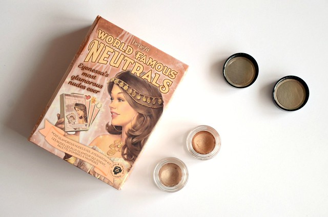
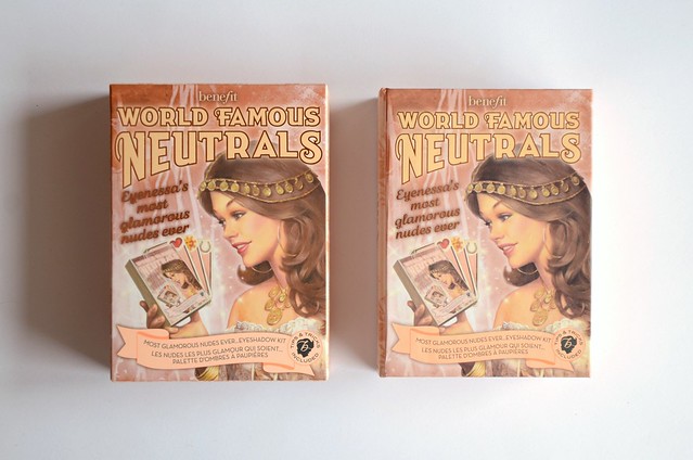
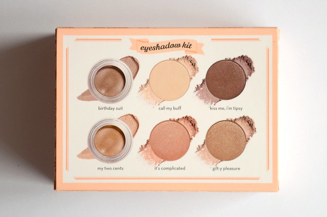
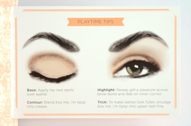
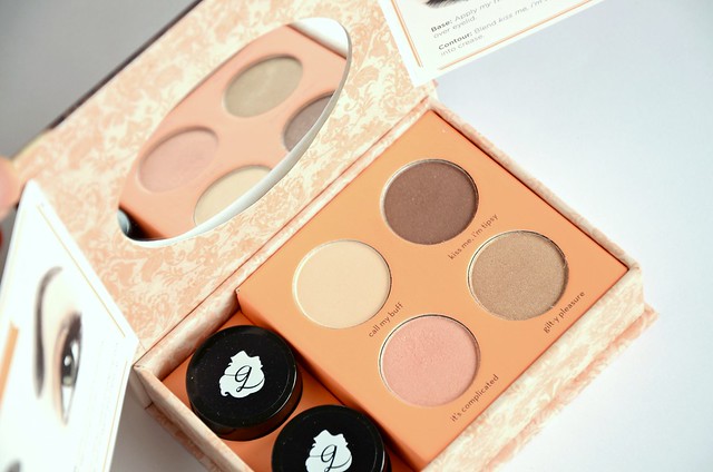
I held out on these Benefit World Famous Neutrals kits for several months, but after watching this video featuring the Most Glamorous Nudes Ever, I literally ran out to the shops the next day to buy it. I find Benefit to be on the pricier side in Australia, but this set is fairly good value for money, considering you get two cream eyeshadows and four powder eyeshadows for $44. Of course, buying it in the States would be cheaper (it's $30 before tax), but it's about the same price as buying in the UK (£23.50). There's two other kits (Easiest Nudes Ever and Sexiest Nudes Ever), but Most Glamorous Nudes Ever seems to be the most popular pick.


Is it just me, or is that Kelly Clarkson on the cover?


There's a protective plastic sheet covering the contents that suggests once you're done with the shadows to use the box to store your keepsakes. I find the packaging of Benefit products to always be meticulously thought out, but invariably bulky and a little overdecorated, if you will. Still, the box doesn't take up too much space and in any event, is more practical than the Go TropiCORAL Lip & Cheek Kit, where everything could be taken out and used except a small pan of Coralista blush that was stuck to the cardboard packaging.

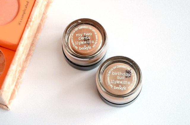
l-r: Birthday Suit, My Two Cents

The major selling point of these kits to me are the two cream eyeshadows in their own mini pots. While I was drawn to No Pressure! from Easiest Nudes EverMy Two Cents is exactly the kind of shade I normally go for, and Birthday Suit has been on my radar since Estée first brought it to my attention. I've waxed lyrical about the Creaseless Cream Shadow/Liner in Busy Signal, so I welcomed the prospect of adding two new shades to my collection. The pots in this kit are 3.2g each while a full size cream shadow is 4.5g. Thirty percent less product isn't a big deal to me, given I can't see myself finishing up a whole pot (full size or not) any time in the distant future. Plus, I'd rather have variety than more of the same. My only complaint is that the packaging of the smaller pots seems a little flimsy, particularly the lid, and because the jar itself is quite small but deep, I can see it being a challenge to get product out with your finger beyond a certain point.

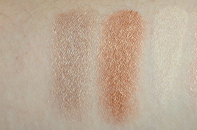
On the underside of my arm (which is about 2-3 shades lighter than my face), Birthday Suit is one of the most aesthetically pleasing eyeshadows I've seen — a sandy taupe with subtle but glistening gold shimmer. On my lid, it's barely visible and very underwhelming, like a cool-toned, pale, silvery grey with grainy gold/white shimmer. One of those colours that I think would be stunning on pale-skinned girls, but very ordinary otherwise. In that respect, it reminds me a bit of L'Oréal Infallible eyeshadow in Sahara Treasure, another eyeshadow I fell in love with from swatches I'd seen, but that simply didn't work for my colouring.

My Two Cents reminds me of a darker, more brown and less goldish-peach MAC Paint Pot in Rubenesque. It gives a relatively light gold/copper/bronze sheen to the lids that's not too scarily metallic in a gritty, overly frosty way. The metallic pigment in this is very fine and overall, it gives a relatively muted wash of warm, coppery bronze to the eyes. You could definitely wear it on its own, but I prefer to use it as a base for the other powder eyeshadows in the kit.

l-r: Call My Buff, It's Complicated, Gilt-y Pleasure, Kiss Me, I'm Tipsy

The four Longwear Powder Shadows inside are 1.2g compared with 3g for the full size.

Call My Buff is an off-white shadow that looks almost matte in the pan, but has a subtle pearl running through it. It seems like every eyeshadow kit or palette needs to have this kind of highlighting shade in it, but they rarely excite me. I haven't found much purpose to them except the obvious (inner corner or brow bone highlight, or occasionally as a blending shade), and they're all virtually indistinguishable to me.

It's Complicated, along with My Two Cents, is the star of this kit. I wasn't expecting to like this shade as much as I do, considering my aversion to anything pink around the eyes. This is a stunning pale peachy pink with a perfectly woven gold sheen that borders on duochrome. I was instantly reminded of Too Faced Satin Sheets from the Naked Eye palette, but Satin Sheets is far more intensely light gold (almost white in comparison). Neither Organza (a much darker pink) nor Gateau (missing the peach) from the Sleek Oh So Special palette are all that similar either, though they're much closer than Satin Sheets.

Gilt-y Pleasure is a light-to-medium orangey gold. It's not as distinctly orange as say, LORAC Gold from the PRO Palette or theBalm Mischievous Marissa (from ShadyLady Vol. 2), mainly because the emphasis is on the sandy gold quality while the copper element is toned down. It's more understated than I expected, but still a solid all-over lid colour, particularly if you're after something that's not excessively shimmery.

Kiss Me, I'm Tipsy is a warm dark chocolate that appears to have a load of sparkle in the pan, but hardly any translates onto the lids. I felt the pigmentation fell short of impressive, and there was some noticeable fallout. Unless it's the brushes I'm using, I need to pat this on 2-3 times to get my desired opacity, though similar shades have no such issues (L'Oréal Infallible eyeshadow in Endless Chocolat, the left Definer shade in Wet n Wild Comfort Zone, but to be fair, both lean closer to black than brown).


l-r: Birthday Suit, My Two Cents, Call My Buff, It's Complicated, Gilt-y Pleasure, Kiss Me, I'm Tipsy

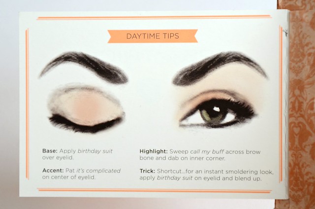
One of my go-to eye looks of late is taken from Alix in her Updated Everyday Makeup Routine, where she uses My Two Cents over the lid as a base, It's Complicated in the first third of the eye, and Kiss Me, I'm Tipsy in the outer corner. I use my Real Techniques Deluxe Crease Brush to blend the dark colour out. I don't bother repeating the same colours on the lower lash line. It doesn't seem like it'd work with my eye shape, but surprisingly pulls together in the end. The cream shadow base really extends the life and vibrancy of the shadows, and the shades themselves have a fine, sophisticated sheen to them that are daytime-appropriate but still live up to their glamorous name.
Related Posts Plugin for WordPress, Blogger...