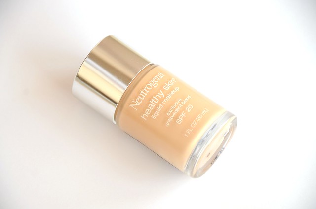
For the longest time, I basically had no interest in matte eyeshadow. It was all about satin, shimmery, metallic or downright glittery shades. I simply dismissed matte eyeshadows as flat and dull, not suited to my eye shape and often hard to work with. Mattes simply did not excite me and I rarely, if ever, used them. But suddenly and for no apparent reason, that all changed. I started to tire of my usual shimmery shades, which seemed too much for the daytime and at times glaringly frosty. With foundation slipping off my face at the end of the day, shimmery eyeshadow in the mix made me look almost grimy. I needed a new approach. Maybe it was also the release of the
Urban Decay Naked Basics palette that triggered a change in perspective, but in the last couple of weeks, I've begun experimenting with wearing mattes on a daily basis.
In light of my new fascination with mattes, I felt compelled to go through my entire eyeshadow collection and bring out all the mattes I had. Perhaps doing so would help quell the urge to buy a new, matte-only palette (
Stila In the Know, which I've previously always overlooked in favour of
In the Light, is particularly calling my name). Having all the shades laid out in front of me would also make it easier to examine my options.
First up is
Revlon Luxurious Color Matte Eye Shadow in
Vintage Lace (001). I've literally never used this shade and I don't see that changing any time soon. I just don't know what I'd use it for. I wear eyeshadow in an attempt to add definition and the illusion of depth to my eyes, and this shade isn't going to do that. Not having a visible crease, this would be as good as wearing nothing. I'm not even sure the colour would show up unless I packed it on. Maybe I could use this as a highlight or blending colour, though there'd be better and more effective options. The quality is reasonably good (much better than the
other shades I've tried in the range), though a tad powdery.
Next are two
Revlon quads I have: ColorStay 16 Hour Eye Shadow in
Attitude (545) and ColorStay 12 Hour Eye Shadow in
Coffee Bean (02). I've previously written about
Attitude here, and I've been loving the third shade applied close to the upper lash line and blended out as an everyday colour. I haven't touched the fourth shade yet because it's too dark to wear during the day, and the second pink colour disinterests me for the same reasons as
Revlon Vintage Lace (and pretty much all light matte shades). I recently
rediscovered Coffee Bean, a palette I'd always appreciated but never used. The second shade in the quad, a light mink/beige with a grey tinge, is probably the lightest I'll go. I find the 16 Hour eyeshadows are better quality than the 12 Hour ones, in that they're generally more pigmented and less powdery.
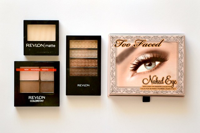
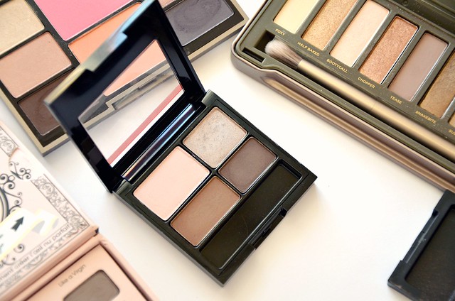
I was underwhelmed with the Too Faced
Naked Eye palette, but it does have some excellent quality mattes.
In the Buff is a touch whiter than
Revlon Vintage Lace, but creamier and denser in texture.
Like a Virgin is a revelation and I can see it fast becoming a favourite, much like shade 3 in
Revlon Attitude.
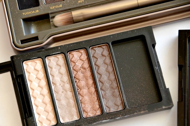
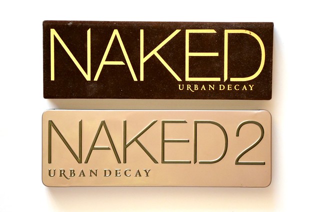
The original
Urban Decay Naked palette has two matte shades,
Naked and
Buck, while Naked2 has
Foxy and
Tease. The beige and tan shades of
Naked and
Buck aren't too thrilling in that they're similar to other variations of brown in
Revlon Coffee Bean and
Attitude. But they're versatile and useful shades to have, not just as all-over lid colours, but for softening harsh edges or even contouring the nose (
Buck seems to be a favourite of
Promise Phan). Can't do that with a shimmery eyeshadow!
Foxy in Naked2 is a bit more yellow than
Too Faced In the Buff and
Revlon Vintage Lace, and probably would barely show up on my lids. As a highlight colour, I'd prefer something more pearly/frosty over a matte, such as
Urban Decay Sin or
Bootycall.
Tease however, is another ideal everyday shade. My only gripe is once applied, it loses much of the purplish tone it has in the pan and looks more like a conventional brown.
Laura Mercier does the best mattes, period.
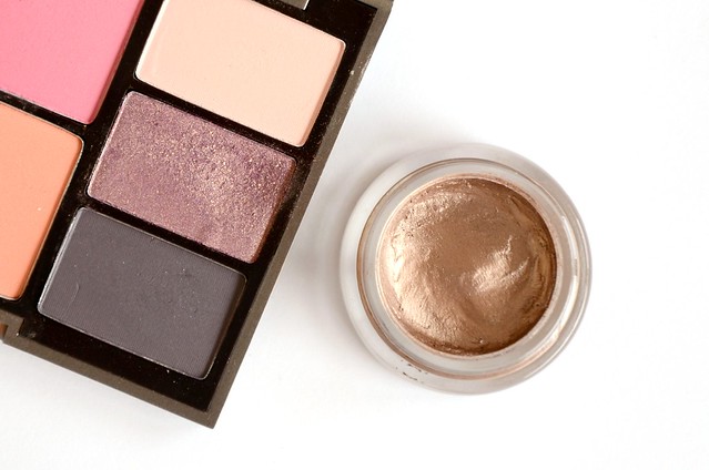
Pale Pink from the
Lingerie Eye & Cheek Palette is a touch warmer than the slightly dustier pink from
Revlon Attitude. I use it occasionally as a blending colour but it's too light for my skin tone to be worn over the lid. From the same palette,
Rich Cocoa and
Black Plum are smooth, buttery and stunningly pigmented. The two shades are more suited for a nighttime smoky eye, but with an angled brush, they could work as an alternative to gel or liquid eyeliner during the day. I often use
Rich Cocoa and
Black Plum, along with
Laura Mercier Twilight Grey, on the upper lash line over a lighter, shimmery colour to add definition.
The mattes in the
Sleek i-Divine Eyeshadow palette in
Storm were unexpectedly a disappointment. The shimmery shades are spectacular (the bronze is one of my favourite eyeshadows ever), but the mattes were subpar. The black was passable, but I literally had the scratch the surface of the two brown shades to get any pigment. Even then, it was a struggle to swatch them. To be fair, I think they might fare better with a proper eyeshadow brush than the surface of a finger. The colours aren't unique enough for me to prefer them over better versions in the
Urban Decay Naked palette.
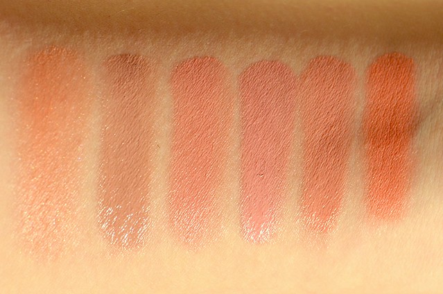
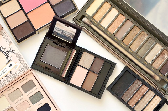
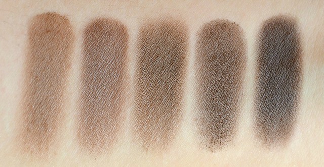
l-r: Too Faced In the Buff, Revlon Vintage Lace, Urban Decay Foxy, Laura Mercier Pale Pink, Revlon Attitude (shade 1), Revlon Coffee Bean (second shade), Sleek Storm (third shade), Urban Decay Naked
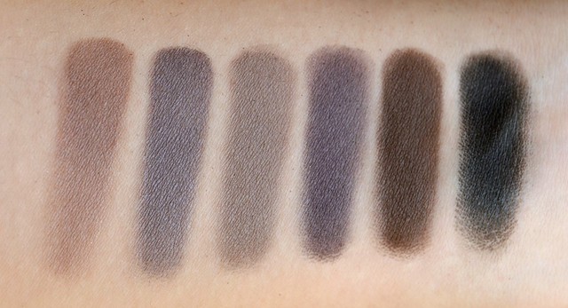
l-r: Urban Decay Buck, Revlon Attitude (shade 3), Sleek Storm (eleventh shade), Revlon Coffee Bean (fourth shade), Revlon Attitude (shade 4)
l-r: Urban Decay Tease, Laura Mercier Twilight Grey, Too Faced Like a Virgin, Laura Mercier Black Plum, Laura Mercier Rich Cocoa, Sleek Storm (twelfth shade)
Many of these shades are either too light or too dark. There's only a few that are mid-tone and useable as all-over lid colours, and even then, they still lean on the darker side. I need to be mindful of not applying the shadows too high up or heavily, and blending/softening the edges. I'm liking the more daytime-appropriate, softer and polished look of mattes over the sometimes garish and OTT nature of more frosty and metallic picks. But whether my venture into mattes is a brief flirtation or something longer-lasting, at least I'm now open to using them rather than largely ignoring their existence.