
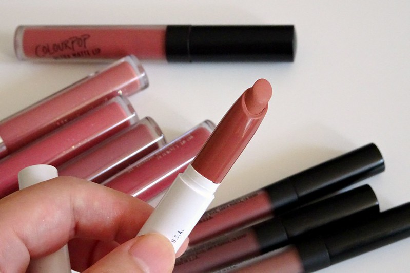
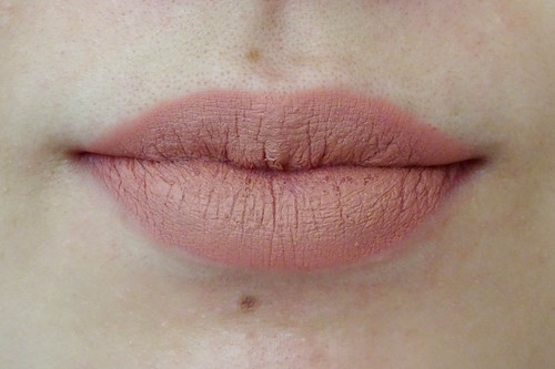
Matte X Lippie Stix in Hotline
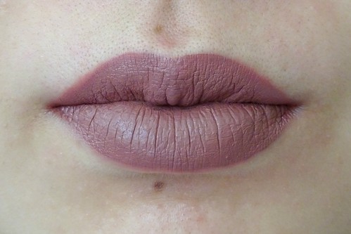
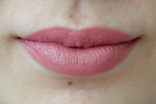
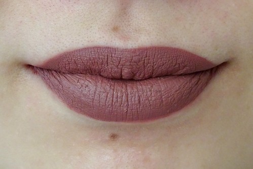
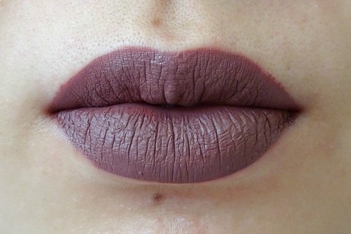
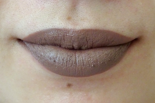
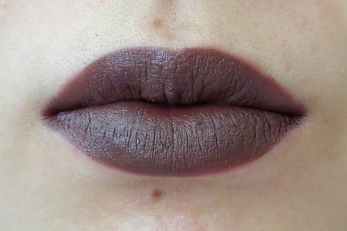
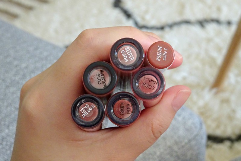
Beeper is a dark plummy brown. November is a medium warm rose pink. Wild Nothing is a deep chocolatey plum. Teeny Tiny is a darker, more purple version of Wild Nothing. Frick N' Frack is a deep, mauvey berry. Mess Around is a dark brown grey. Toolips is a blackened plum. Stud is a fractionally browner/darker Frick N' Frack. And I mean fractionally...
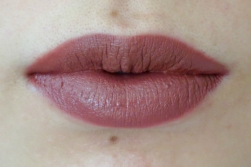
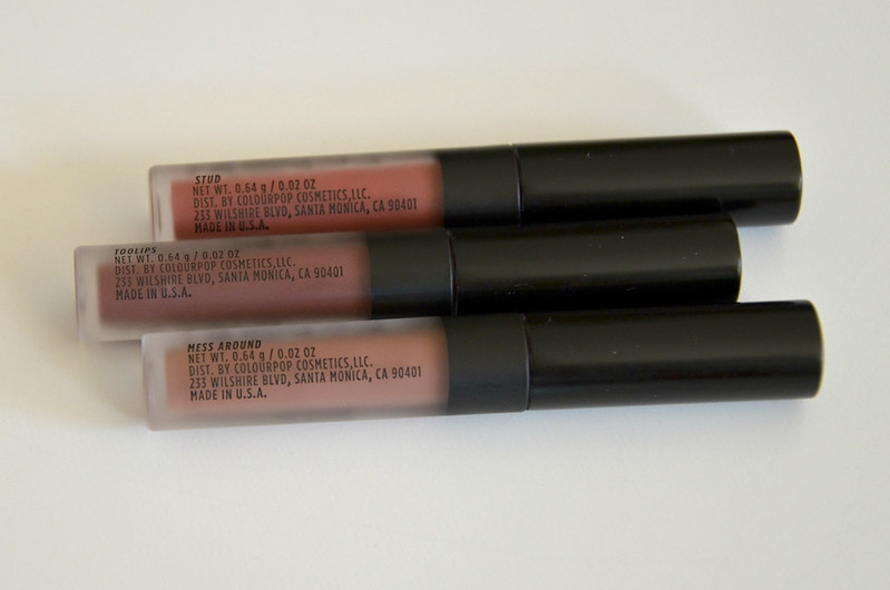
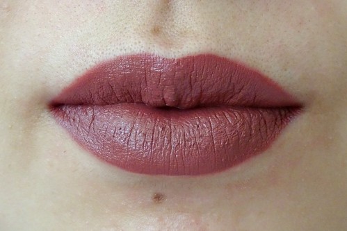
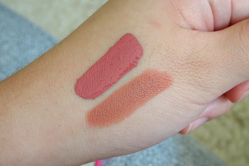
Top lip Stud, bottom lip Frick N' Frack
Come on. They're basically indistinguishable. They're both also the Ultra Satin Lip formula so not even different in finish!
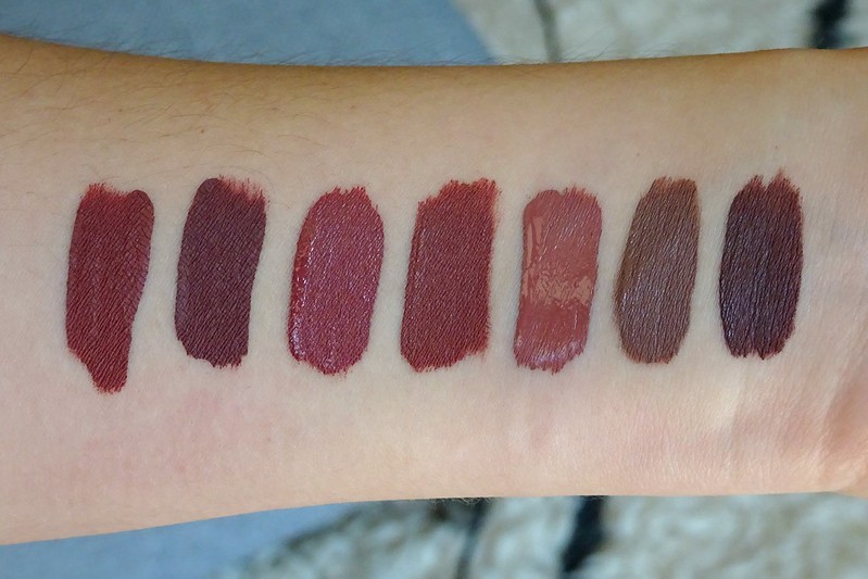
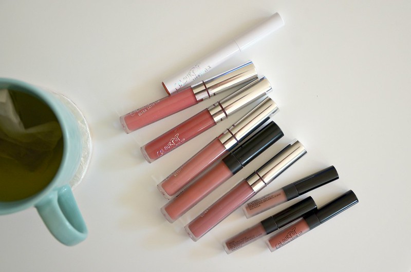
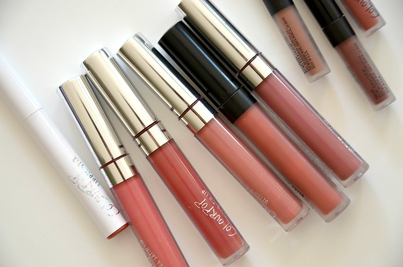
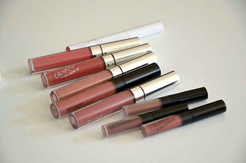
l-r: Wild Nothing, Teeny Tiny, Frick N' Frack, Stud, Beeper, Mess Around, Toolips
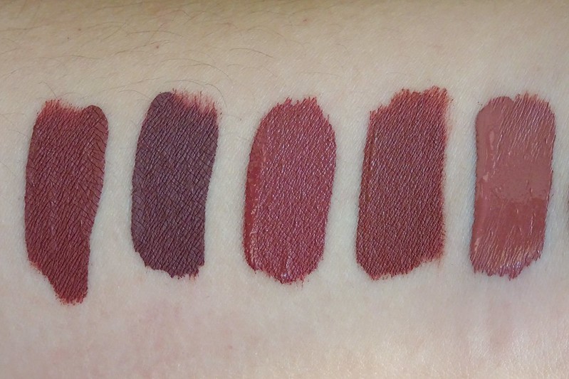
l-r: Wild Nothing (UML), Teeny Tiny (UML), Frick N' Frack (USL), Stud (USL), Beeper (UML)
Here we can see just how similar these colours are. Sure, Teeny Tiny is more purply and darker than the rest, Beeper is a bit lighter, Wild Nothing is perhaps a touch deeper and browner than the redder Frick N' Frack and Stud, but the differences aren't enough to justify half of these shades being separate and distinct. You'd hope that a brand would consciously avoid having dupes or near dupes within their own collection, but maybe Colourpop has other priorities.
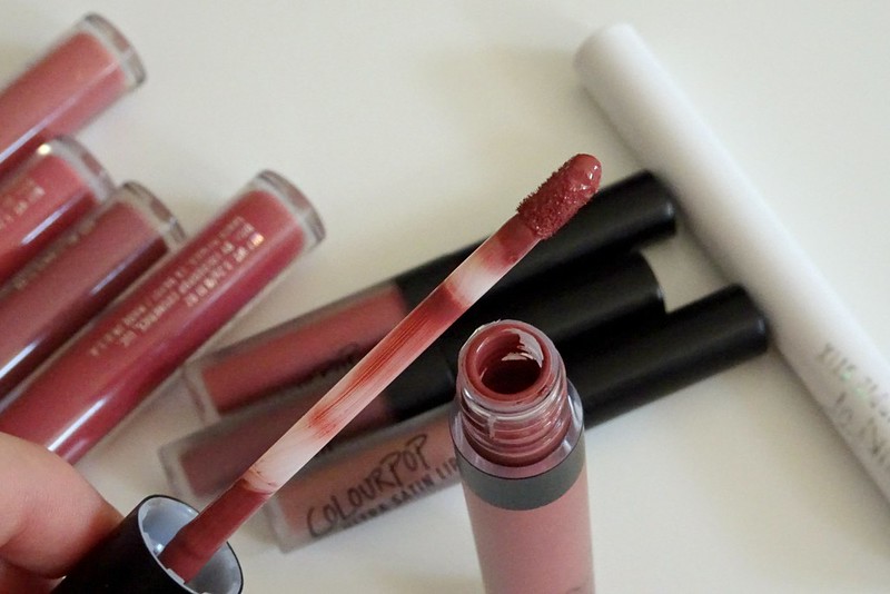
This was also my first time trying out the Ultra Satin Lip formula. I find them a lot more comfortable to wear than the Ultra Matte Lips which are drying and suck all the moisture from your lips. The fluffier applicator on the USL is noticeably more plush and cushiony than the UML which feels harder and not as giving, perhaps to facilitate a harsher, more precise edge. The Ultra Satin Lip dries down to a more matte finish anyway, so they just feel like a more moisturising version of their Ultra Matte Lip. I find the Ultra Matte Lip colours fare better with a coat of lip balm underneath, an initial layer of product that's dabbed on with the fingers, then a second coat applied the same way after the first has dried. This helps create a more even finish and gets around needing a super precise application. If given the choice, I would abandon the Ultra Matte Lip in favour of the Ultra Satin Lip for any future purchases.
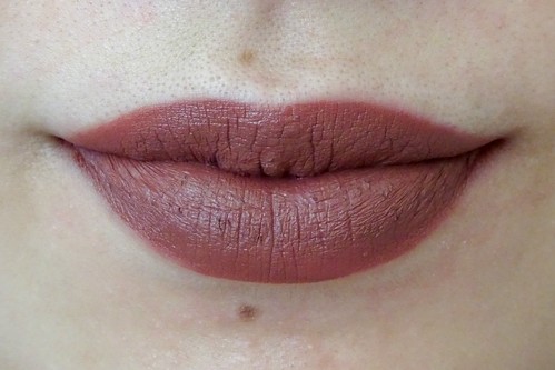
Top to bottom: November, Hotline
The Matte X Lippie Stix was pretty much what I was expecting: a full coverage but lightweight, extremely matte lipstick. I bought Hotline after seeing this blog post because it looked so perfect on the blogger. It's not as love-at-first-sight on me, but it's a nicely done warm peachy nude. Probably what I'd hoped Revlon Matte lipstick in Smoked Peach would be. Reminds me of a more orange, lighter Wet n Wild MegaLast Lip Color in Bare It All or Maybelline Color Drama Intense Velvet Lip Pencil in Nude Perfection.
I was kind of excited for November since it's distinctly not like the other vampy shades and I do like KathleenLights. But I think it's a bit too syrupy for me? There's something simultaneously neon yet old-fashioned about it. Not the hugest fan, but could work if not at 100% opacity.
Once again, I'm not particularly thrilled with Colourpop (see previous posts here and here). I do stand by what I said before, which is they're a good place to go if you want to try out trendy, daring, bold, fun shades at an affordable price point. I mean, I'm probably never going to wear Toolips or Mess Around out, but at least the option's there and I've seen what they look like on. I also give them props for making colours that look great on darker skin tones. But I was majorly annoyed by 2 things with this latest batch of products. These observations seem to be more a criticism of their business model than the quality of their products per se.
First, not every consumer will be bothered or savvy enough to properly research the colour accuracy of their shades. If they purchase, like my friend, based upon photographs of the products on the Colourpop website, they will be sorely disappointed. The colour in the tube isn't the colour on the lips, and that's a problem. See for example, reviews on Frick N' Frack and Toolips respectively:
One complaint is that Frick N Frack (and pretty much all ColourPop's lipsticks) look much darker in reality than in their pictures. I'm giving 4/5 because I think it's beautiful, but they need to be more honest with their pictures, because it does disappoint some people. For example, I would rather have a lip colour like the picture than the actual frick n frack but it's still beautiful (oh_yeez_itzz_kylizzle on Nov 7, 2016)
I was super excited about this beautiful fall/winter color, but ended up being disappoint with how dark it turned out. It turned out to be dark brown when applied and even was mistaken to be a black lipstick by my friends. However, the color does last without rubbing off for almost the whole day. Just was not what I was expecting from the pictures. (Sav on Oct 27, 2016)Yes, they do have swatches on their website as well, but when you have so many colours in your range, it would be much more helpful if similar-appearing colours were swatched together (a la Makeup Geek eyeshadows), rather than disparate shades in a "collection". That way, at least people have a chance at avoiding duplicate colours, or at least will be more aware of the differences, no matter how small.
Secondly, I don't think a company should be producing nearly identical colours like Frick N' Frack and Stud under different names in the first place. The fact that those two shades, plus Wild Nothing, Beeper and Teeny Tiny were just so similar, leaves a very bad taste in my mouth. Sure, no one put a gun to anyone's head to buy them all, but you'd hope if you bought FIVE different colours, they'd at least have some point of difference on the lips to not make it all feel like a massive waste of money. This coming from someone with a gazillion same pink lipsticks and bronze eyeshadows.
A third minor complaint I have is the lettering on the packaging of their products fades unbelievably quickly. I'm talking in a matter of days with ordinary handling, or after a single trip in the handbag. What's the point?
I think Colourpop could be so much better if they sorted their shit out. I haven't experienced any of these issues with any other brand. Perhaps these problems arise because they favour pushing out fresh new product even if the formulas, shades or aspects of packaging aren't perfected. Having said all that, somehow I've accumulated a sizeable collection of their stuff even though I'm not super happy with most of it. I guess they must be doing something right.


