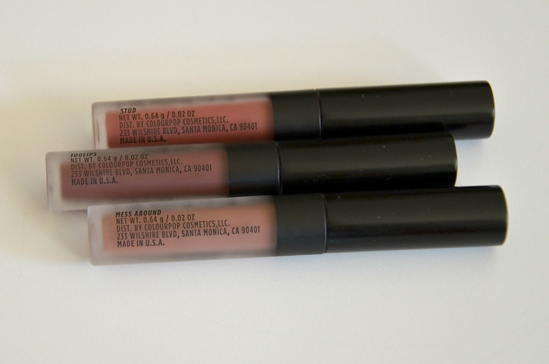
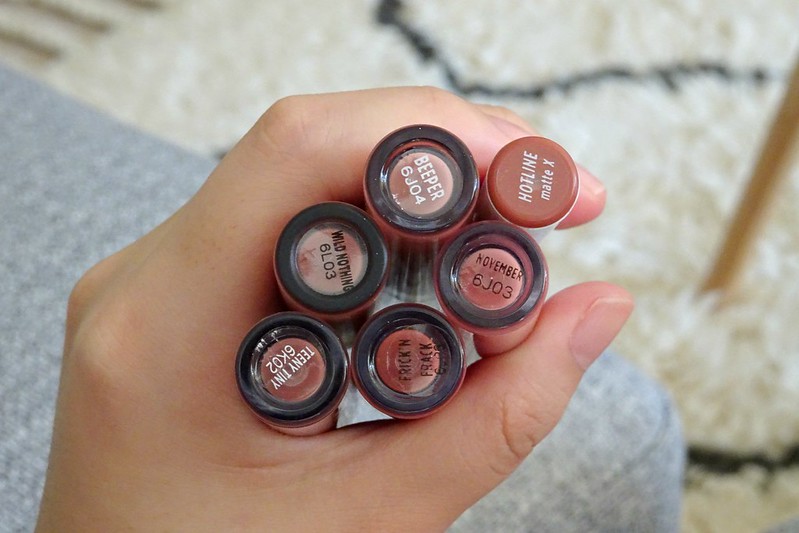
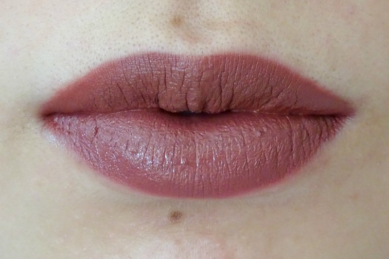
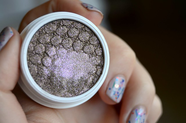
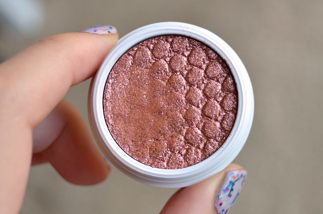
I have to admit I've been following the Jaclyn Cosmetics lipstick drama a little too closely (like, watched all the YouTube videos, read all the Twitter and reddit threads, you name it). Whatever your conclusions might be, the whole thing has inspired me to revisit lipsticks. Jaclyn Hill claims lipsticks were her first makeup love and that much I share with her. If you read this blog, you'll know ― I love lipsticks! I've gone off them the past couple of years as my general interest in makeup has waned, but the 80+ tubes I have lying around at home are a testament to my past obsession. My most recent proper lipstick purchase was sometime late last year, when I ordered Colourpop Lux Lipstick in Quickie. The creamy but pigmented formula and the peachy nude shade is what I imagine Jaclyn Cosmetics could be ... though at this rate I most likely will never find out with all the issues with the launch and the exorbitant international shipping cost.
Colourpop is a company that continues to suck me in, though I haven't been thrilled with most of what I've ordered from them. These Lux Lipsticks however, from my experience with Quickie, could be a turning point (or a firm hit among a sea of 'meh' and misses). First, the price point is great, as always. I ordered mine for $6 USD, though I just looked at their website and they're $7.50 now (when did that happen?). That's a 25% price hike ... which while still affordable, seems like a big increase.
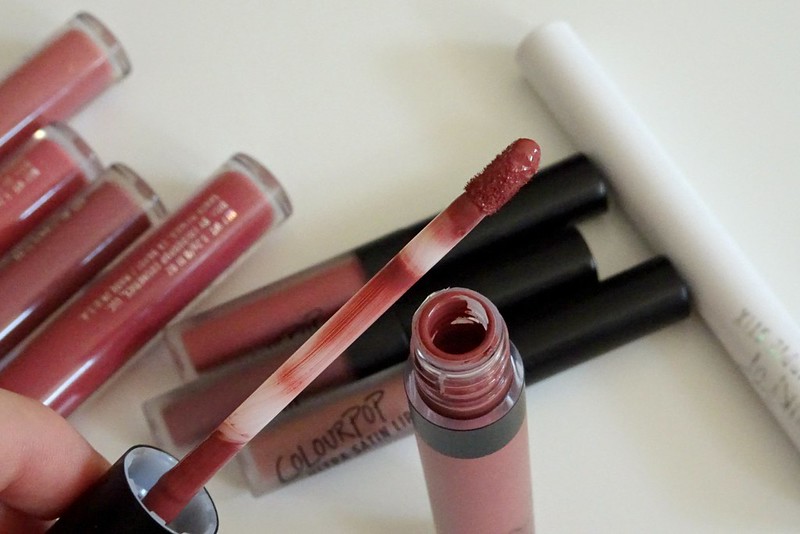
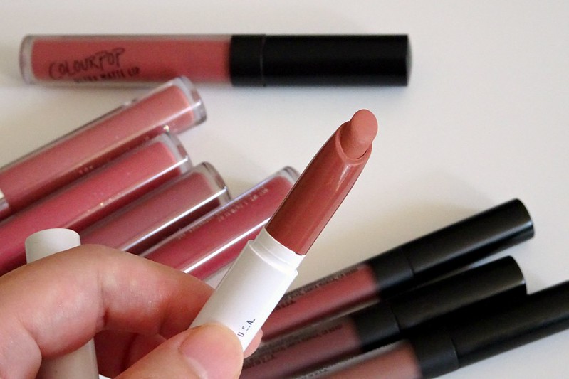
Having said that, if I found a colour that I particularly liked and thought would be flattering on me, I'd have no problem paying $7.50 USD for one Lux Lipstick (though I usually order when they have a free international shipping promotion or when I have enough I want to buy to qualify for free shipping). The packaging is absolutely beautiful and the lipstick component feels well made and not cheap or poor quality. I have to admit the first thing I thought of when I saw the rose gold exterior and star motif was Charlotte Tilbury, but hey, even if a blatant rip off, it unquestionably works to make the thing aesthetically pleasing. The formulation is opaque, not too drying, and creamy without being overly thick. It reminds me a bit of MAC Amplified finish. It's a satin finish with decent lasting power so long as you're not eating/drinking constantly. This particular shade does have a tendency to settle into lip lines and look almost too pigmented when freshly applied, but after a while when it wears off slightly, the problem solves itself and the lipstick looks more natural and evenly applied.
The only thing that prevents me from LOVING the lipstick is the colour. It's a touch too light and pastel for my skin tone. It's one of those lipsticks that makes your teeth look more yellow when you smile. It washes my complexion out and is more a nude lipstick to complement a particular makeup look, as opposed to something you slap on without much thought to add a flattering colour to your lips. I would've loved this shade a few years ago when I was crazy about pastels and peach, but I've evolved, learned from my mistakes, and know better. Now, I prefer something a tad darker, with more of a brownish nude/rose slant. Basically, if Colourpop could please dupe NYX Soft Matte Lip Cream in Abu Dhabi in Lux Lipstick form, my search would be over.
Showing posts with label colourpop. Show all posts
Showing posts with label colourpop. Show all posts
Sunday, June 16, 2019
Thursday, January 26, 2017
Current Makeup Menu #2
I was contemplating doing a "Best of 2016" post, but ultimately decided against it as I had no clue what would be on the list. I didn't blog for 3 months and averaged about 2 posts a month, so my engagement with makeup and product discoveries were all a bit plodding and piecemeal. Usually I look back on what I blogged about to get a sense of the stuff I enjoyed in the past year, but nothing stood out to me when I reviewed what I'd written about. Rather than force the issue, I thought I'd do a current makeup loves post instead. On that topic, I do have something to say.
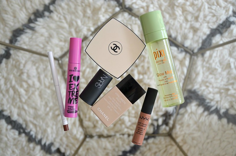
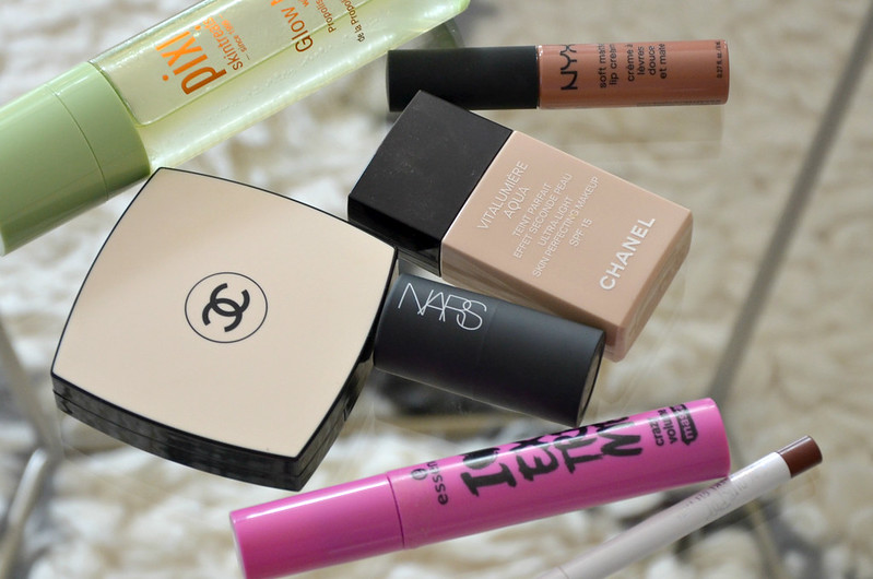
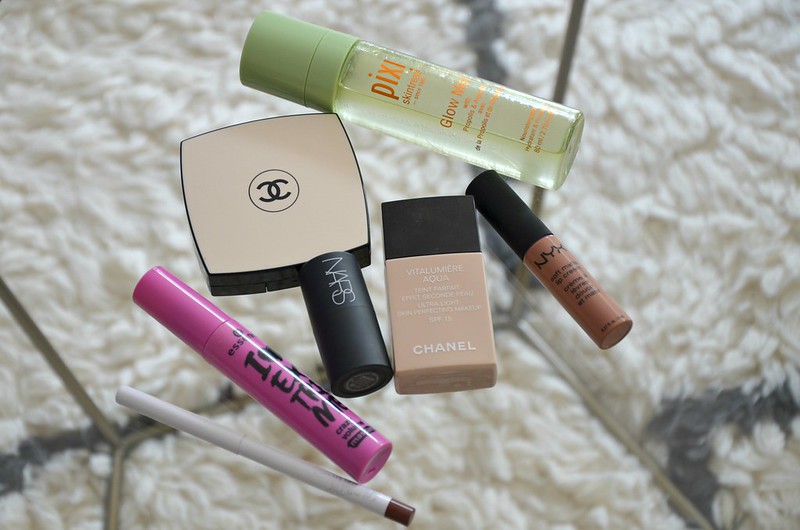
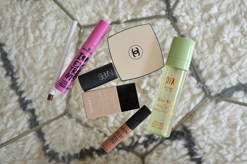
I've switched back to Chanel Vitalumiere Aqua after persevering quite joylessly with Dior BB Creme. I forgot what an absolutely incredible foundation this is. It's in my top 3 all-time favourites alongside NARS Sheer Glow and YSL Le Teint Touche Eclat. Definitely a better summer foundation than for the colder months (the YSL is better for winter as it's more hydrating/forgiving), but I haven't experienced any issues with it highlighting dry patches as I have occasionally in the past. Could just be my skin's in decent condition at the moment. Not too dry, not too oily, more or less unblemished (knock on wood). With an unproblematic canvas, Vitalumiere Aqua works super well. It's immediately flattering but believable. Makes the skin look softly luminous, lifted, more plump and youthful. It blends in effortlessly, never sitting on top of the skin, and doesn't ever look too heavy or obvious. Just a high quality, high performing foundation that I must remember to repurchase when I run out.
I've also been turning to Chanel Les Beiges Healthy Glow Sheer Powder to set my face with my Wayne Goss Brush 00. Previously I didn't think it did much, but I probably was just using it all wrong. I find the key is not using too much product, finding the right brush, and applying only a light, thin layer. It takes down unwanted shine a notch or two without totally mattifying the skin, and minimises the need to blot my face down the track (I still do it, but less product comes off). I like that it's undetectable on the skin and doesn't weigh it down with the appearance of a powder caked on top.
Pixi Glow Mist is a product I've been meaning to try for ages, especially after hearing it being compared with Tatcha Dewy Skin Face Mist, the price of which I could never justify, never mind it's not even sold in Australia. (Seriously, $48 USD or $70 for 40ml of liquid you spritz on your face for fun. Can't do it.) To me, the main things I look out for in a mist are a) if it feels good on the skin, i.e. isn't noticeably drying, irritating or otherwise uncomfortable b) if it does the job, i.e. makes my makeup look fresher and my complexion dewier if I've overdone it with the powders or my foundation's too matte/flat c) if there are any ingredients I should be wary of, like alcohol or menthol. Glow Mist ticks all the boxes, plus it was a far more affordable price point for double the amount you get in the Tatcha at 80ml (I bought it in a pack with Glow Tonic on sale from ASOS for about $45).
I've heard good things about Essence I Love Extreme Crazy Volume Mascara (especially from ozproductjunkie), so I purchased a tube during one of Priceline's 40% off cosmetics sales. I finally opened mine up a few weeks ago, and I really like it. It reminds me so much of Benefit They're Real, but is a fraction of the price. The wand, formula, application and effect are very similar. My only minor gripe is that it could do a better job at getting to the outer lashes, but I can overlook that shortcoming since it does everything else so well for being so affordable. I honestly don't know why I'd buy any other mascara from now on when this is $5.75 and so effective. As its name suggests, it builds up lots of thickness and volume in the lashes, without looking too spidery and clumpy. Separation is good, curl is good, lasting power is great and it does a good job on the bottom lashes as well without smudging too much throughout the day.
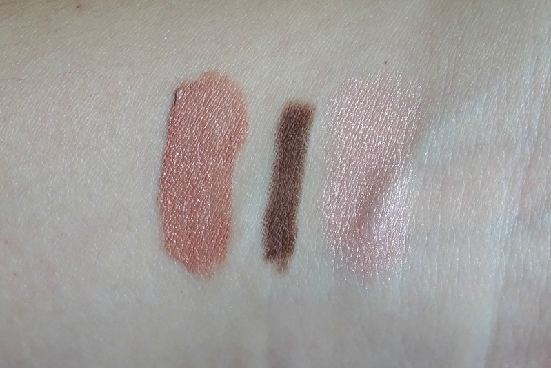
In a recent Colourpop free shipping promo, I ordered Mr. Bing Liner (a collaboration with YouTuber KathleenLights). The purchase was mainly spurred by curiosity more than anything, since Kathleen raved so much about the formula and I haven't been overly impressed with all that many pencil eyeliners I've tried. Since it arrived, I've been using this to define my lower lash line daily. I like the warm chocolately brown colour, wear time is excellent and it doesn't budge. The fine tip allows for precise application and the twist up mechanism is convenient (no pesky, wasteful sharpening ever!). The formula isn't completely soft and gel-like, but it's not totally dry and hard either. It's a little waxy, but still has a bit of give upon contact with skin.
My friend gave me her unwanted mini of NARS The Multiple in Orgasm and I've been reaching for this as part of my "quick" makeup with minimal (for me) products. Basically using it as a substitute for Stila Convertible Colour in Gerbera in my go-to low-key makeup post (ditching the cream pot eyeshadows for my beloved KIKO Long Lasting Stick Eyeshadow and swapping pencil eyeliner for liquid felt tip eyeliner). This product is a faithful interpretation of Orgasm powder blush but in cream blush form. The golden sheen comes out a touch more than in the pressed version, but there's still that distinctive warm, translucent, corally baby pink. I literally draw on a few strokes onto my cheek and then use my fingers to blend out the edges. The lasting power isn't as good as the powder blush and you have to be a little careful so it's not patchy upon application as the formula is on the thin side but quite emollient (not greasy however). I love the small size and the fact it doesn't require a brush to use, making it super portable and ideal for travel.
Lastly, we have NYX Soft Matte Lip Cream in Abu Dhabi. To me, this is possibly the most perfect nude I've encountered. If you're light (NC 20-25) and Asian/yellow-toned, I highly recommend you seek out Abu Dhabi and try it. It's like MAC Patisserie on steroids (or the bolder, fully matte version). The only minor downside is it does settle a little bit in the lip lines, but I usually just rub the product in with my finger or blot with a tissue or the back of my hand. The lasting power isn't amazing, but perhaps to be expected for a light MLLB colour. I couldn't find this shade individually to purchase in any Priceline or Target, so I had to buy it in a set called "The Nudes" with Simply Nude Lip Cream in Sable and Intense Butter Gloss in Chocolate Crepe. Worth it.
I've switched back to Chanel Vitalumiere Aqua after persevering quite joylessly with Dior BB Creme. I forgot what an absolutely incredible foundation this is. It's in my top 3 all-time favourites alongside NARS Sheer Glow and YSL Le Teint Touche Eclat. Definitely a better summer foundation than for the colder months (the YSL is better for winter as it's more hydrating/forgiving), but I haven't experienced any issues with it highlighting dry patches as I have occasionally in the past. Could just be my skin's in decent condition at the moment. Not too dry, not too oily, more or less unblemished (knock on wood). With an unproblematic canvas, Vitalumiere Aqua works super well. It's immediately flattering but believable. Makes the skin look softly luminous, lifted, more plump and youthful. It blends in effortlessly, never sitting on top of the skin, and doesn't ever look too heavy or obvious. Just a high quality, high performing foundation that I must remember to repurchase when I run out.
I've also been turning to Chanel Les Beiges Healthy Glow Sheer Powder to set my face with my Wayne Goss Brush 00. Previously I didn't think it did much, but I probably was just using it all wrong. I find the key is not using too much product, finding the right brush, and applying only a light, thin layer. It takes down unwanted shine a notch or two without totally mattifying the skin, and minimises the need to blot my face down the track (I still do it, but less product comes off). I like that it's undetectable on the skin and doesn't weigh it down with the appearance of a powder caked on top.
Pixi Glow Mist is a product I've been meaning to try for ages, especially after hearing it being compared with Tatcha Dewy Skin Face Mist, the price of which I could never justify, never mind it's not even sold in Australia. (Seriously, $48 USD or $70 for 40ml of liquid you spritz on your face for fun. Can't do it.) To me, the main things I look out for in a mist are a) if it feels good on the skin, i.e. isn't noticeably drying, irritating or otherwise uncomfortable b) if it does the job, i.e. makes my makeup look fresher and my complexion dewier if I've overdone it with the powders or my foundation's too matte/flat c) if there are any ingredients I should be wary of, like alcohol or menthol. Glow Mist ticks all the boxes, plus it was a far more affordable price point for double the amount you get in the Tatcha at 80ml (I bought it in a pack with Glow Tonic on sale from ASOS for about $45).
I've heard good things about Essence I Love Extreme Crazy Volume Mascara (especially from ozproductjunkie), so I purchased a tube during one of Priceline's 40% off cosmetics sales. I finally opened mine up a few weeks ago, and I really like it. It reminds me so much of Benefit They're Real, but is a fraction of the price. The wand, formula, application and effect are very similar. My only minor gripe is that it could do a better job at getting to the outer lashes, but I can overlook that shortcoming since it does everything else so well for being so affordable. I honestly don't know why I'd buy any other mascara from now on when this is $5.75 and so effective. As its name suggests, it builds up lots of thickness and volume in the lashes, without looking too spidery and clumpy. Separation is good, curl is good, lasting power is great and it does a good job on the bottom lashes as well without smudging too much throughout the day.
In a recent Colourpop free shipping promo, I ordered Mr. Bing Liner (a collaboration with YouTuber KathleenLights). The purchase was mainly spurred by curiosity more than anything, since Kathleen raved so much about the formula and I haven't been overly impressed with all that many pencil eyeliners I've tried. Since it arrived, I've been using this to define my lower lash line daily. I like the warm chocolately brown colour, wear time is excellent and it doesn't budge. The fine tip allows for precise application and the twist up mechanism is convenient (no pesky, wasteful sharpening ever!). The formula isn't completely soft and gel-like, but it's not totally dry and hard either. It's a little waxy, but still has a bit of give upon contact with skin.
l-r: NYX Abu Dhabi, Colourpop Mr. Bing, NARS The Multiple in Orgasm
My friend gave me her unwanted mini of NARS The Multiple in Orgasm and I've been reaching for this as part of my "quick" makeup with minimal (for me) products. Basically using it as a substitute for Stila Convertible Colour in Gerbera in my go-to low-key makeup post (ditching the cream pot eyeshadows for my beloved KIKO Long Lasting Stick Eyeshadow and swapping pencil eyeliner for liquid felt tip eyeliner). This product is a faithful interpretation of Orgasm powder blush but in cream blush form. The golden sheen comes out a touch more than in the pressed version, but there's still that distinctive warm, translucent, corally baby pink. I literally draw on a few strokes onto my cheek and then use my fingers to blend out the edges. The lasting power isn't as good as the powder blush and you have to be a little careful so it's not patchy upon application as the formula is on the thin side but quite emollient (not greasy however). I love the small size and the fact it doesn't require a brush to use, making it super portable and ideal for travel.
Lastly, we have NYX Soft Matte Lip Cream in Abu Dhabi. To me, this is possibly the most perfect nude I've encountered. If you're light (NC 20-25) and Asian/yellow-toned, I highly recommend you seek out Abu Dhabi and try it. It's like MAC Patisserie on steroids (or the bolder, fully matte version). The only minor downside is it does settle a little bit in the lip lines, but I usually just rub the product in with my finger or blot with a tissue or the back of my hand. The lasting power isn't amazing, but perhaps to be expected for a light MLLB colour. I couldn't find this shade individually to purchase in any Priceline or Target, so I had to buy it in a set called "The Nudes" with Simply Nude Lip Cream in Sable and Intense Butter Gloss in Chocolate Crepe. Worth it.
Sunday, December 4, 2016
Colourpop Lip Haul (+ Rant)
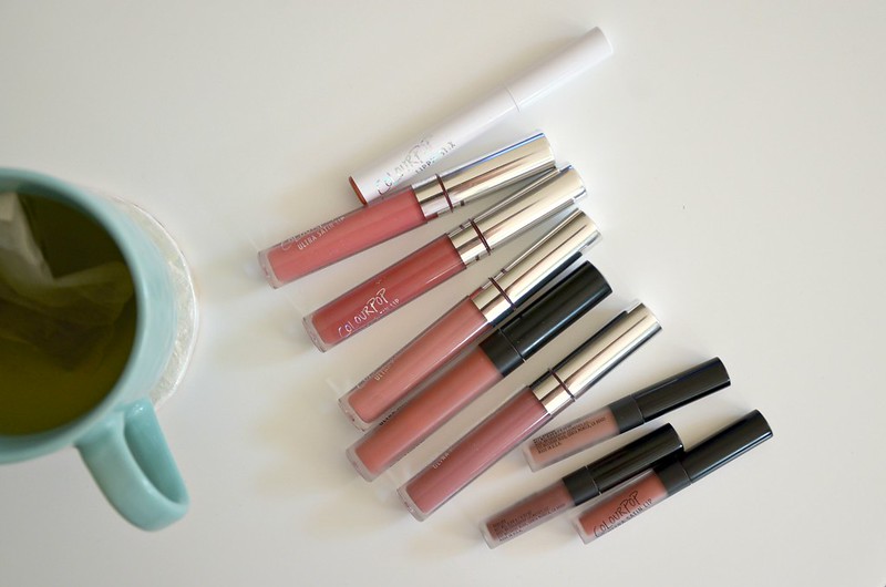
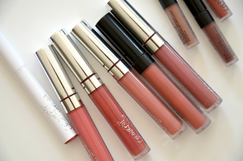
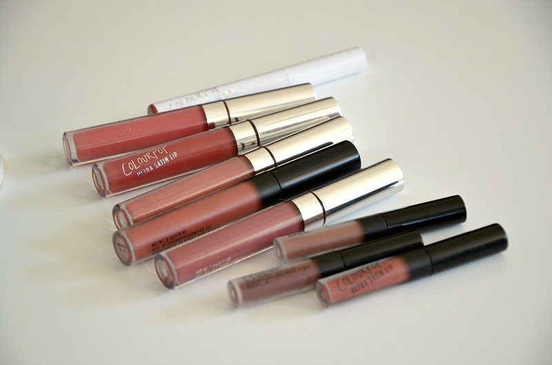
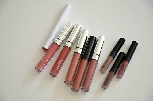
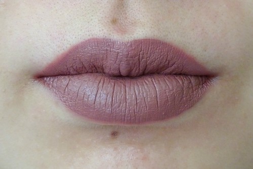
Colourpop recently had free international shipping, so I caved and put in a modest order. My friend however, showed no such restraint, and ordered 18 lip products. That's right, 18. She chucked whatever took her fancy into her cart without the requisite, thorough research us beauty bloggers might do, and based her choices purely on the product photos on the Colourpop website. BIG MISTAKE. When the goods arrived, it didn't take long to realise many of the colours on the lips were much deeper than how they appeared in the tube. Soon I found myself the beneficiary of some of her discarded shades: Ultra Matte Lips (UML) in Beeper, Wild Nothing and Teeny Tiny, Ultra Satin Lips (USL) in Frick N' Frack and November, and mini USLs in Stud, Mess Around and Toolips. In my own order, I bought just Matte X Lippie Stix in Hotline because I'd heard raves about the Matte X formula.
Colourpop lip haul, Beeper
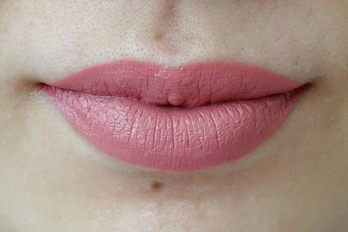
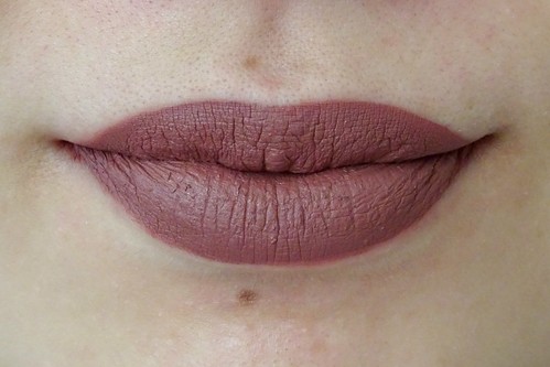
November, Wild Nothing
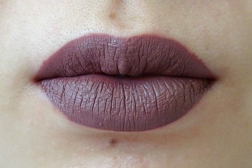
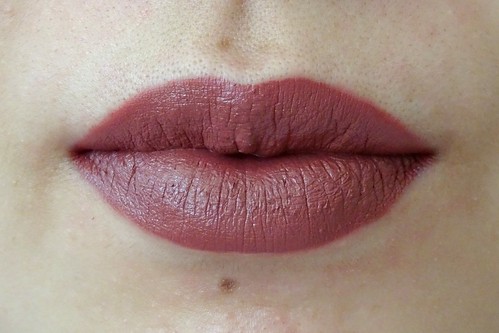
Teeny Tiny, Frick N' Frack
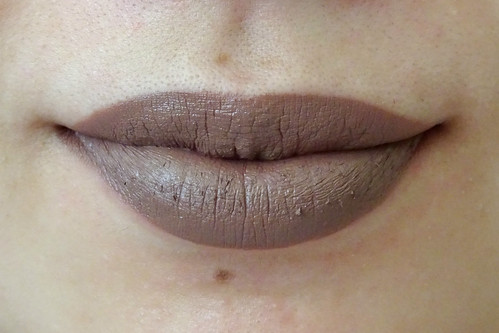
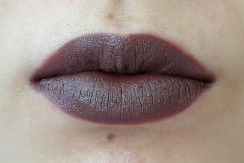
Mess Around, Toolips
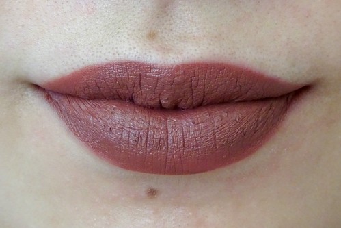
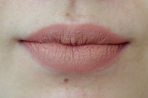
Stud, Hotline
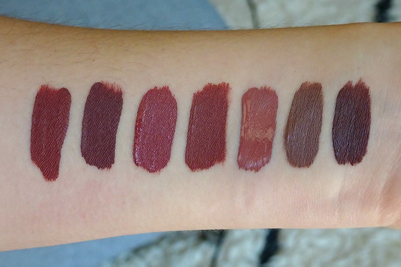
Beeper is a dark plummy brown. November is a medium warm rose pink. Wild Nothing is a deep chocolatey plum. Teeny Tiny is a darker, more purple version of Wild Nothing. Frick N' Frack is a deep, mauvey berry. Mess Around is a dark brown grey. Toolips is a blackened plum. Stud is a fractionally browner/darker Frick N' Frack. And I mean fractionally...
Come on. They're basically indistinguishable. They're both also the Ultra Satin Lip formula so not even different in finish!
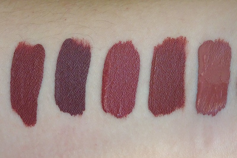
Here we can see just how similar these colours are. Sure, Teeny Tiny is more purply and darker than the rest, Beeper is a bit lighter, Wild Nothing is perhaps a touch deeper and browner than the redder Frick N' Frack and Stud, but the differences aren't enough to justify half of these shades being separate and distinct. You'd hope that a brand would consciously avoid having dupes or near dupes within their own collection, but maybe Colourpop has other priorities.
This was also my first time trying out the Ultra Satin Lip formula. I find them a lot more comfortable to wear than the Ultra Matte Lips which are drying and suck all the moisture from your lips. The fluffier applicator on the USL is noticeably more plush and cushiony than the UML which feels harder and not as giving, perhaps to facilitate a harsher, more precise edge. The Ultra Satin Lip dries down to a more matte finish anyway, so they just feel like a more moisturising version of their Ultra Matte Lip. I find the Ultra Matte Lip colours fare better with a coat of lip balm underneath, an initial layer of product that's dabbed on with the fingers, then a second coat applied the same way after the first has dried. This helps create a more even finish and gets around needing a super precise application. If given the choice, I would abandon the Ultra Matte Lip in favour of the Ultra Satin Lip for any future purchases.
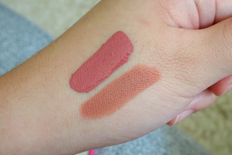
The Matte X Lippie Stix was pretty much what I was expecting: a full coverage but lightweight, extremely matte lipstick. I bought Hotline after seeing this blog post because it looked so perfect on the blogger. It's not as love-at-first-sight on me, but it's a nicely done warm peachy nude. Probably what I'd hoped Revlon Matte lipstick in Smoked Peach would be. Reminds me of a more orange, lighter Wet n Wild MegaLast Lip Color in Bare It All or Maybelline Color Drama Intense Velvet Lip Pencil in Nude Perfection.
I was kind of excited for November since it's distinctly not like the other vampy shades and I do like KathleenLights. But I think it's a bit too syrupy for me? There's something simultaneously neon yet old-fashioned about it. Not the hugest fan, but could work if not at 100% opacity.
Once again, I'm not particularly thrilled with Colourpop (see previous posts here and here). I do stand by what I said before, which is they're a good place to go if you want to try out trendy, daring, bold, fun shades at an affordable price point. I mean, I'm probably never going to wear Toolips or Mess Around out, but at least the option's there and I've seen what they look like on. I also give them props for making colours that look great on darker skin tones. But I was majorly annoyed by 2 things with this latest batch of products. These observations seem to be more a criticism of their business model than the quality of their products per se.
First, not every consumer will be bothered or savvy enough to properly research the colour accuracy of their shades. If they purchase, like my friend, based upon photographs of the products on the Colourpop website, they will be sorely disappointed. The colour in the tube isn't the colour on the lips, and that's a problem. See for example, reviews on Frick N' Frack and Toolips respectively:
Secondly, I don't think a company should be producing nearly identical colours like Frick N' Frack and Stud under different names in the first place. The fact that those two shades, plus Wild Nothing, Beeper and Teeny Tiny were just so similar, leaves a very bad taste in my mouth. Sure, no one put a gun to anyone's head to buy them all, but you'd hope if you bought FIVE different colours, they'd at least have some point of difference on the lips to not make it all feel like a massive waste of money. This coming from someone with a gazillion same pink lipsticks and bronze eyeshadows.
A third minor complaint I have is the lettering on the packaging of their products fades unbelievably quickly. I'm talking in a matter of days with ordinary handling, or after a single trip in the handbag. What's the point?
I think Colourpop could be so much better if they sorted their shit out. I haven't experienced any of these issues with any other brand. Perhaps these problems arise because they favour pushing out fresh new product even if the formulas, shades or aspects of packaging aren't perfected. Having said all that, somehow I've accumulated a sizeable collection of their stuff even though I'm not super happy with most of it. I guess they must be doing something right.
Matte X Lippie Stix in Hotline


Beeper is a dark plummy brown. November is a medium warm rose pink. Wild Nothing is a deep chocolatey plum. Teeny Tiny is a darker, more purple version of Wild Nothing. Frick N' Frack is a deep, mauvey berry. Mess Around is a dark brown grey. Toolips is a blackened plum. Stud is a fractionally browner/darker Frick N' Frack. And I mean fractionally...
Top lip Stud, bottom lip Frick N' Frack
Come on. They're basically indistinguishable. They're both also the Ultra Satin Lip formula so not even different in finish!
l-r: Wild Nothing, Teeny Tiny, Frick N' Frack, Stud, Beeper, Mess Around, Toolips
l-r: Wild Nothing (UML), Teeny Tiny (UML), Frick N' Frack (USL), Stud (USL), Beeper (UML)
Here we can see just how similar these colours are. Sure, Teeny Tiny is more purply and darker than the rest, Beeper is a bit lighter, Wild Nothing is perhaps a touch deeper and browner than the redder Frick N' Frack and Stud, but the differences aren't enough to justify half of these shades being separate and distinct. You'd hope that a brand would consciously avoid having dupes or near dupes within their own collection, but maybe Colourpop has other priorities.
This was also my first time trying out the Ultra Satin Lip formula. I find them a lot more comfortable to wear than the Ultra Matte Lips which are drying and suck all the moisture from your lips. The fluffier applicator on the USL is noticeably more plush and cushiony than the UML which feels harder and not as giving, perhaps to facilitate a harsher, more precise edge. The Ultra Satin Lip dries down to a more matte finish anyway, so they just feel like a more moisturising version of their Ultra Matte Lip. I find the Ultra Matte Lip colours fare better with a coat of lip balm underneath, an initial layer of product that's dabbed on with the fingers, then a second coat applied the same way after the first has dried. This helps create a more even finish and gets around needing a super precise application. If given the choice, I would abandon the Ultra Matte Lip in favour of the Ultra Satin Lip for any future purchases.
Top to bottom: November, Hotline
The Matte X Lippie Stix was pretty much what I was expecting: a full coverage but lightweight, extremely matte lipstick. I bought Hotline after seeing this blog post because it looked so perfect on the blogger. It's not as love-at-first-sight on me, but it's a nicely done warm peachy nude. Probably what I'd hoped Revlon Matte lipstick in Smoked Peach would be. Reminds me of a more orange, lighter Wet n Wild MegaLast Lip Color in Bare It All or Maybelline Color Drama Intense Velvet Lip Pencil in Nude Perfection.
I was kind of excited for November since it's distinctly not like the other vampy shades and I do like KathleenLights. But I think it's a bit too syrupy for me? There's something simultaneously neon yet old-fashioned about it. Not the hugest fan, but could work if not at 100% opacity.
Once again, I'm not particularly thrilled with Colourpop (see previous posts here and here). I do stand by what I said before, which is they're a good place to go if you want to try out trendy, daring, bold, fun shades at an affordable price point. I mean, I'm probably never going to wear Toolips or Mess Around out, but at least the option's there and I've seen what they look like on. I also give them props for making colours that look great on darker skin tones. But I was majorly annoyed by 2 things with this latest batch of products. These observations seem to be more a criticism of their business model than the quality of their products per se.
First, not every consumer will be bothered or savvy enough to properly research the colour accuracy of their shades. If they purchase, like my friend, based upon photographs of the products on the Colourpop website, they will be sorely disappointed. The colour in the tube isn't the colour on the lips, and that's a problem. See for example, reviews on Frick N' Frack and Toolips respectively:
One complaint is that Frick N Frack (and pretty much all ColourPop's lipsticks) look much darker in reality than in their pictures. I'm giving 4/5 because I think it's beautiful, but they need to be more honest with their pictures, because it does disappoint some people. For example, I would rather have a lip colour like the picture than the actual frick n frack but it's still beautiful (oh_yeez_itzz_kylizzle on Nov 7, 2016)
I was super excited about this beautiful fall/winter color, but ended up being disappoint with how dark it turned out. It turned out to be dark brown when applied and even was mistaken to be a black lipstick by my friends. However, the color does last without rubbing off for almost the whole day. Just was not what I was expecting from the pictures. (Sav on Oct 27, 2016)Yes, they do have swatches on their website as well, but when you have so many colours in your range, it would be much more helpful if similar-appearing colours were swatched together (a la Makeup Geek eyeshadows), rather than disparate shades in a "collection". That way, at least people have a chance at avoiding duplicate colours, or at least will be more aware of the differences, no matter how small.
Secondly, I don't think a company should be producing nearly identical colours like Frick N' Frack and Stud under different names in the first place. The fact that those two shades, plus Wild Nothing, Beeper and Teeny Tiny were just so similar, leaves a very bad taste in my mouth. Sure, no one put a gun to anyone's head to buy them all, but you'd hope if you bought FIVE different colours, they'd at least have some point of difference on the lips to not make it all feel like a massive waste of money. This coming from someone with a gazillion same pink lipsticks and bronze eyeshadows.
A third minor complaint I have is the lettering on the packaging of their products fades unbelievably quickly. I'm talking in a matter of days with ordinary handling, or after a single trip in the handbag. What's the point?
I think Colourpop could be so much better if they sorted their shit out. I haven't experienced any of these issues with any other brand. Perhaps these problems arise because they favour pushing out fresh new product even if the formulas, shades or aspects of packaging aren't perfected. Having said all that, somehow I've accumulated a sizeable collection of their stuff even though I'm not super happy with most of it. I guess they must be doing something right.
Wednesday, January 20, 2016
Colourpop Continued
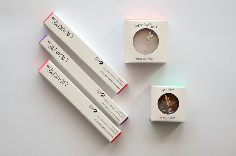
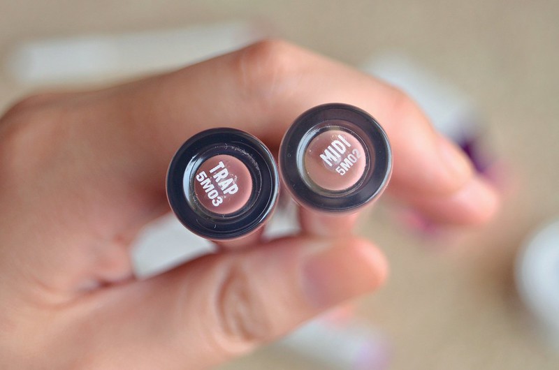
I wasn't completely thrilled with my first Colourpop order, but I thought to give the brand another try. After all, my last order consisted only of their Super Shock eyeshadows and I wanted to test out some of their lip and cheek products. If I wasn't happy with those either, then at least I'd be satisfied I gave Colourpop a good go but things just didn't work out. When they were having a $5 off promotion around Christmas (sadly shipping was still exorbitant), I finally ordered a few items on my radar: Ultra Matte Lip in Trap and Midi, Lippie Pencil in Lumière, Super Shock Cheek in Monster and Super Shock Shadow in Nillionaire.
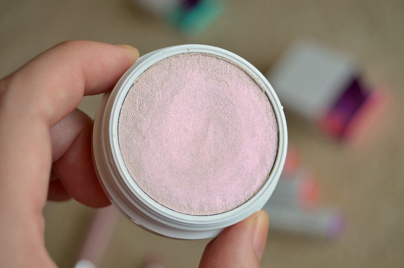
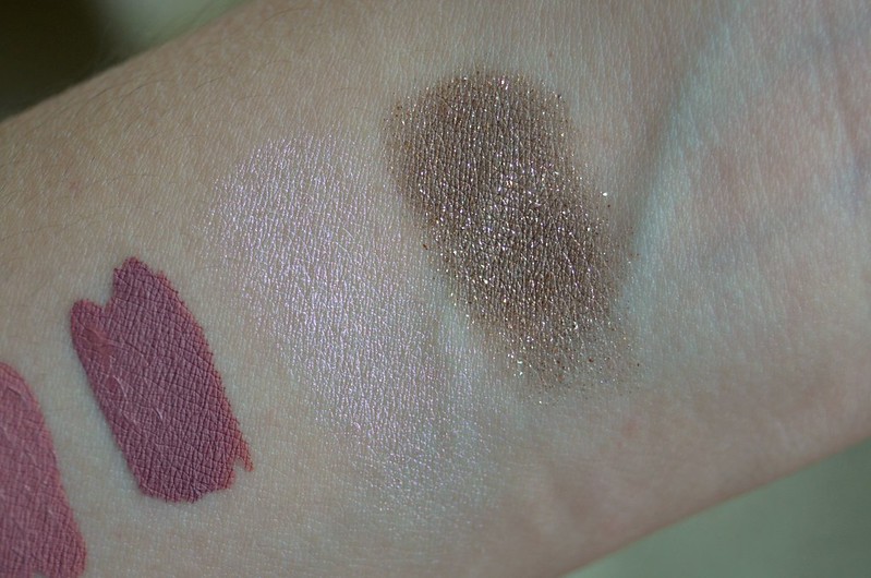
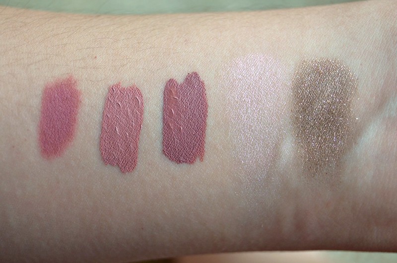
The Super Shock Cheek in Monster was probably the product I was most excited about. I remember when Colourpop first came out with highlighters, Monster was the one shade that called out to me. I'm naturally drawn to highlighters that flash an opalescent/iridescent pink or purple as I find them rarer and more special than your typical gold, champagne or frosty/whitish variety. Seeing it reviewed and mentioned a few times on auxiliary beauty only reinforced that I needed it.
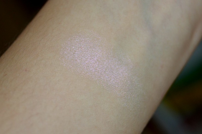
Fortunately Monster came as expected and its pronounced pinky/purple shift didn't disappoint. I can safely say I don't have anything like it in my bloated makeup collection, which is always pleasing and extra justification for purchasing. I'm still not 100% won over by the texture (very similar to their eyeshadows, if not the same) as I find it weirdly thin and emollient and capable of being blended away to nothing a bit too easily. However that same weirdly thin and emollient texture does have its benefits, like increased multipurpose use (for example, you could use Monster as an inner corner highlight, cream shadow, eyeshadow topper, or on top of lipstick for a metallic overlay or accent).
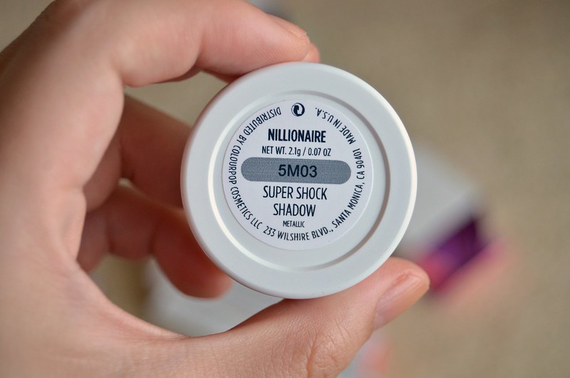
The Super Shock Shadow in Nillionaire was entirely enabled by Tiffany. This one definitely did not look as good on me as it did her. I wished it was more of a neutral-to-warm gold leaf effect, but on my lids, it looks too greyish/greenish, dull and muddy. The underlying colour is like a medium khaki taupe rather than something closer to my all-time favourite shadow, the left side of the NARS Kalahari duo. It's a typical problem I have with similar colours (think L'Oréal Infallible eyeshadow in Sahara Treasure), but clearly I never learn.
I've also concluded after trying 6 Colourpop eyeshadows that I simply dislike the texture of them. Sure, the shimmery shades have the advantage of no fall out, but you have to apply them with your finger, they need to be layered multiple times to achieve desired opacity, and any blending needs to be targeted and careful otherwise it will become a glittery mess quickly.
Moving onto the lip products. These I generally liked. I was tempted to order a single Lippie Stix (it probably would've been Tootsi) just to see what they were like, but in the end I decided to keep my cart as tight as possible.
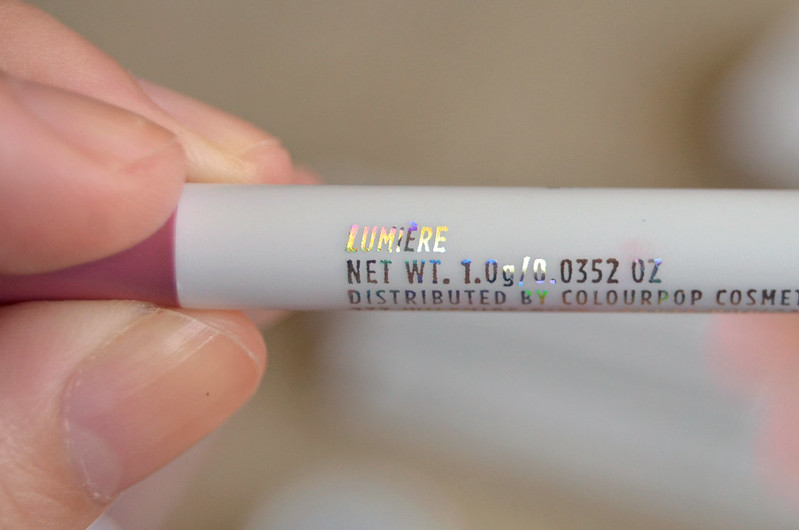
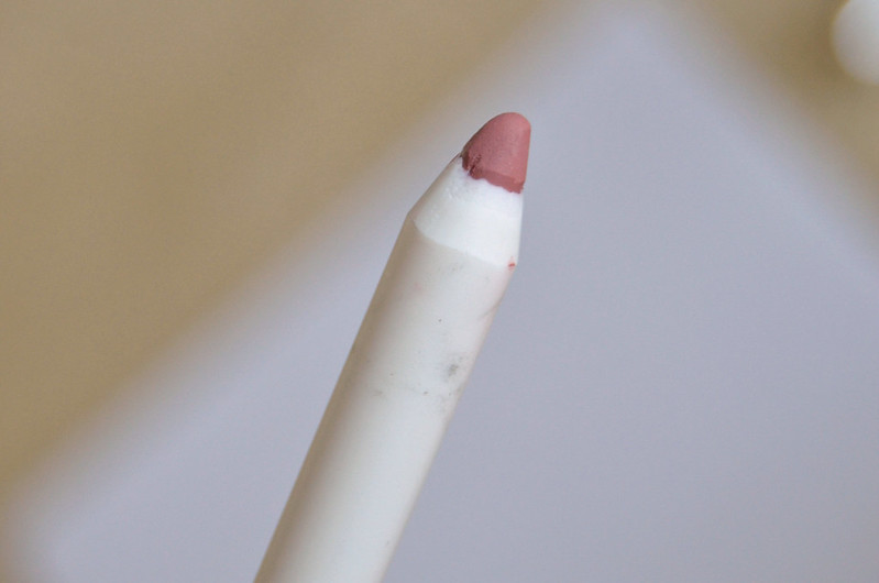
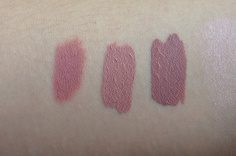
The lip liners (Lippie Pencils) tend to garner more raves than the lipsticks from reviews I've come across, so I opted for the shade made in collaboration with KathleenLights, Lumière. It looked good on her (worn in this video) and was featured in her November 2015 Favourites, plus it's been compared with NARS Audacious Lipstick in Anna, so I had high hopes. It's a great lip pencil for the price. Very pigmented, a nice texture (not too dry, not overly soft and creamy), long lasting and fairly comfortable on the lips. These kind of deeper, purply rosy mauve shades are fashionable now, so it's fun to experiment with a trendy shade without breaking the bank.
Speaking of trendy lip colour, the Ultra Matte Lip in Trap was an unabashed foray into that world. After Monster, it was the product I was most excited about (and we're talking a very close second). Trap is decidedly darker, more cool-toned and greyish than Lumière, though the two certainly have their similarities. So long as the rest of your face makeup works with it, it's a striking statement colour that isn't too out there and certainly not unflattering.
Midi is a lighter, nude, less purple version of Trap. It's warmer and more pink. I think it's super pretty, though like most nude shades, it requires a flawless base to shine, otherwise it can emphasise any areas of redness and unevenness in the complexion.
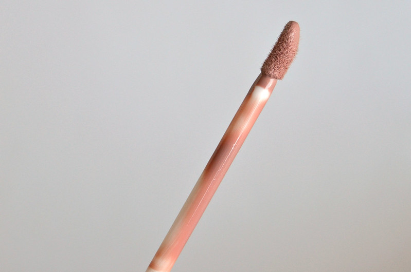
There have been comments about the formula of these liquid matte lipsticks not being the best. Personally, I don't find them too bad, though your lips do need to be in good condition (if you have dry, chapped or flaky lips, forget it). They're slightly drying, but nothing major. I didn't experience separating, cracking or flaking, though I usually don't wear a lip product for longer than 1-2 hours until I start eating and it all comes off, or I just remove it because I can't be bothered anymore and I dislike the feel of product on my lips. You can apply a lip balm or gloss over these to make them more hydrating and change the finish while retaining the colour.
Overall, this was a more successful order than my last one, mostly thanks to the lip products and Monster meeting expectations. To me, the appeal of Colourpop is its ability to deliver a huge product range with trendy, creative and more unusual shades at an affordable price point (so long as you live in the States). I'll be steering clear of the eyeshadows from now on though.
Colourpop Super Shock Cheek in Monster
The Super Shock Cheek in Monster was probably the product I was most excited about. I remember when Colourpop first came out with highlighters, Monster was the one shade that called out to me. I'm naturally drawn to highlighters that flash an opalescent/iridescent pink or purple as I find them rarer and more special than your typical gold, champagne or frosty/whitish variety. Seeing it reviewed and mentioned a few times on auxiliary beauty only reinforced that I needed it.
Fortunately Monster came as expected and its pronounced pinky/purple shift didn't disappoint. I can safely say I don't have anything like it in my bloated makeup collection, which is always pleasing and extra justification for purchasing. I'm still not 100% won over by the texture (very similar to their eyeshadows, if not the same) as I find it weirdly thin and emollient and capable of being blended away to nothing a bit too easily. However that same weirdly thin and emollient texture does have its benefits, like increased multipurpose use (for example, you could use Monster as an inner corner highlight, cream shadow, eyeshadow topper, or on top of lipstick for a metallic overlay or accent).
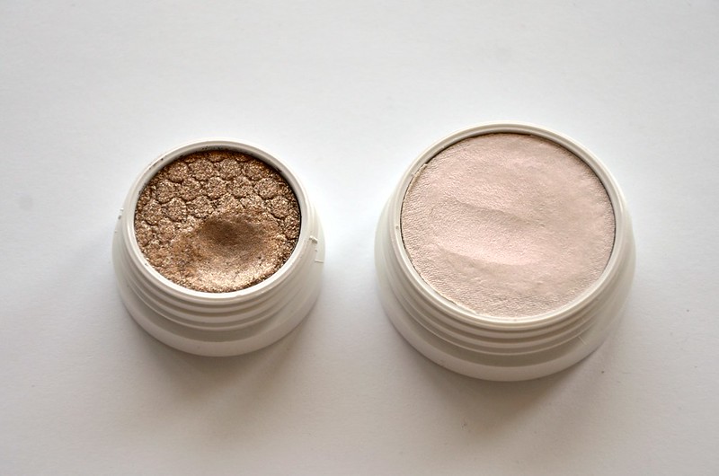
l-r: Super Shock Cheek in Monster, Super Shock Shadow in Nillionaire
The Super Shock Shadow in Nillionaire was entirely enabled by Tiffany. This one definitely did not look as good on me as it did her. I wished it was more of a neutral-to-warm gold leaf effect, but on my lids, it looks too greyish/greenish, dull and muddy. The underlying colour is like a medium khaki taupe rather than something closer to my all-time favourite shadow, the left side of the NARS Kalahari duo. It's a typical problem I have with similar colours (think L'Oréal Infallible eyeshadow in Sahara Treasure), but clearly I never learn.
I've also concluded after trying 6 Colourpop eyeshadows that I simply dislike the texture of them. Sure, the shimmery shades have the advantage of no fall out, but you have to apply them with your finger, they need to be layered multiple times to achieve desired opacity, and any blending needs to be targeted and careful otherwise it will become a glittery mess quickly.
l-r: Lippie Pencil in Lumière, Ultra Matte Lip in Midi and Trap
Moving onto the lip products. These I generally liked. I was tempted to order a single Lippie Stix (it probably would've been Tootsi) just to see what they were like, but in the end I decided to keep my cart as tight as possible.
The lip liners (Lippie Pencils) tend to garner more raves than the lipsticks from reviews I've come across, so I opted for the shade made in collaboration with KathleenLights, Lumière. It looked good on her (worn in this video) and was featured in her November 2015 Favourites, plus it's been compared with NARS Audacious Lipstick in Anna, so I had high hopes. It's a great lip pencil for the price. Very pigmented, a nice texture (not too dry, not overly soft and creamy), long lasting and fairly comfortable on the lips. These kind of deeper, purply rosy mauve shades are fashionable now, so it's fun to experiment with a trendy shade without breaking the bank.
Speaking of trendy lip colour, the Ultra Matte Lip in Trap was an unabashed foray into that world. After Monster, it was the product I was most excited about (and we're talking a very close second). Trap is decidedly darker, more cool-toned and greyish than Lumière, though the two certainly have their similarities. So long as the rest of your face makeup works with it, it's a striking statement colour that isn't too out there and certainly not unflattering.
Midi is a lighter, nude, less purple version of Trap. It's warmer and more pink. I think it's super pretty, though like most nude shades, it requires a flawless base to shine, otherwise it can emphasise any areas of redness and unevenness in the complexion.
There have been comments about the formula of these liquid matte lipsticks not being the best. Personally, I don't find them too bad, though your lips do need to be in good condition (if you have dry, chapped or flaky lips, forget it). They're slightly drying, but nothing major. I didn't experience separating, cracking or flaking, though I usually don't wear a lip product for longer than 1-2 hours until I start eating and it all comes off, or I just remove it because I can't be bothered anymore and I dislike the feel of product on my lips. You can apply a lip balm or gloss over these to make them more hydrating and change the finish while retaining the colour.
l-r: Lippie Pencil in Lumière, Ultra Matte Lip in Midi and Trap, Super Shock Cheek in Monster, Super Shock Shadow in Nillionaire
Overall, this was a more successful order than my last one, mostly thanks to the lip products and Monster meeting expectations. To me, the appeal of Colourpop is its ability to deliver a huge product range with trendy, creative and more unusual shades at an affordable price point (so long as you live in the States). I'll be steering clear of the eyeshadows from now on though.
Labels:
colourpop,
eyeshadow,
highlighter,
lip liner,
lipstick
Wednesday, May 20, 2015
ColourPop Curious
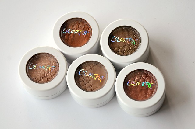
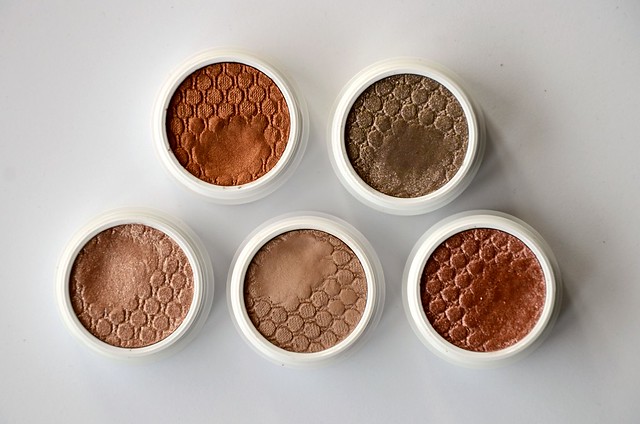
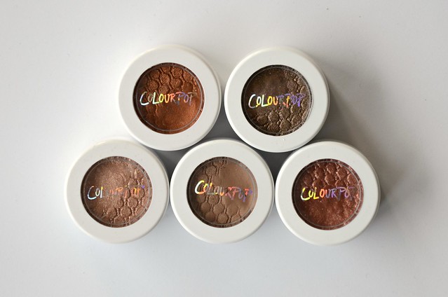
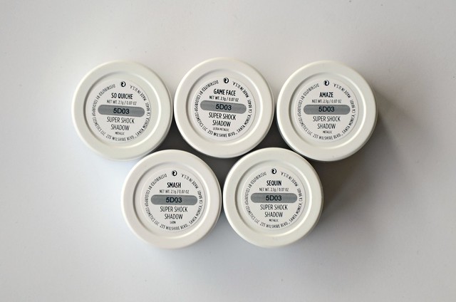
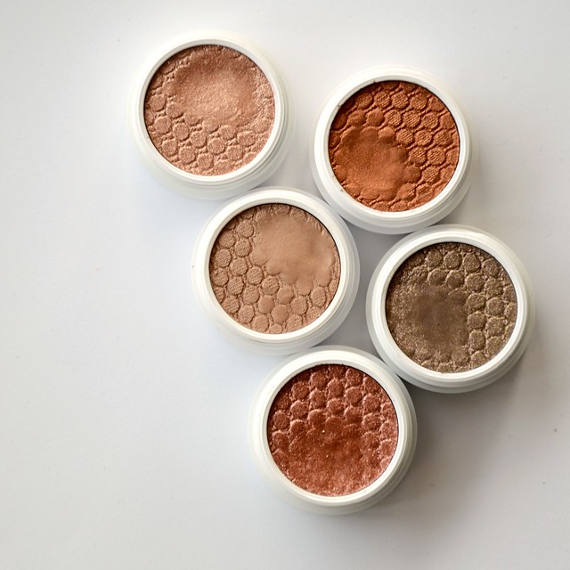
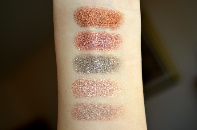
ColourPop is having a moment in the beauty world. After resisting for a while, inevitably, I reached a breaking point (probably around the time KathleenLights came out with her Where the Light Is set). I was uncharacteristically good and stuck with my self-imposed lip product ban, limiting myself to the Super Shock Shadows only. (Unfortunately, the new highlighters hadn't been released at that point, otherwise a couple definitely would've ended up in my cart.) The hardest part was of course, deciding which shades to order. After an eternity of Googling, reading blog posts and watching YouTube videos, I settled for Smash (satin), Amaze (metallic), So Quiche (metallic), Sequin (metallic) and Game Face (ultra metallic). I was contemplating Bill and Desert as well, but decided to omit both. My total order came to $43.91 USD ($58.78), of which a large chunk (we're talking $18.91 USD) was devoted to shipping. That's 75% of the total cost of the five shadows. Bummer.
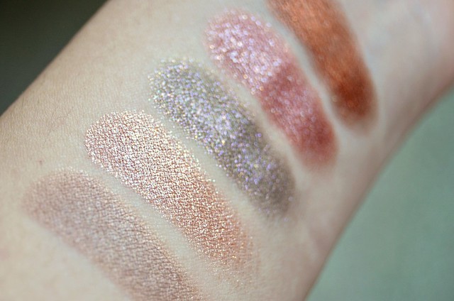
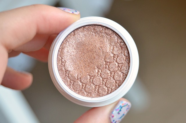
Smash is a slightly dirty, slightly warm-toned, light goldy beige. On my lids, because it's not that much darker than my skin tone, it's barely detectable (even less so with glasses). On a paler person, I can picture this being an all-over lid staple, but on me, it's entirely wasted. It reminds me a little of Burberry Pale Barley, but Pale Barley is darker, cooler-toned, more grey/taupe with slight purplish tones in comparison. They do have a similar finish though, both with a subtly shimmering goldish overlay.
Amaze was one of the shadows I was most looking forward to, but ultimately, it failed to excite. It's a light, ultra-reflective, shimmer-packed rose gold. The primary sheen it gives off is whitish/silvery, which I don't find flattering. Sheered out, it's almost intolerably glittery. Don't get it anywhere near your face unless you want the world's most sparkly highlighter. It's almost impossible to build up to full opacity, so I'd recommend it more as glitter top coat or dabbed on the centre of the lid for extra dimension and interest.
So Quiche is a dirty olive green base with purply-pink sparkles. I'm sure there's other colours of glitter in there, but purply-pink is the gist of it. With one swipe, it's not as strong in terms of pigmentation as the others. A sheerer application really brings out the beauty of the glitter (truly eye-catching and gorgeous), but doesn't give much definition or depth in terms of the base colour. Conversely, when built up, the green comes through stronger but a lot of the detail in the multi-coloured glitter is lost.
Sequin is a super pigmented, super glittery, russet (orangey, pinky, coppery, reddish) stunner. I can thank Angela for introducing me to it. This is the only shade out of the 5 I bought that I can and do wear all over the lid, though it's not one to reach for if you're after subtlety.
Game Face is a very warm, mid-tone, rich glistening bronze with a goldish, coppery lustre. To the uninitiated, this shade seemed to be a clear standout in the Super Shock Shadow range and the only one I didn't remotely hesitate to order. It's not so much shimmery as it is metallic. Pigmentation is excellent though oddly, I found it swatches better on the hand than when applied to the lids.
I've been playing with the shadows for around 3 weeks now and overall, I like them but I'm not completely won over. For me, the main problem is convenience and wearability. While the round white pots are certainly distinctive, the individual packaging of the shadows somehow makes me less inclined to reach for them. In their own containers, the lid of which you have to physically unscrew just to see and use the shadow, they're not as accessible compared with say, a quad or palette where everything is laid out in front of you, ready to be utilised.
While I painstakingly attempted to minimise disappointment in the shades I picked, some of them simply don't work for me the way I hoped. They're either not dark enough, oddly sheer and somewhat patchy despite strong pigmentation, difficult to layer and achieve full opacity, overly glittery (and this, coming from someone who wears shimmer/metallic finishes on a daily basis) or not the most flattering colour against my skin tone. The biggest success of the lot is probably Sequin. I could've done without Smash (Desert likely wouldn't have fared any better). Amaze is beautiful but a total glitterbomb, too light to be used over the lid and too reflective in the inner corner. So Quiche is pleasingly unique and I love the contrasting glitter and base, but it's the sheerest of the bunch and difficult to pull off. Game Face is an absolutely stunning shade but its beauty doesn't translate on the lids, where it appears borderline muddy, a bit too dark and too warm.
Much has been said about the unusual texture of these shadows. They're thin and emollient, but packed with pigment. They're definitely closer to a cream shadow than a powder, but at the same time, they're drier to the touch and not as wet and creamy as traditional cream shadows like the Maybelline Color Tattoos, Benefit Creaseless Cream Shadows or MAC Paint Pots. ColourPop recommends applying them with your fingers, and most reviews seem to agree. I wouldn't bother with brush unless it's a relatively stiff, flat, synthetic brush like the Ecotools Concealer Brush from their 5-Piece Bamboo Brush Set. On my non-oily monolids, I don't seem to experience any noticeable issues with wear time or creasing, though a primer underneath these shadows seems like a good idea to increase the vibrancy of the shadows, make them stay on longer and ensure they don't move around.
ColourPop advises that the lids on these shadows need to be secured tightly after each use. It makes me wonder what alchemy was involved in their formulation, to what degree they would change in pigmentation or texture naturally over time, and how long it'd take until things get really bad. It's not uncommon for certain cream shadows to dry out terribly after a year or so (my Maybelline Color Tattoo in Bad to the Bronze is basically unusable now), but it seems they've been mindful to design the packaging in a way that reduces the chances of that happening.
Top row, then bottom row: Game Face, So Quiche, Amaze, Smash, Sequin
l-r: Smash, Amaze, So Quiche, Sequin, Game Face
Top to bottom: Game Face, Sequin, So Quiche, Amaze, Smash
l-r: Smash, Amaze, So Quiche, Sequin, Game Face
l-r: Smash, Amaze, So Quiche, Sequin, Game Face
Smash
Smash is a slightly dirty, slightly warm-toned, light goldy beige. On my lids, because it's not that much darker than my skin tone, it's barely detectable (even less so with glasses). On a paler person, I can picture this being an all-over lid staple, but on me, it's entirely wasted. It reminds me a little of Burberry Pale Barley, but Pale Barley is darker, cooler-toned, more grey/taupe with slight purplish tones in comparison. They do have a similar finish though, both with a subtly shimmering goldish overlay.
Amaze
Amaze was one of the shadows I was most looking forward to, but ultimately, it failed to excite. It's a light, ultra-reflective, shimmer-packed rose gold. The primary sheen it gives off is whitish/silvery, which I don't find flattering. Sheered out, it's almost intolerably glittery. Don't get it anywhere near your face unless you want the world's most sparkly highlighter. It's almost impossible to build up to full opacity, so I'd recommend it more as glitter top coat or dabbed on the centre of the lid for extra dimension and interest.
So Quiche
So Quiche is a dirty olive green base with purply-pink sparkles. I'm sure there's other colours of glitter in there, but purply-pink is the gist of it. With one swipe, it's not as strong in terms of pigmentation as the others. A sheerer application really brings out the beauty of the glitter (truly eye-catching and gorgeous), but doesn't give much definition or depth in terms of the base colour. Conversely, when built up, the green comes through stronger but a lot of the detail in the multi-coloured glitter is lost.
Sequin
Sequin is a super pigmented, super glittery, russet (orangey, pinky, coppery, reddish) stunner. I can thank Angela for introducing me to it. This is the only shade out of the 5 I bought that I can and do wear all over the lid, though it's not one to reach for if you're after subtlety.
Game Face
Game Face is a very warm, mid-tone, rich glistening bronze with a goldish, coppery lustre. To the uninitiated, this shade seemed to be a clear standout in the Super Shock Shadow range and the only one I didn't remotely hesitate to order. It's not so much shimmery as it is metallic. Pigmentation is excellent though oddly, I found it swatches better on the hand than when applied to the lids.
I've been playing with the shadows for around 3 weeks now and overall, I like them but I'm not completely won over. For me, the main problem is convenience and wearability. While the round white pots are certainly distinctive, the individual packaging of the shadows somehow makes me less inclined to reach for them. In their own containers, the lid of which you have to physically unscrew just to see and use the shadow, they're not as accessible compared with say, a quad or palette where everything is laid out in front of you, ready to be utilised.
While I painstakingly attempted to minimise disappointment in the shades I picked, some of them simply don't work for me the way I hoped. They're either not dark enough, oddly sheer and somewhat patchy despite strong pigmentation, difficult to layer and achieve full opacity, overly glittery (and this, coming from someone who wears shimmer/metallic finishes on a daily basis) or not the most flattering colour against my skin tone. The biggest success of the lot is probably Sequin. I could've done without Smash (Desert likely wouldn't have fared any better). Amaze is beautiful but a total glitterbomb, too light to be used over the lid and too reflective in the inner corner. So Quiche is pleasingly unique and I love the contrasting glitter and base, but it's the sheerest of the bunch and difficult to pull off. Game Face is an absolutely stunning shade but its beauty doesn't translate on the lids, where it appears borderline muddy, a bit too dark and too warm.
Much has been said about the unusual texture of these shadows. They're thin and emollient, but packed with pigment. They're definitely closer to a cream shadow than a powder, but at the same time, they're drier to the touch and not as wet and creamy as traditional cream shadows like the Maybelline Color Tattoos, Benefit Creaseless Cream Shadows or MAC Paint Pots. ColourPop recommends applying them with your fingers, and most reviews seem to agree. I wouldn't bother with brush unless it's a relatively stiff, flat, synthetic brush like the Ecotools Concealer Brush from their 5-Piece Bamboo Brush Set. On my non-oily monolids, I don't seem to experience any noticeable issues with wear time or creasing, though a primer underneath these shadows seems like a good idea to increase the vibrancy of the shadows, make them stay on longer and ensure they don't move around.
ColourPop advises that the lids on these shadows need to be secured tightly after each use. It makes me wonder what alchemy was involved in their formulation, to what degree they would change in pigmentation or texture naturally over time, and how long it'd take until things get really bad. It's not uncommon for certain cream shadows to dry out terribly after a year or so (my Maybelline Color Tattoo in Bad to the Bronze is basically unusable now), but it seems they've been mindful to design the packaging in a way that reduces the chances of that happening.
Subscribe to:
Comments (Atom)


