Saturday, May 30, 2015

Shrill Musk, Quiet Fig

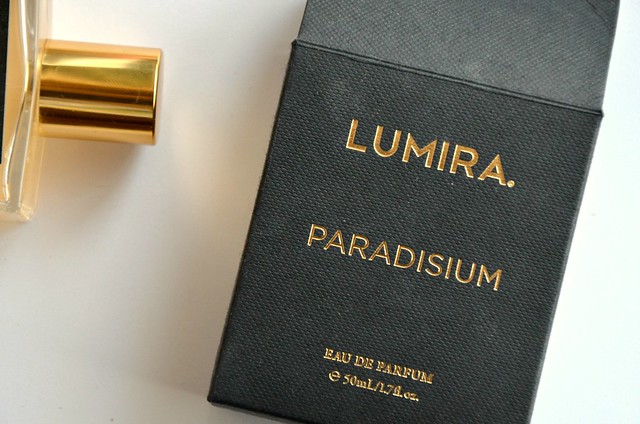
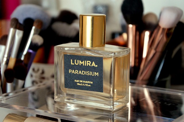
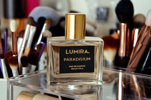
Have you ever been compelled to seek out and buy something simply because it was featured on a blog? That's what happened with me and Lumira Paradisium eau de parfum. Beautiful pictures and rave reviews on The Beauty Look Book had me convinced I needed it in my life. Many probably have never even heard of Lumira. I certainly had no idea of its existence until Sabrina's posts introduced me to the boutique Australian candle company. That's right, Australian. It was so weird to me that this small Australian brand was being featured on this huge American beauty blog. I tried looking up more information about Paradisium, but hardly anything came up. When a fragrance doesn't even have its own listing on Fragrantica, it doesn't get more niche than that. One day after work, I made a dedicated trip to Made on Earth on Pitt St to smell it, and in the absence of absolute revulsion, buy it. I paid $89.95 for a 50ml bottle after spraying it on my hand and walking around the shop for 2 minutes. Because you know, I'm hasty and ridiculous prudent and measured with my perfume purchases like that.


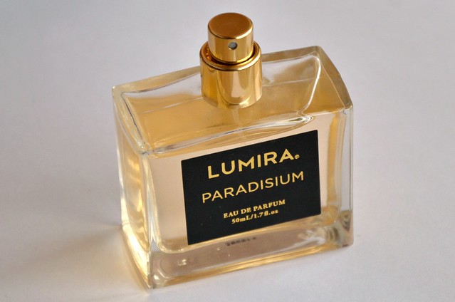
Before I launch into a review of the scent, a couple of things irritated me about the packaging. Firstly, the spray nozzle thing on the perfume is SO TIGHT that I have to press down super hard to get it to spritz. It's almost like it's stuck. If my fingers are slightly greasy due to putting on some hand/face cream beforehand, it's nearly impossible. Secondly, the sticker on the bottle wasn't applied in a straight line and is noticeably crooked. I mean, it's not the end of the world, but neatly affixing the label to your $90 perfume shouldn't be too hard to ask.


Paradisium opens with the immediate freshness of fig combined with candied citrus. Instantly reminiscent of Acqua di Parma Blu Mediterraneo Fico di Amalfi EDT. The prominence of fig in the top notes doesn't last too long and within a few minutes, it starts to mellow into a somewhat woody, somewhat sweet, somewhat fruity concoction. Every now and then, I get a hit of sharp, strong soapiness, bordering on laundry detergent or similar household product, that destroys the delicate, ethereal nature of the fruits. It gives the scent a fullness and body, but I still haven't made my mind up whether it destroys the whole thing or adds to its character. The fig is my favourite part of this perfume, but apart from the burst of it at the very beginning, it's very much in the background. Still detectable and undoubtedly there, but not center stage as I would've preferred.

Paradisium is a fragrance that smells better from a distance than up close, and in smaller doses than liberally sprayed. This is truly an EDP in terms of strength and longevity, which I absolutely appreciate. I can see this being very potent mixed with sweat on hot summer days, especially if you're generous with the spritzes. You don't need much at all. One spray on the neck and one on the wrist is plenty.

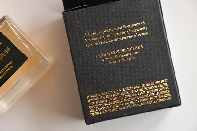
The Lumira website lists the composition as top notes of Bergamot, Grapefruit and Lemon, middle notes of Fig Nectar and Guava and base notes of Vetiver, Sea Moss and Cedarwood. I'm by no means a perfume expert, but I detect almost no guava, and the vetiver (or my embarrassingly limited understanding of it) is faint if there at all. It claims to be "evocative of a verdant Mediterranean nirvana", but I don't get a huge naturalistic greenness or lushness to it, mainly because of the overbearing, almost headache-inducing freshly washed sheets smell I mentioned earlier.

I'm happy to have Paradisium in my perfume collection despite it not being everything I hoped for. I don't have anything like it, plus it's strong and lasts a long time — just how I like 'em. It's hard to categorise as it's not predominately fruity, sweet, woody or green, though all those elements make an appearance at some point. Any sweetness is restrained (it's meant to be unisex, after all), and after an hour or so, there's only the suggestion of fruit, not the juicy, ripe, real thing. I'm mainly left with a shrill, clean musk smell with a hint of sweetened citrus, salt, and woody fig. If only they'd toned down the soapiness and amped up the fig à la diptyque Philosykos or Jo Malone Wild Fig & Cassis, I probably would've bought a backup bottle.

Wednesday, May 27, 2015

Gold and Fudge Squares

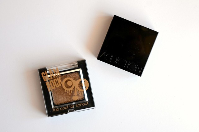
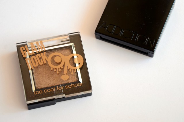
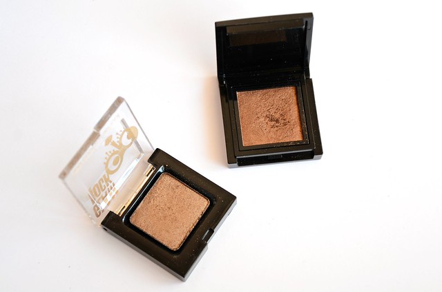
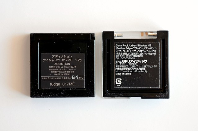
This post is long overdue, but I guess better late than never. While in Japan in September last year, I made two Asian market eyeshadow purchases: Too Cool For School Glam Rock Urban Shadow in Golden Edge (#5) and Addiction by Ayako Fudge (017ME). The former is a Korean brand I'd never heard of before, but Golden Edge appeared to be the perfect neutral with faultless texture and pigmentation. I had to have it. In contrast, I'd already heard about Addiction, a highly regarded, hard-to-get Japanese makeup brand, and was eager to explore the product range in person. I'd read the eyeshadows were a bit hit or miss, but the consensus seemed to be that Fudge was a clear standout.


Too Cool For School Golden Edge (#5)


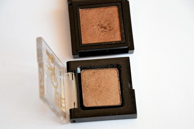
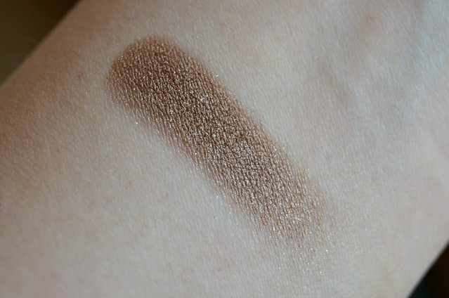
Too Cool For School in Golden Edge is a warm, slightly olive, antique medium gold. Built up, it becomes a darker bronze with a golden lustre. The greenish tinge was unexpected, and not in a good way. I'm not huge on greenish golds. They're not as abysmal as cool-toned, frosty taupes, but I prefer more coppery shades or true bronzy golds. I thought I'd found that in Golden Edge (I didn't detect any yellowy-green in the pan or when I first swatched it), but the khaki tinge is definitely there on the lids. I guess it gives Golden Edge a point of distinction, just not one I particularly care for.

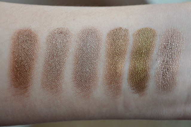
l-r: Urban Decay Smog, Urban Decay Suspect, Essence Party All Night, Too Cool For School Golden Edge, Maybelline Gold Shimmer, NARS Kalahari (I)

I hoped Golden Edge would be a deeper version of NARS Kalahari (the left side of the eyeshadow duo, or the shade included in the And God Created the Woman palette), but the two aren't alike at all. Kalahari is pinker, slightly mauve in comparison, more brown, less olive and golden. Golden Edge is probably closest to Urban Decay Smog, but Smog is darker, more brown, less yellow gold. Maybelline Color Tattoo in Gold Shimmer is clearly more green but the undertone is very similar. Urban Decay Suspect is more of a sandy beige, while Essence Party All Night is greyer and cooler-toned.

Addiction Fudge (017ME)


With rave reviews by fellow bloggers, I was almost expecting Addiction Fudge to be my new favourite eyeshadow. It certainly swatched promisingly enough, but it suffers from the same problem as ColourPop Game Face. It's too dark and warm to be used all over the lid (it just looks messy and muddy), yet too metallic and not dark enough to effectively deepen the upper lash line and add definition. I like it best applied with a small brush like the Real Techniques Accent Brush (from the Starter Set) or Ecotools Petite Eye Shading Brush (from the Bamboo 6 Piece Eye Brush Set) to define and smoke out the lower lash line.

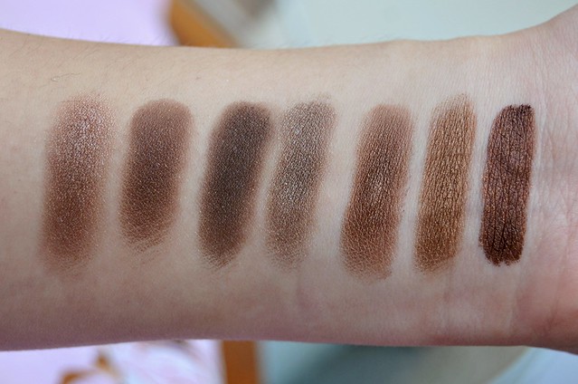
l-r: Face of Australia Bronze Sphinx, NARS Galapagos, Too Faced Cocoa Chili, Burberry Midnight Brown, Sleek Dust Storm, Addiction Fudge, Rimmel Bad Girl Bronze

While well formulated, Fudge isn't the most unique colour, especially to a bronze eyeshadow enthusiast like me. Surprisingly, I don't have an exact dupe, though the bronze shade from the Sleek i-Divine Eyeshadow Palette in Storm (which Google informs me is named Dust Storm) comes the closest. Of all the eyeshadows I pulled out to compare it with, Fudge is the most yellowy ochre in tone. Too Faced Cocoa Chili and NARS Galapagos are darker and more ash grey (the NARS a lot sheerer and lighter than the Too Faced, both have gold glitter). Burberry Midnight Brown is cooler-toned and more silvery. Face of Australia Budge Proof Eyeshadow in Bronze Sphinx, Sleek Dust Storm and Rimmel ScandalEyes Shadow Stick in Bad Girl Bronze are more chocolate brown, though the Rimmel is a lot darker and the Face of Australia is slightly reddish/purplish-tinged.

Wednesday, May 20, 2015

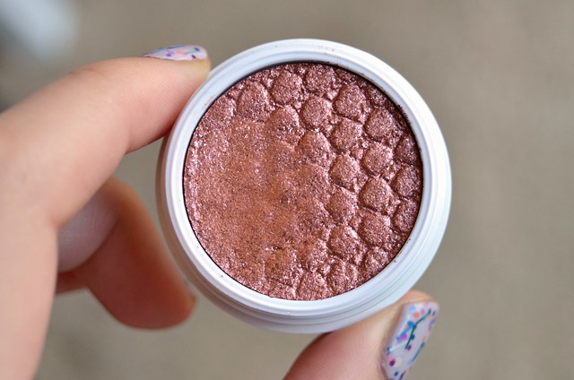
ColourPop Curious

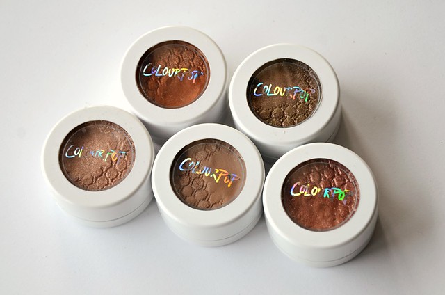
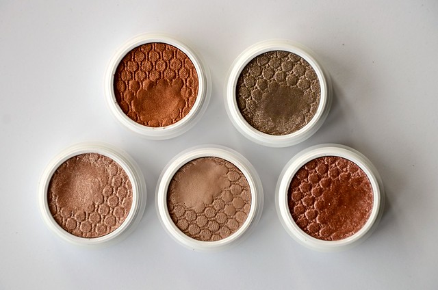
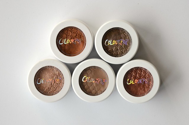
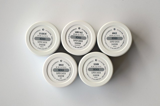
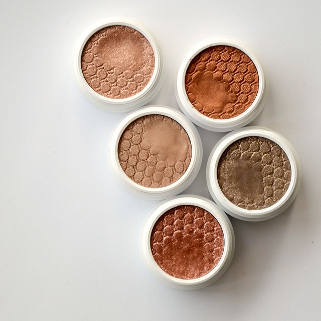
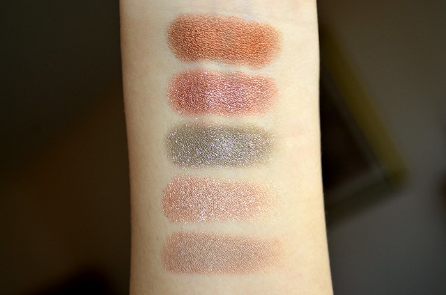
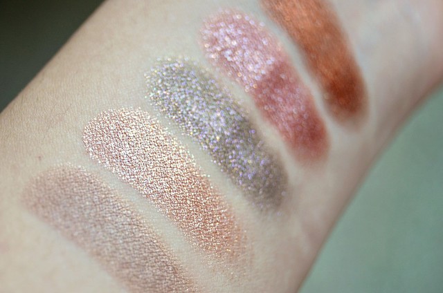
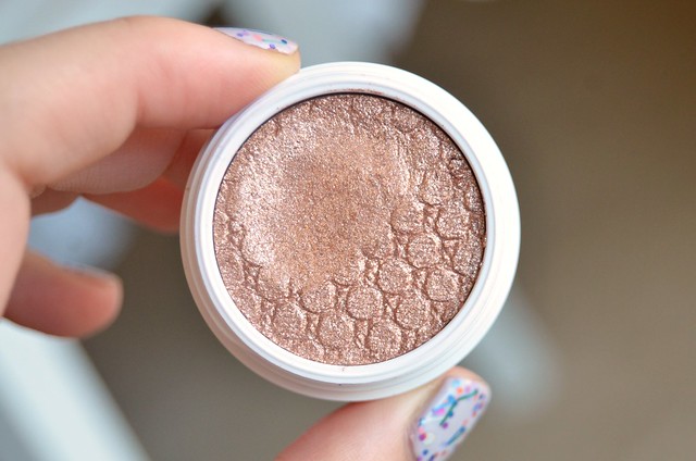
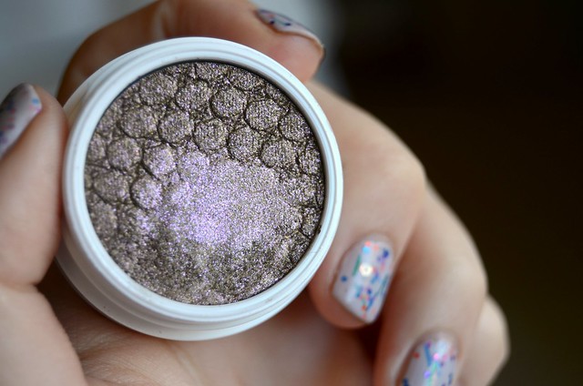
ColourPop is having a moment in the beauty world. After resisting for a while, inevitably, I reached a breaking point (probably around the time KathleenLights came out with her Where the Light Is set). I was uncharacteristically good and stuck with my self-imposed lip product ban, limiting myself to the Super Shock Shadows only. (Unfortunately, the new highlighters hadn't been released at that point, otherwise a couple definitely would've ended up in my cart.) The hardest part was of course, deciding which shades to order. After an eternity of Googling, reading blog posts and watching YouTube videos, I settled for Smash (satin), Amaze (metallic), So Quiche (metallic), Sequin (metallic) and Game Face (ultra metallic). I was contemplating Bill and Desert as well, but decided to omit both. My total order came to $43.91 USD ($58.78), of which a large chunk (we're talking $18.91 USD) was devoted to shipping. That's 75% of the total cost of the five shadows. Bummer.


Top row, then bottom row: Game Face, So Quiche, Amaze, Smash, Sequin


l-r: Smash, Amaze, So Quiche, Sequin, Game Face

Top to bottom: Game Face, Sequin, So Quiche, Amaze, Smash

l-r: Smash, Amaze, So Quiche, Sequin, Game Face

l-r: Smash, Amaze, So Quiche, Sequin, Game Face

Smash

Smash is a slightly dirty, slightly warm-toned, light goldy beige. On my lids, because it's not that much darker than my skin tone, it's barely detectable (even less so with glasses). On a paler person, I can picture this being an all-over lid staple, but on me, it's entirely wasted. It reminds me a little of Burberry Pale Barley, but Pale Barley is darker, cooler-toned, more grey/taupe with slight purplish tones in comparison. They do have a similar finish though, both with a subtly shimmering goldish overlay.

Amaze

Amaze was one of the shadows I was most looking forward to, but ultimately, it failed to excite. It's a light, ultra-reflective, shimmer-packed rose gold. The primary sheen it gives off is whitish/silvery, which I don't find flattering. Sheered out, it's almost intolerably glittery. Don't get it anywhere near your face unless you want the world's most sparkly highlighter. It's almost impossible to build up to full opacity, so I'd recommend it more as glitter top coat or dabbed on the centre of the lid for extra dimension and interest.

So Quiche

So Quiche is a dirty olive green base with purply-pink sparkles. I'm sure there's other colours of glitter in there, but purply-pink is the gist of it. With one swipe, it's not as strong in terms of pigmentation as the others. A sheerer application really brings out the beauty of the glitter (truly eye-catching and gorgeous), but doesn't give much definition or depth in terms of the base colour. Conversely, when built up, the green comes through stronger but a lot of the detail in the multi-coloured glitter is lost.

Sequin

Sequin is a super pigmented, super glittery, russet (orangey, pinky, coppery, reddish) stunner. I can thank Angela for introducing me to it. This is the only shade out of the 5 I bought that I can and do wear all over the lid, though it's not one to reach for if you're after subtlety.

Game Face

Game Face is a very warm, mid-tone, rich glistening bronze with a goldish, coppery lustre. To the uninitiated, this shade seemed to be a clear standout in the Super Shock Shadow range and the only one I didn't remotely hesitate to order. It's not so much shimmery as it is metallic. Pigmentation is excellent though oddly, I found it swatches better on the hand than when applied to the lids.


I've been playing with the shadows for around 3 weeks now and overall, I like them but I'm not completely won over. For me, the main problem is convenience and wearability. While the round white pots are certainly distinctive, the individual packaging of the shadows somehow makes me less inclined to reach for them. In their own containers, the lid of which you have to physically unscrew just to see and use the shadow, they're not as accessible compared with say, a quad or palette where everything is laid out in front of you, ready to be utilised.

While I painstakingly attempted to minimise disappointment in the shades I picked, some of them simply don't work for me the way I hoped. They're either not dark enough, oddly sheer and somewhat patchy despite strong pigmentation, difficult to layer and achieve full opacity, overly glittery (and this, coming from someone who wears shimmer/metallic finishes on a daily basis) or not the most flattering colour against my skin tone. The biggest success of the lot is probably Sequin. I could've done without Smash (Desert likely wouldn't have fared any better). Amaze is beautiful but a total glitterbomb, too light to be used over the lid and too reflective in the inner corner. So Quiche is pleasingly unique and I love the contrasting glitter and base, but it's the sheerest of the bunch and difficult to pull off. Game Face is an absolutely stunning shade but its beauty doesn't translate on the lids, where it appears borderline muddy, a bit too dark and too warm.

Much has been said about the unusual texture of these shadows. They're thin and emollient, but packed with pigment. They're definitely closer to a cream shadow than a powder, but at the same time, they're drier to the touch and not as wet and creamy as traditional cream shadows like the Maybelline Color Tattoos, Benefit Creaseless Cream Shadows or MAC Paint Pots. ColourPop recommends applying them with your fingers, and most reviews seem to agree. I wouldn't bother with brush unless it's a relatively stiff, flat, synthetic brush like the Ecotools Concealer Brush from their 5-Piece Bamboo Brush Set. On my non-oily monolids, I don't seem to experience any noticeable issues with wear time or creasing, though a primer underneath these shadows seems like a good idea to increase the vibrancy of the shadows, make them stay on longer and ensure they don't move around.

ColourPop advises that the lids on these shadows need to be secured tightly after each use. It makes me wonder what alchemy was involved in their formulation, to what degree they would change in pigmentation or texture naturally over time, and how long it'd take until things get really bad. It's not uncommon for certain cream shadows to dry out terribly after a year or so (my Maybelline Color Tattoo in Bad to the Bronze is basically unusable now), but it seems they've been mindful to design the packaging in a way that reduces the chances of that happening.

Monday, May 18, 2015

Fruity Accent

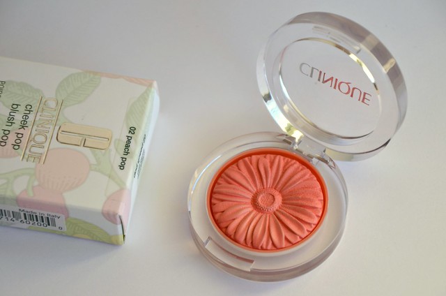
With the recent release of 8 new shades of Clinique Cheek Pops (Heather Pop and Fig Pop are calling my name), my attention refocused on the original lineup. I'd previously overlooked the four existing shades as being too generic, but countless raves about the impeccable and unique formula encouraged me to have another look. Peach Pop seemed to be the most popular shade and the one I'd get the most wear out of, so it seemed to be the natural choice. These retail for $40 in Australia, but I purchased mine duty-free from Narita Airport for around $25.


l-r: NARS Deep Throat, Clinique Peach Pop, Hourglass Diffused Heat, theBalm FratBoy

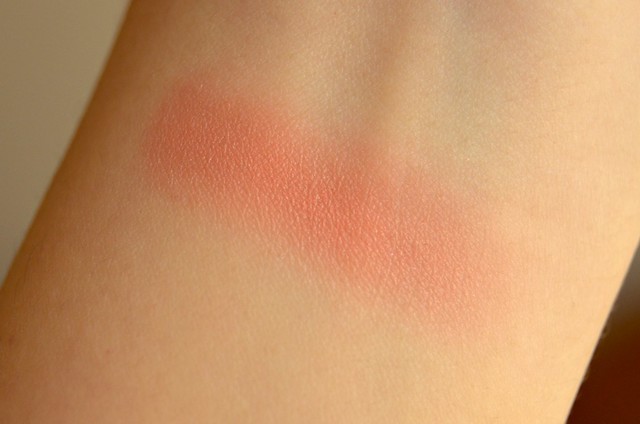
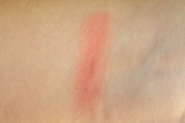
I suspected I'd have a not insignificant number of similar blushes to Peach Pop, and sure enough I pulled out three near dupes. NARS Deep Throat does have more golden shimmer that's detectable on the skin. I don't reach for theBalm FratBoy very often, mainly because I'm not a huge fan of the overly powdery texture and I find it leaves much to be desired when it comes to wear time. It's also extremely pigmented and red-based, which leaves me running scared as I preferably want to avoid patchy, inflamed cheeks. Hourglass Ambient Lighting Blush in Diffused Heat is the closest to Peach Pop colour-wise, though it has the addition of subtle pale yellow shimmer. It's softer and more powdery in texture than the Clinique, but similarly blends seamlessly into the skin and injects a healthy glow to the complexion.


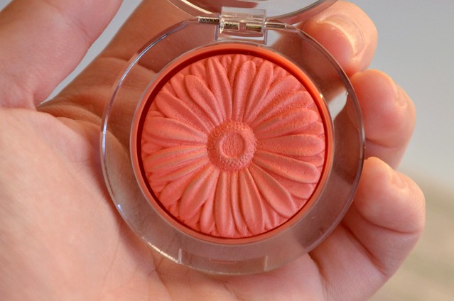
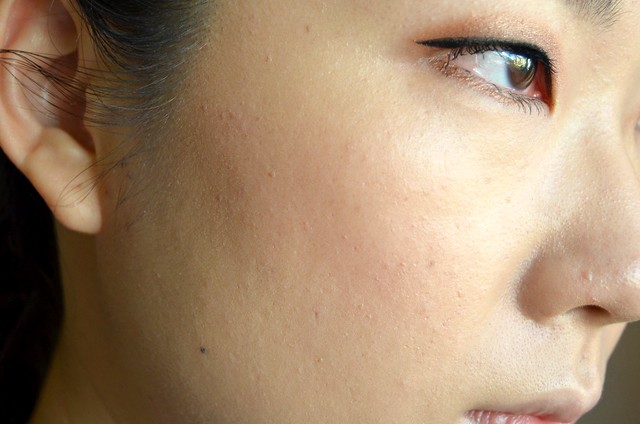
Texture-wise, these Clinique Cheek Pops avoid any suggestion of powderiness and have zero fall out. I have heard them being described as somewhere between a powder and a cream, with a slight bounciness to them. They definitely have no wetness and aren't emollient like a cream blush, but they're not hard or dry in any way (unlike NARS blushes or Tarte Amazonian Clay 12-Hour Blushes). They're dense to the touch but have a slight creaminess to them. You could definitely apply and blend the product with the fingers if no brush was around. Pigmentation is buildable and not as strong as you might think given how bright and colourful the blush looks in the pan. On the cheeks, there's no chalkiness or patchiness, and the product doesn't sit on top of the skin, but rather, sinks in and melds with your skin for a natural-looking, healthy flush. Lasting power is fairly good (it stays on for about three-quarters of the day) but not remarkable. I still find my Benefit, Hourglass and NARS blushes to wear longer.

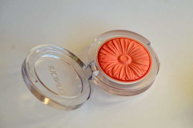
Bonus points for the adorable, compact packaging that manages to make thick plastic encasing look refined and classy rather than cheap and nasty. The flower imprint is a cute touch that gives these blushes an instant visual signature. At $21 USD, these are also more affordably priced than comparable brands. I may or may not be mentally scheduling to add a couple more to my blush stash next time I'm in the States…
Related Posts Plugin for WordPress, Blogger...