


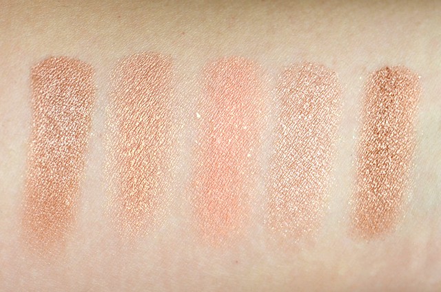
l-r: Wet n Wild Comfort Zone Eyelid shade, MAC Rubenesque, NARS Enchanted, Prestige Champagne, Urban Decay Chopper
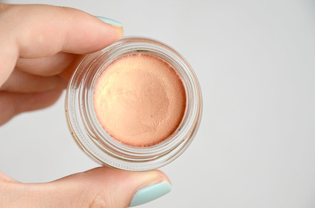
MAC Rubenesque is described as a "mid-tone frosted golden peach with gold and pink pearl". There's only a hint of pink, and it's not as frosty as some other eyeshadows that I have in that the predominant shimmer isn't white or silver. To my eyes, it's more of a sheer peach with a gold overlay. This is one of those colours that looks beautiful when swatched, but falls flat when I apply it. It just doesn't work with my eye shape and skin tone. It took about three layers for the pigmentation to be built up to a light wash of slightly orangey gold. The formula of the Paint Pot itself was smooth, blendable and creamy, but it appeared a little drying on the lid and not as emollient as other cream shadows I have, notably the Benefit Creaseless Cream Eyeshadow/Liner.
Compared to similar shades I have, there's nothing that's an exact dupe. Interestingly, the left "Eyelid" colour of the Wet n Wild Color Icon Eyeshadow Collection in Comfort Zone is nearly identical to Urban Decay Chopper from the Naked2 palette (Chopper is slightly more intense in pigmentation and metallic in finish). Both colours are more copper compared to the lighter goldish peach of Rubenesque. Prestige Champagne is sheerer and more of a browny peach with less of a pinky-orange undertone and missing the gold sheen that runs through Rubenesque. NARS Enchanted, actually a cream blush, is surprisingly the most dissimilar. It's a lot more vibrantly pinky peach with the addition of crazy glitter shards.
I wanted to love Rubenesque, but since I bought it, I've barely touched it. I think this would look better on those with fairer skin and a visible crease/socket for an everyday, brightening look. The only way I'd imagine getting some use out of it is as a base for gold, copper or bronze eyeshadows, or maybe even as a highlighter.


that's a beautiful gold shade
ReplyDeletecutenquirky.blogspot.com
I absolutely love the almost rose-gold shade, it's probably the paint pot that I would be most interested in buying. It sucks that it doesn't work for your skintone! I wonder if it would be flattering for my skintone.
ReplyDeleteI've been hearing about this particular shade of the paint pot lately! Looks like a great champagne-y based! xx
ReplyDeletehttp://norwegianelephant.blogspot.com
It's a beautiful shade and it sucks that it doesn't work for you. :( I don't own any MAC paint pots, and I really can't see myself paying Australian prices when there are great, cheaper alternatives out there. I need to make a trip to the US like you did! :P xx
ReplyDeleteit is such a pretty shade! ^_~
ReplyDeleteRubenesque is pretty! I like how peachy it is, but I feel like I wouldn't be able to make it work on my eyes either :<
ReplyDeleteI've had a crush on this paint pot for years but have never bought it because I don't know how it will sit on my skin tone! It's such a gorgeous colour and it's great to see how it compares to those from different brands :)
ReplyDeleteShell xx
I agree the Benefit Creaseless Cream E/S are great. This color is very pretty, I love colors with a golden touch.
ReplyDeleteSuch a pity it doesn't work on you! I don't really find the Paint Pots enticing enough to warrant the price- I'm hoping they'll bring over those Color Tattoo Metals for a wider shade range! I need to try me a Benefit Creaseless Cream Shadow/Liner but for now the Revlon Seashells palette will do just fine. :) xx
ReplyDeletePS: HAPPY BIRTHDAY FOR YESTERDAY. May it be filled with shopping the stash and success in every aspect. To another great year of sleep and water (oh how punny.)! xxx
Awwww, thank you! So sweet :) I may have shelled out some moolah on cosmetics/skin care I totally don't need in the name of the occasion :p I'm hoping they bring Barely Branded and others here, but I'm starting to lose hope of that happening :'(
DeleteI have found a website with MAC samples, I will post about it when I receive my order but it would be good for times like these! Rubenesque is indeed a gorgeous colour, shame about the application. I probably shouldn't have bought Painterly as like you said it can really only be used as a primer and I can find much cheaper alternatives but I am getting a sample of bare study as a base for shimmery colours.
ReplyDeleteMAC Paint Pot is on my wish list since like, forever. But I never get my hands on it, always, every time I visit MAC Counter, I interested more on the blushes, or powders, or lippies and forgot about the paint pot.
ReplyDeleteRubenesque looks beautiful and it looks like a very easy shade to wear, but I don't know if it will make any different on my lids..
I use this on days when I don't have much time to do full eye make up and it works very well for me. The shade really suits my skin tone. :)
ReplyDeleteHey great review like usual. I heard the paint pots really cease that's why I never purchased. I think their shades are really nice though, xoxo.
ReplyDeleteI love MAC Paint Pots and this is a colour I have been wanting to try for ages but have never got round to picking it up!! Great post! :) ♥
ReplyDeletehttp://abeautyromancee.blogspot.co.uk/
I love Mac Paint Pot!I use quite natural everyday!
ReplyDeleteI love Mac Paint Pots, my favourite is Constructivist, which is a fantactic metallic brown colour!
ReplyDeleteMyMakeUpCompulsion
I actually am not a huge fan of MAC paint pots to be honest - the texture feels too.. stiff (?) to be a cream shadow. But the swatch looks absolutely divine so thanks for doing this great post :)
ReplyDeleteReally like the colour so pretty the texture looks amazing too x
ReplyDeletewww.krystelcouture.co.uk ♥
Such a shame that you didn't get on with Rubenesque after you finally got it in the states (it really saddens me that makeup is so expensive for you Australians!!). I haven't taken the plunge into the world of paint pots yet but have always been curious; I've never looked into this shade but it really does look lovely :)
ReplyDeleteCassie
thriftthick.blogspot.com
I can totally see why you'd be a bit disappointed or underwhelmed with this shade, seeing as there are so many dupes - it's really pretty, but for the price of a MAC paint pot, maybe it's not quite worth the price...at least you got it in the US and didn't end up paying even more for it! xx
ReplyDeleteIf it doesn't work on you then it most likely won't work on me either! It's a beautiful shade of gold nonetheless!
ReplyDelete-Lisa
The Lovely Memoir
It's such a shame it doesn't work for you!!
ReplyDeleteI really want to try groundwork!!
xoxo
It's a lovely shade, but I can see how it might be better suited to fairer skin tones x
ReplyDeletehttp://www.bowtiedbeauty.blogspot.com/
It looks gorgeous swatched, a shame it doesn't work for you!
ReplyDeleteI love shimmery pink colours.
good review. It's interesting how you said that you dont reach for this product much. I think if i bought it, i probably wouldn't either lol :x the color seems like a nice one but i already a few in the same shade. it looks great on some youtubers, i agree! :)
ReplyDeleteJoyce @carouselstreet.com
I know! Well, it could be some sort of a purging stage, however if it aint broken why fix it? My skin state right now is at its best, I only use 3 products and my skin hasn't been this clear in years. So i better stop adding stuff into my routine to maintain it.
ReplyDeleteI purchased rubenesque but returned it after using it a couple of times. Its too patchy on my eyelids. Tried it with primer as well and its still patchy..Plus the shade looked off on my eyelids..maybe because I have redness around my eyes. Oh well, I simply returned it.
This colour is lovely, it's a shame you haven't been able to get much use out of it. Atleast you bought it in the US rather than paying the ridiculous Australian prices!
ReplyDeleteAww I'm sorry to hear Rubenesque didn't work for you! I have to say it's probably my favorite MAC Paint Pot, especially in Summer. But as you mentioned, I am very fair, so it probably shows up a bit better on me.
ReplyDeletexx Louise
A Little Beauty Luxury
When it comes to paint pot type of products, I don't like anything that is too frosty. Make me look older. I think a pink undertone should be nice. The color looks great.
ReplyDeleteHave you tried Maybelline Color Tattoo? I want to. Looks close to paint pots.
Girlie Blog Seattle | Casual Chic Fashion
Yep, I love the Bad to the Bronze one - that's my favourite :) I also dislike frosty colours, I hate when the silver/whitish shimmer is so overwhelming it almost covers up the actual colour.
DeleteI felt exactly the same about it! Just didn't 'wow' me on my lids :( such a shame! x
ReplyDeletehttp://thebeautyvisual.blogspot.co.uk
It really is a beautiful colour, but my, that price tag is outrageous! I've ventured into a MAC counter on my latest trip to Buenos Aires and swatches a couple of things but everything was so expensive I couldn't bring myself to justify the splurge : /
ReplyDelete:O such a gorgeous color!
ReplyDeleteLovely pictures as usual! :)
- Andrea Marie xx
frominsidemycloset.com