Showing posts with label gold. Show all posts

Saturday, May 11, 2013

A True Odyssey

I debated for the longest time whether to get the Clarins Eye Quartet Mineral Palette in Odyssey (09). It was already top of my wishlist in October last year, but somehow I resisted buying it around Christmas when it physically hit our department stores. Before I could second-guess that decision, it was sold out everywhere. For the next couple of months, each time I passed by a Clarins counter, I would have this lingering hope that somehow, miraculously, the Odyssey palette would be there. Needless to say, that never happened.

Knowing it was limited edition, I basically gave up on the idea of it ever being mine. I wasn't quite sure whether it was a decision I regretted. After all, I didn't really need it. There was nothing particularly spectacular about it, right? Just four neutral eyeshadows, gorgeously packaged, one of them being the most amazing gold shade my eyes had ever witnessed. No big deal.

I clearly hadn't completely given up all hope, because one night, I must've been Googling it, or double-checking there wasn't any remnant stock still available online, when I discovered it on StrawberryNet. Even then, I held out. Now wasn't the time for rash decision-making, just because something I'd wanted for literally months, that I thought I could never get my hands on again, suddenly appeared from nowhere for me to potentially buy and have shipped to me in the space of a few days.

Such was the extent of my restraint that when StrawberryNet had 10% off all makeup, I didn't cave. I had it in my cart, total price displayed, credit card details just begging to be entered. But no. I closed the window. But we all know how the story ends. A week later, sale over, I decided the idiocy must end. I did what should've happened five months ago, and bought the damn thing.


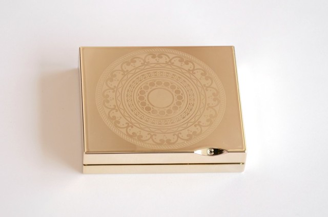
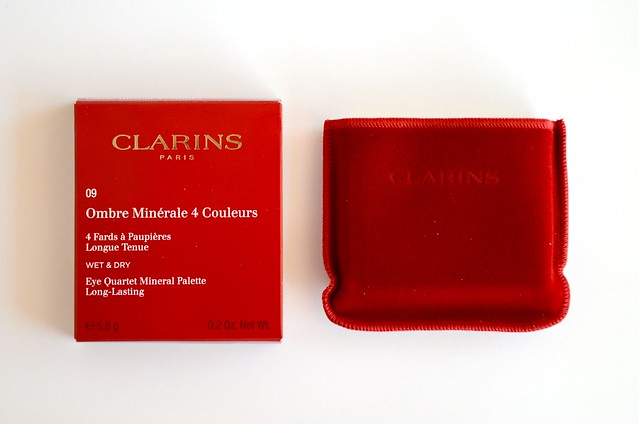
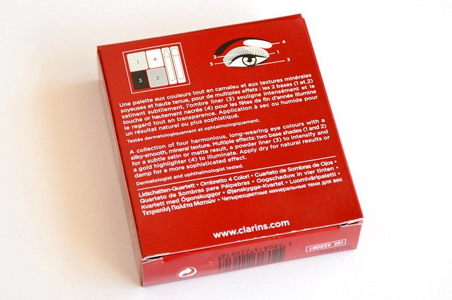
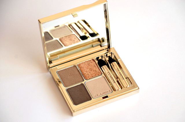
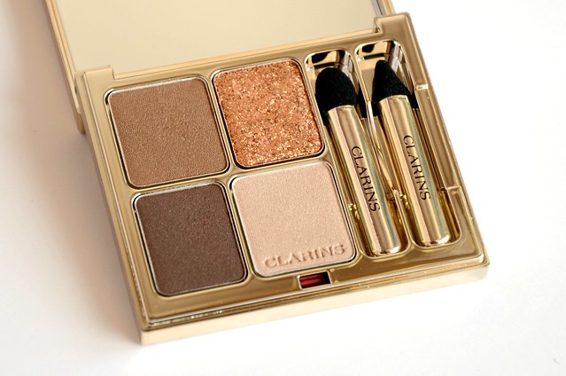
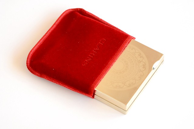
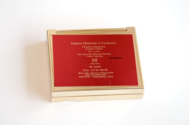
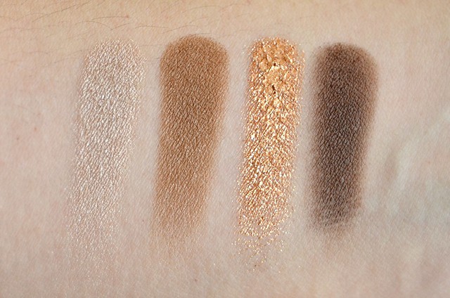
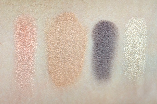
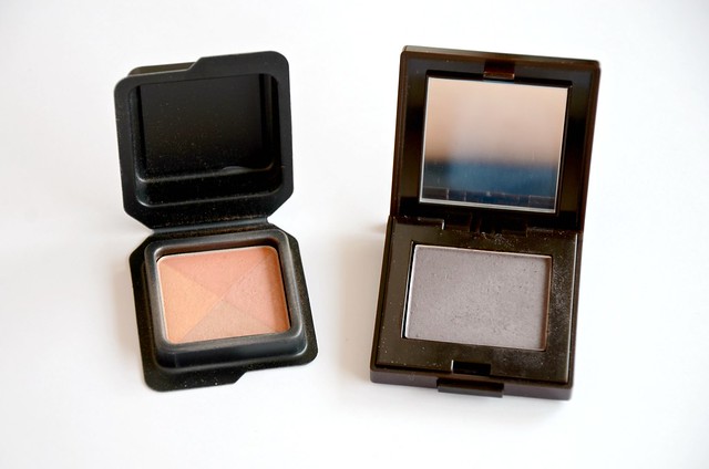
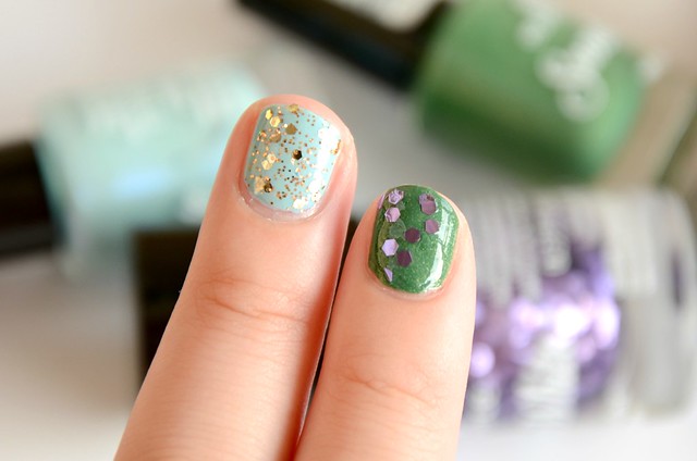
This has to be the prettiest palette that I own. Clarins couldn't have done any better with the packaging, which is sophisticated and feminine, and just the right balance of streamlined and decorative. The shadows themselves are exactly what I expected them to be, which comes as no surprise given the extensive research I did before finally taking the plunge. The gold shade is absolutely stunning — you need only the lightest touch to pick up pigment, but the other 3 shades are more on the sheer side, and admittedly, not exactly unique colour-wise (they remind me of a more refined and subdued version of the Revlon CustomEyes Shadow & Liner palette in Naturally Glamorous). They have a soft, satin finish and can be built up in pigmentation. The lightest shade doesn't show up that well on my lids, but the medium brown is a good everyday lid shade (though perhaps a tad too dark). I'm sure I could find close enough matches to all 3 shades in my existing collection, but that hasn't deterred me from enjoying them regardless.

In addition to how pleasing the palette is to the eye, the gold shade is what distinguishes Odyssey from the ordinary. It has an almost spongy texture, but it's not quite a cream shadow. As a finishing touch to your eye makeup, you can gently dab the gold onto the middle of your lids for that extra dimension and drama (as illustrated by Charlotte Tilbury using the Tom Ford Eye Colour Quad in Cognac Sable). With more layers, the gold becomes almost opaque. It's blindingly shimmery and reflective, but still intensely gold, and not silvery or frosty which is a pet peeve of mine. The gold itself isn't too yellow or orange. You can see from the swatch that if I apply it a little too heavily, it practically looks like gold leaf. As an added bonus, I experienced no fallout with any of the shades.

I don't regret purchasing this Clarins quad in the slightest, but only because I was very clear about the aspects that attracted me to it (and I was accepting and prepared for any shortcomings I'd read about in reviews that weren't 100% complimentary), and the palette completely met my expectations in that respect. It's aesthetically beautiful, the gold shade is unlike anything I have, and the other 3 shades, while not anything to get super excited about, are classic, easy to wear and can be used to create a variety of looks.

Saturday, March 9, 2013

Rubenesque Rundown

I remember first being introduced to MAC Paint Pot in Rubenesque in one of Nic from Pixiwoo's videos. It made her eyelids glisten with such an eye-catching, subtle but multifaceted orangey-gold sheen that I was compelled to made a note of the name of the product so I could check it out and hopefully purchase it later. I'd always been drawn to the MAC Paint Pots because of the ease and versatility of cream eyeshadows, but with the Maybelline Color Tattoos a much more affordable alternative, I couldn't bring myself to spend $35 on one. Painterly had always been the shade I was most tempted by, but I rationalised that such a colour would barely show up on my lids and only act an an eyelid primer more than anything. Rubenesque was yet another US purchase I made (that trip really was about fulfilling 95% of my makeup wishlist), setting me back $18.50 rather than almost double that had I bought it in Australia.


l-r: Wet n Wild Comfort Zone Eyelid shade, MAC Rubenesque, NARS Enchanted, Prestige Champagne, Urban Decay Chopper

MAC Rubenesque is described as a "mid-tone frosted golden peach with gold and pink pearl". There's only a hint of pink, and it's not as frosty as some other eyeshadows that I have in that the predominant shimmer isn't white or silver. To my eyes, it's more of a sheer peach with a gold overlay. This is one of those colours that looks beautiful when swatched, but falls flat when I apply it. It just doesn't work with my eye shape and skin tone. It took about three layers for the pigmentation to be built up to a light wash of slightly orangey gold. The formula of the Paint Pot itself was smooth, blendable and creamy, but it appeared a little drying on the lid and not as emollient as other cream shadows I have, notably the Benefit Creaseless Cream Eyeshadow/Liner.

Compared to similar shades I have, there's nothing that's an exact dupe. Interestingly, the left "Eyelid" colour of the Wet n Wild Color Icon Eyeshadow Collection in Comfort Zone is nearly identical to Urban Decay Chopper from the Naked2 palette (Chopper is slightly more intense in pigmentation and metallic in finish). Both colours are more copper compared to the lighter goldish peach of Rubenesque. Prestige Champagne is sheerer and more of a browny peach with less of a pinky-orange undertone and missing the gold sheen that runs through Rubenesque. NARS Enchanted, actually a cream blush, is surprisingly the most dissimilar. It's a lot more vibrantly pinky peach with the addition of crazy glitter shards.

I wanted to love Rubenesque, but since I bought it, I've barely touched it. I think this would look better on those with fairer skin and a visible crease/socket for an everyday, brightening look. The only way I'd imagine getting some use out of it is as a base for gold, copper or bronze eyeshadows, or maybe even as a highlighter.

Sunday, February 10, 2013

Top 10 Nail Polishes

I was looking through my hot mess of a nail polish drawer this morning, and had an idea to do a post on my favourite ten polishes. Unsurprisingly, there's a lot of glitter featured. Glitter just holds my attention. There's more detail, more interest, more festivity in a glitter polish. But a good creme can't be overlooked (mainly pastel in persuasion, and from the green, blue or purple family), as well as intensely vibrant golds and reds.


l-r: Essie Absolutely Shore, Revlon Whimsical, Revlon Popular, Essie A Cut Above

l-r: China Glaze Snow Globe, Sportsgirl Storm, OPI Teenage Dream, OPI GoldenEye,
OPI The One That Got Away, Revlon Scandalous

l-r: Essie Absolutely Shore, Sportsgirl Storm

Essie Absolutely Shore 
The perfect pale seafoam green, which is one of my favourite colours. What I love about this polish is that the colour on your nails is exactly how it appears in the bottle.  That's always been a pet peeve of mine when it comes to pastel polishes, as I find they often apply darker and flatter on the nails. Even though I need 3 coats for completely streak-free application, the formula itself is very smooth and easy to work with.

Sportsgirl Storm
I'd go so far as to say this is my favourite polish, ever. It was discontinued ages ago and I barely can use it now because I've already gone through 50% of the bottle and it's seriously gloopy, but something about the colour is just so perfect to me. There are probably similar shades out there (Essie Cocktail Bling, maybe), but nothing will match the exact lightness/darkness and mix of grey and purple of Storm. It's simply foolproof.

l-r: OPI GoldenEyeOPI The One That Got AwayEssie Absolutely Shore, Sportsgirl Storm

OPI GoldenEye
Already raved about here, but there's been no loss of enthusiasm. All other gold polishes can just go home, because GoldenEye can't be trumped.

OPI The One That Got Away
I really fell in love with this polish the last time I decided to wear it. There's a beautiful brilliance and depth to this slightly vampy raspberry with a glass fleck finish. Has to be seen in real life to be fully appreciated.

l-r: China Glaze Snow Globe over Sportsgirl StormRevlon Whimsical over Essie Absolutely Shore

China Glaze Snow Globe 
So, so pretty. My glitter dreams in a bottle. The iridescence of the different glitter particles is incredible (see more here and here). It's basically crushed opals on the nail, and I absolutely love the colours that it reflects.

Revlon Whimsical
I was ecstatic when I finally tracked this down in the US. It still hasn't made its way to Australia, and I'm not exactly holding my breath. I'm now berating myself for not buying a backup bottle when I had the chance. The composition is simple enough, with a sheer greenish blue base and pink and blue hexagonal glitter with smaller bits and blobs. But it's just so childlike and delicate. When this runs out, I may have to fork out for the Deborah Lippmann option because I can't be without it.

Essie A Cut Above over OPI Teenage Dream

OPI Teenage Dream
One day I will probably grow out of liking pink and sparkly things. In the meantime, I'll continue to exalt Teenage Dream. The circular holographic glitter in this is everything.

Essie A Cut Above
See above. I love the generosity of glitter and how relatively easy it is to spread uniformly around the nail. I usually wear A Cut Above on its own, though it's perfect for layering and gradient effects.

l-r (pinky and ring finger): Revlon Scandalous, Revlon Popular

Revlon Scandalous
To be honest, I haven't worn this polish in a while, but I remember the first time I painted this on my nails and how it exceeded all my expectations. The base colour is opaque in 2 coats and the glitter is plentiful. The blackish purple and magenta glitter combination is darkly alluring for autumn and winter.

Revlon Popular
An ethereal and super girly polish. Very pale pink base with packed silver microglitter and silver hexagonal glitter that appears almost white when layered. Another polish ideal for layering, though the base isn't as sheer as Revlon Whimsical. Because of the lack of contrast between the pink and the silver glitter, and the overall lightness of Popular, there's an understated quality to it that's in direct contrast to the exuberant bling of OPI Teenage Dream and Essie A Cut Above.


Saturday, February 2, 2013

January Favourites

I don't know what's been up with the weather this past month. From extreme heat to non-stop rain, I've come down with something in the past few days that I haven't managed to shake, even with lemon and honey, Panadol and baths with eucalyptus oil. Coughing hurts my throat, my voice sounds like death and my mouth feels dry and scratchy. Needless to say, I haven't been terribly enthused with makeup in my current state, though I do have a few standouts from the past month that comprise my January Favourites.


l-r: Benefit Sugarbomb, Rimmel Soft BeigeLaura Mercier Twilight GreytheBalm Mary-Lou Manizer


Rimmel Wake Me Up Foundation
I've been meaning to buy this foundation for ages after reading not a single bad review. I managed to nab this for just under $10 due to the 50% off Revlon, Maybelline and Rimmel sale at Chemist Warehouse. I was tossing up between Soft Beige and the shade down, True Ivory, but I found it hard to tell the difference between them. Soft Beige is warmer and more orange/yellow than True Ivory, which is more olive-toned, but they seemed more or less the same darkness when I swatched them alongside each other.

In the end, I chose Soft Beige, which turned out to be a mistake since it's way too dark for me. The first couple of times, I didn't use that much product and I had my neck covered, so I didn't notice just how hilariously wrong the shade is for me until I had my hair up and was wearing a scoop neck top. I started to mix it 50/50 with Bourjois Healthy Mix Serum in 52, which is too light for me, and the two turned out to be the perfect combination. The thickness and coverage of the Rimmel mixes with the more fluid, satiny Healthy Mix to form an ideal everyday foundation.


Benefit Sugarbomb
My favourite discovery for the month. Sugarbomb made me believe that a blush could be genuinely easy to wear and work effortlessly with my skin tone. Full post here.


Laura Mercier Eye Colour in Twilight Grey
I've used this consistently since receiving it in Sue's giveaway parcel at the beginning of the month. So pigmented, smooth, easy to blend and with minimal fallout. I use this with my default Maybelline Bad to the Bronze or the purple colour in Wet n Wild Color Icon Eyeshadow Trio in Silent Treatment.


theBalm Mary-Lou Manizer
I've come to appreciate this powder highlighter tenfold just recently. I found the trick is to forget about brushes. Use your fingers. The texture is so blendable, soft and almost creamy, and it's so luminous and pigmented, that using the fingers gives the best result. You get better control, you don't overload on product and it blends more seamlessly into the skin. This is a much stronger highlighter than the more subtle Jemma Kidd Dewy Glow All Over Radiance Crème, so it's my pick for when you need that extra glow and lift.


Clarins Multi-Active Night Youth Recovery Cream
I bought this as part of a Clarins "Renewing" Set on Boxing Day, which also contained a Gentle Foaming Cleanser (100ml), Toning Lotion with Camomile (125ml) and Beauty Flash Balm (30ml). I use this at night mixed with a couple of drops of Josie Maran Argan Oil and/or Antipodes Divine Oil. It feels refreshing and intensely hydrating, without being greasy or heavy. It's gently perfumed with an uplifting, soothing scent. The pin hole opening is hygienic and ensures that you have control over the amount that comes out each time. This is the first skin care product I've tried from Clarins and I'm definitely keen to try out more.

Wednesday, January 16, 2013

Pure Glitter

I didn’t really go crazy in the post-Christmas sales, but I did have a good look around the beauty section of department stores, Mecca Cosmetica and Kit. I spotted NARS Enchanted cream blush on sale at Mecca for $23 (from $45). It’s probably not a NARS blush I’d set out to buy at full price (Laguna and Luster are next on my wishlist), but discounted NARS isn’t something I see very often (at least in physical Australian stores), and there was only one left, so I was reluctant to pass it up.


Swatches of Enchanted are misleading — it looks like a decently pigmented soft peach with gold shimmer. On the skin, unless you're extremely pale, there's next to zero colour payoff. It fails spectacularly as a blush. Not only does it require 3-4 layers for just a subtle peachiness to come through, but the amount of glitter for such minimal pigmentation is overwhelming. Not shimmer, but glitter. You can see the gold/diamond particles, but what's extraordinary about Enchanted is there are larger chunks of glitter that remind me of miniature glass shards. They’re predominately gold but flash clear or almost white in the light. You can kind of brush them off after the product has set, as the pieces sit on top of the cream and don't adhere to the skin very well.

Enchanted is more an extremely festive cream highlighter better suited for parties and special occasions. The glitter factor is way too much for everyday wear, but you might be able to away with it if lightly and sparingly applied. Just be prepared to see a lot of glitter on your face every time you look in the mirror, particularly under artificial light. Otherwise, I imagine you could use this as a cream version of a shimmer powder on the body, mainly to add sparkle to the décolletage, shoulders and neck, kind of like The Body Shop The Sparkler. This might also work as a cream eyeshadow, either as a sparkly base or lightly dabbed on top of powder shadows to add a finishing dusting of glitter.

Sunday, January 13, 2013

Essence of Disney

Whenever Essence launch a limited edition collection, there’ll usually be one or two standout products that are understandably popular and sell out really quickly. On my latest trip to Target, hoping to snap up the Asian Sensation blush and paper lashes from the new Cherry Blossom Girl range, instead I spotted an almost full stand of nail polishes from the Snow White Trend Edition. I remember seeing swatches of some of them on Kate’s blog and being impressed with the glitters in particular, so I knew I had to take some home with me.

l-r: Evil Queen, The Huntsman, Bashful, Sleepy


I’m not the hugest fan of medium green polishes, but something about Bashful called out to me. It reminds me a lot of OPI Live and Let Die with the fine gold shimmer, but the green base is much warmer and lighter.


I have a bazillion nail polishes like Sleepy, but ultimately I was sold on the unique blueish-purple sheen running through the airy, slightly dusty baby blue. On my nails, the shimmer is undetectable and the blue is darker and flatter than in the bottle, a perennial issue I have with these kinds of shades (see Revlon Blue Lagoon). I really like this paired with The Huntsman for a classic gold-flecked turquoise.

l-r: Bashful, Sleepy


Evil Queen technically isn't anything all that special, but come on. Just look at all that glitter packed like fish scales in the bottle. It’s purple hexagonal glitter in a clear base, hard to apply evenly without making it so thick it takes about 3 hours to dry, but when it comes to nail polish, I have abundant patience.


The Huntsman is the must-have in this collection. It’s a gold glittergasm. What makes it special are random foil shards that almost look like bits of shiny candy wrappers stuck to your nail, similar to the shreds in China Glaze Luxe and Lush.

l-r: The Huntsman over Sleepy, Evil Queen over Bashful


The Special Effect Toppers are $3.95 for 10ml which I think are excellent value. The smaller bottles are 5ml and $3.25. They're so affordable that even though I didn't really need any of them, I still felt my $14.40 was well spent. I was lucky to come across a decently stocked stand, since limited edition Essence tends to sell out quickly. Even though there was no sight of the Cherry Blossom Girl collection at my local Target, at least I didn't miss out on Snow White.
Related Posts Plugin for WordPress, Blogger...